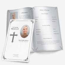
Customization Services
 Photo
Retouching Services
Photo
Retouching Services Live
Support
Live
SupportWhy the Photo Matters in a Funeral Program
A single photo can set the entire tone of a funeral program. It’s often the first thing guests notice and the image that family members hold onto afterward. The chosen picture represents not just what your loved one looked like, but who they were — their warmth, their spirit, their presence.
Whether you’re creating a folded handout, a tri-fold brochure, or a multi-page memorial, the photo anchors every design decision. A bright, centered portrait can make a minimalist layout feel warm and inviting, while a softly lit candid shot adds intimacy to a nature-themed background.
Because this image becomes part of a printed keepsake, it’s worth spending a few extra minutes choosing the right one. Below are the most important considerations for photo selection and how to avoid common mistakes that can diminish the final result.
Choosing the Right Photo
1. Start with clarity and lighting
The photo should be clear, evenly lit, and free from heavy shadows or glare. Indoor photos with natural light or outdoor portraits taken on cloudy days tend to reproduce best when printed. Avoid snapshots that look overly bright or have harsh flash highlights — these can make faces appear washed out once transferred to paper.
If possible, use the original photo file instead of a screenshot or social media download. Images pulled from Facebook or text messages are often compressed and lose sharpness during printing.
💡 Tip: If you only have an older printed photograph, scan it at a minimum of 300 DPI so it retains enough quality for print.
2. Choose a background that supports, not distracts
Busy backgrounds — like patterned walls, crowds, or bright signs — can draw attention away from the person being remembered. Neutral or softly blurred backgrounds keep focus on the subject’s face and expression.
For templates that include a full-cover photo or large portrait section, look for pictures with balanced space around the person’s head and shoulders. Cropping too tightly can make text overlays difficult to position later.
If your image’s background is distracting but meaningful (for example, a beach where your loved one often spent time), lightly fade or soften it instead of removing it entirely.
3. Dress and posture matter more than you think
Formal photos such as wedding portraits or professional headshots may work well for traditional programs, while relaxed, candid images often fit modern or celebration-of-life layouts.
Before you decide, consider the tone of the service:
- Formal or religious: a portrait in dress clothes or uniform feels appropriate.
- Celebration of life: a smiling outdoor photo or casual pose can convey warmth and personality.
- Youth or child memorial: photos showing natural expressions or favorite activities feel most authentic.
Ultimately, the best photo is one that captures the person as loved ones remember them — not necessarily their most “perfect” picture.
4. Match the image with your program design
Your choice of template should complement the photo rather than compete with it. For example:
- A nature-themed layout pairs beautifully with outdoor portraits.
- A floral background softens formal attire or vintage photos.
- A minimalist or light-colored design enhances high-contrast black-and-white images.
If you’re still choosing a layout, browse examples in our Funeral Program Layouts Guide to see how different styles emphasize portraits. Matching tone and imagery early will save time and prevent reformatting later.
5. Use color intentionally
Color photos feel familiar and vibrant, but black-and-white images can evoke timelessness and focus emotion on expression.
If your photo has inconsistent tones — for instance, strong yellow lighting or mixed color balance — try converting it to black-and-white instead of over-editing. It’s often easier to achieve a clean, even look this way.
You can also use color harmony between the photo and background: a soft blue sky or light tan sand can subtly echo the color of a pastel background or frame.
Confirm the Emotional Fit
Before finalizing, print a small proof or show the photo to close family members. Ask, “Does this feel like them?” Sometimes, a technically perfect picture doesn’t carry the warmth or familiarity people expect.
Choosing a photo that makes people smile through their tears is far more important than choosing one with flawless lighting.
Editing and Cropping Tips for a Perfect Fit
Even a great photo can look off if it’s cropped too tightly, stretched, or poorly positioned in the template. Proper editing ensures your loved one’s image looks natural and polished on both screen and paper.
1. Maintain the Original Proportions
Never drag the photo’s corners unevenly in Microsoft Word to make it “fit.” This distorts the face and body, especially when printing. Instead, use the “Lock Aspect Ratio” option in Word’s image formatting tools. Resize proportionally until it sits comfortably within the image box.
If you’re filling a rectangular placeholder with a square image (or vice versa), crop gently — keeping at least the person’s shoulders and upper chest visible. This framing feels balanced and professional.
2. Center the Subject’s Eyes
The most natural placement is with the eyes roughly one-third of the way down from the top of the frame. This composition rule, called the “rule of thirds,” draws focus immediately to the face.
When you import your photo into a Word template, check that the image doesn’t sit too low or high within its placeholder. Slight adjustments of just a few pixels can make a noticeable difference.
3. Use Light Editing, Not Filters
Soft retouching — like gently brightening, adjusting contrast, or removing small dust marks — is fine. However, avoid heavy filters or strong color effects. Oversaturated edits can make skin tones appear unnatural or clash with the program’s overall color scheme.
💡 Tip: When editing, view the photo at 100% zoom (actual size). This helps you see how details and sharpness will appear on the printed page.
4. Keep File Sizes Practical
High-resolution images are great, but files that are too large (5–10 MB or more) can slow down printing or cause formatting errors in Word. If your photo exceeds 3000 pixels wide, resize it to around 2000–2500 pixels before inserting.
This balance keeps clarity high without bloating the document.
5. Use Non-Destructive Editing
Always save a copy of the original photo before making changes. This ensures that if you crop too tightly or over-edit, you can easily start again.
If you’re working in Word, you can also insert the same image twice — one cropped for the cover and another full version for an inside memory page or collage.
Common Mistakes to Avoid
Even with the best intentions, it’s easy to make choices that lead to disappointing print results. Here are the most frequent issues and how to prevent them.
1. Using Low-Resolution Photos
Photos saved from text messages or social media often appear crisp on screen but pixelated in print. If you see jagged edges or fuzziness when zooming in, the resolution is too low.
✅ Fix: Always use the original digital photo or a 300 DPI scan of a printed one.
2. Over-Cropping
Cutting too close to the face removes natural breathing room in the design and makes text placement harder. Give the portrait space so it feels calm and centered.
✅ Fix: Leave some background visible — even if it’s later softened — for balance.
3. Overusing Filters or Effects
Trendy filters can distort tone and feel out of place in printed memorials. What looks stylish on a phone may print harshly or unevenly.
✅ Fix: Stick with minor color correction and basic contrast adjustments.
4. Choosing a Distracting Background
Bright walls, multiple people, or clutter behind the subject draw the eye away from what matters most.
✅ Fix: Select photos with simple, non-competing backgrounds. If unavoidable, gently blur or vignette the edges before inserting into the program.
5. Mixing Lighting Styles
When using multiple photos (for example, one on the cover and one inside), try to choose images with similar lighting — both natural, both indoor, or both softly lit. Mismatched tones can make the layout feel uneven.
✅ Fix: Adjust brightness and color temperature to maintain visual consistency.
When to Get Professional Help
If the only available photo is faded, torn, or low-quality, professional restoration can make a dramatic difference. Even subtle fixes — removing creases, balancing color, or sharpening edges — can turn an old photograph into a clear, print-ready keepsake.
Our guide on Photo Restoration for Funeral Programs explains what types of images can be restored and how to prepare them for editing or scanning.
Preview Before You Print
Before printing multiple copies, do a single test print on the same paper you’ll use for the final programs. This helps you see how colors translate from screen to print — monitors often show images brighter than printers do.
If the photo looks dull, slightly increase brightness and contrast by about 5–10%. Small changes often bring printed photos back to life.
Printing and Proofing Checklist
Once you’ve chosen and edited your photo, the final step is making sure it prints beautifully. Even a perfect layout can lose impact if colors, brightness, or paper stock don’t translate well in print. Below is a simple checklist to help you produce a polished, professional result.
1. Use the Right Paper Finish
Matte or satin finishes work best for funeral programs because they reduce glare and make text easier to read. Glossy paper can cause unwanted reflections under lighting and may emphasize fingerprints.
If your template includes full-page photos or color backgrounds, consider a heavier-weight paper (28 lb. or thicker). It prevents ink from showing through and gives the program a quality feel.
2. Always Print a Single Proof Copy First
Before running a full batch, print one copy and inspect it closely. Look for:
- Is the photo centered and proportionate?
- Are the colors accurate and skin tones natural?
- Does text near the image appear crisp and readable?
Sometimes what looks perfect on screen appears darker in print. If so, lightly increase brightness and contrast before finalizing.
3. Review Alignment Across Panels
If your program is folded, confirm that images and text align correctly after folding. Misalignment often happens when margins are adjusted late in editing.
💡 Tip: Fold your test print gently by hand before printing in bulk. This quick step prevents the “half-face” effect where the crease cuts across the subject’s image.
4. Save Both the Editable and Print-Ready Versions
Keep your Microsoft Word file (.docx) for future edits and export a clean PDF copy for printing. The PDF version locks formatting, ensuring that nothing shifts when opened on another device or at a print shop.
Create two clearly named versions, such as:
funeral-program-editable.docxfuneral-program-final.pdf
This way, if someone in the family later finds a better photo or wants to add a poem, you can make quick adjustments without starting over.
When to Consider Photo Restoration
Sometimes the only available picture is old, faded, or slightly damaged. Rather than settling for poor quality, consider having the image restored.
Professional restoration can correct discoloration, remove small tears or creases, and enhance details without changing the person’s natural appearance. Even smartphone tools can handle light fixes like:
- Adjusting faded colors
- Removing red-eye
- Cropping out borders from scanned photos
For deeper damage, refer to our detailed guide on Photo Restoration for Funeral Programs, which explains how to prepare your image for digital editing and what to expect from a restoration service.
Matching the Photo to the Overall Layout
Once your image is finalized, make sure it complements the rest of your program design. Here are a few ways to bring visual harmony:
1. Balance Photo Size with Text Density
If the front cover photo is large and full-color, keep interior pages lighter — a small image paired with quotes or readings creates contrast and elegance.
2. Use Borders or Frames When Needed
Adding a soft border or thin frame can help the photo blend smoothly with the background. Choose neutral tones like beige, light gray, or off-white that don’t overpower the image.
3. Repeat Color Elements
Pull one color from the photo — such as a shirt or flower hue — and echo it in the text headings or divider lines. This subtle repetition makes the entire layout feel cohesive.
4. Keep Spacing Consistent
Align photos, text boxes, and headings evenly throughout the program. Consistency builds professionalism and helps the eye move comfortably across the page.
Emotional Considerations
Beyond design, the photo carries emotional weight. It can bring comfort to grieving guests and serve as a centerpiece for remembrance long after the service ends.
Take time to confirm the choice with close family members. Sometimes, one person’s favorite candid may not resonate with others. A short conversation now prevents uncertainty later.
“Does this feel like them?” is often the only question that matters.
This emotional alignment ensures that every printed copy becomes a heartfelt keepsake — not just a document, but a tangible memory of love and presence.
Bringing It All Together
Choosing and preparing a photo for a funeral program blends practical and personal decisions. The right image reflects the spirit of the person you’re honoring, while thoughtful design and printing preserve that memory beautifully.
If you’re still deciding how to structure your layout or where to place the photo, explore examples and ready-made templates on the FuneralPamphlets.com homepage. You’ll find designs specifically crafted to highlight portraits — from minimalist modern styles to floral and faith-inspired themes.
Each template is fully editable in Microsoft Word, helping you create a polished program quickly without design experience. With a few clicks, you can adjust images, colors, and text while keeping professional balance across every page.
Final Thought:
A well-chosen photo tells a life story in a single glance. When paired with the right design and attention to detail, it becomes more than an image — it becomes a reflection of love that endures.
Frequently Asked Questions
Q1. What kind of photo works best for a funeral program?
A clear, well-lit portrait with a simple background prints best and keeps the focus on your loved one’s expression.
Q2. Should I use color or black-and-white?
Both are appropriate. Choose color for familiarity; use black-and-white if lighting or color balance is uneven.
Q3. What resolution do I need for print?
Aim for ~300 PPI at the final print size. Avoid screenshots or social media downloads, which are often too compressed.
Q4. Can I use an old printed photo?
Yes. Scan at 300 DPI or higher. Lightly adjust brightness/contrast, and consider gentle restoration for scratches or fading.
Q5. How should I crop the photo?
Keep shoulders and head visible, and center the eyes about one-third from the top. Avoid stretching or distorting proportions.
Q6. What if the background is busy?
Use a photo with a cleaner background or soften the background slightly so text and the face remain readable.
Q7. How do I ensure the photo prints correctly?
Print a single proof on your chosen paper. If it looks dark, increase brightness/contrast slightly and recheck alignment.
Q8. When should I consider professional restoration?
If the only available photo is torn, discolored, or very soft, restoration can recover detail while keeping a natural look.
Ashley Giddens is the editor at FuneralPamphlets.com and your first point of contact for support. Since 2013, she’s helped families create clear, print-ready memorial programs—editing wording, fixing layouts in Microsoft Word, restoring photos, and customizing templates so they print correctly the first time. Ashley reviews every guide for clarity and printer specs (paper size, margins, image resolution) and updates articles as formats change. Need help? She handles customer service directly and can make quick edits to your file when you’re short on time.