Customization Services
 Photo
Retouching Services
Photo
Retouching Services Live
Support
Live
SupportCreating a funeral or memorial program can feel intimidating when you’re grieving. Between arranging the service, choosing music, and gathering photos, designing something beautiful might seem overwhelming. The good news is that you don’t need to hire a designer or learn new software to create something heartfelt.
With the editable Microsoft Word templates available in our funeral program shop, you can easily customize a layout that looks professional, prints beautifully, and truly reflects your loved one’s life. Word’s built-in tools let you adjust colors, photos, and text in minutes — even if you’ve never worked with templates before.
This guide walks you through every step, from choosing the right design to editing photos and text, so you can confidently create a meaningful keepsake that honors your loved one with grace and care.
Why Personalization Matters in a Funeral Program
A printed program is more than just an outline of events — it’s a lasting reflection of a person’s story. When guests hold it in their hands, they’re seeing more than names and dates; they’re remembering a smile, a laugh, a legacy.
Personalizing the program allows you to capture that essence in a tangible way. Small details — such as the background color, photo placement, or typeface — communicate emotion just as powerfully as the words themselves.
Think of the program as a small portrait of personality.
- A floral design might express gentleness or warmth.
- A scenic layout can evoke peace and eternity.
- A minimalist theme might feel modern and reflective.
Adding a favorite quote, hymn, or verse makes each copy a keepsake rather than just printed paper. The result is something family members can treasure long after the service.
If you’d like examples of how to word your tribute, see our Funeral Program Wording Examples & Templates for short readings, thank-you notes, and message ideas.
Choosing the Right Template Before Editing
Before you begin customizing, spend a few moments choosing a template that fits both the tone of the service and your printing setup. The layout and imagery you select will determine how the finished piece looks and feels.
Match the Mood to the Design
Each design style tells its own story:
- Religious and spiritual designs often include crosses, doves, or peaceful skies.
- Floral and pastel themes feel soft and comforting — perfect for mothers, grandmothers, or gentle personalities.
- Scenic or outdoor backgrounds create a calm, reflective atmosphere suitable for anyone who loved nature.
- Minimal or modern templates keep focus on text and photo, ideal for contemporary services.
Understand the Layout Types
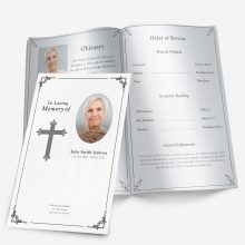
Funeral Pamphlets offers editable templates in several fold styles, each with unique advantages:
- Single-Fold: Classic and simple — easy to print and perfect for short tributes or small gatherings.
- Tri-Fold: Adds extra panels for poems, photos, and longer readings.
- 4-Page Graduated: A professional, booklet-style layout with visible tabs that help organize sections like “Order of Service,” “Obituary,” and “Thank You.”
You can preview and compare these options in our Funeral Program Layouts: Single, Tri-Fold, Gatefold & Graduated guide.
Check Editability
Every downloadable template in Microsoft Word comes pre-formatted with placeholder text and image boxes. You simply replace the sample content with your own — no re-designing required. The file opens instantly, and everything from font size to color can be adjusted using standard Word features.
When selecting, consider how much information you plan to include. For example, a short service may only need a single-fold program, while a full memorial with tributes, poems, and thank-you sections may suit a 4-page graduated design.
Taking a few minutes to pick the right template upfront will make the editing process smoother and faster later.
Preparing to Edit in Microsoft Word
Once your chosen template is open, it helps to organize your materials first. Gather:
- The main photo you’d like to feature
- The full name, dates, and order of service details
- Any quotes, scripture, or messages you plan to include
- A short tribute paragraph or life summary
Keeping everything in one folder makes it easy to copy and paste directly into the template. You’ll spend less time switching between files and more time focusing on design and meaning.
Before you begin editing, save a backup copy of the original file. That way, if you experiment with colors or layout and want to return to the original look, you can do so without re-downloading.
Step-by-Step Guide to Editing in Microsoft Word
Once your materials are gathered and your chosen funeral program template is open in Microsoft Word, personalization becomes an intuitive process. Word’s built-in design tools let you adjust text, images, and color themes quickly — no special design software required.
Below are the five key steps to editing your program, each focused on clarity, readability, and emotional tone.
Step 1 — Replace Sample Text with Personal Details
Every FuneralPamphlets.com template includes pre-filled placeholders such as “Full Name,” “Date of Birth,” and “Order of Service.” Replacing these areas is your first step toward making the program your own.
Click on each text box, highlight the sample words, and type directly over them. Keep the format consistent — names and headers in the same size and color, body text left-aligned or justified for a clean look.
Tips for meaningful wording:
- Include a short introduction that captures the essence of your loved one’s life:
“A loving mother, devoted friend, and light to all who knew her.” - Keep each section brief; white space helps guests focus on what’s most important.
- Confirm spelling of names, dates, and hymns before printing.
For examples of what to write in various sections — from opening lines to thank-you notes — visit our Funeral Program Wording Examples & Templates.
Step 2 — Insert and Format Photos
The featured photo is the emotional centerpiece of your program, often appearing on the cover and inside pages. Choose a high-resolution image (ideally 300 DPI) for crisp, clear printing.
To replace a placeholder image in Word:
- Click the sample photo.
- Select Right-click → Change Picture → From File.
- Choose your image and resize as needed using corner handles (avoid stretching from side edges).
If your photo looks slightly dark or faded, use Picture Format → Corrections → Brightness/Contrast to enhance visibility.
Avoid over-filtering; gentle adjustments keep the image natural. For additional help improving older or damaged photos, see our Funeral Program Photo Quality Guide for best practices and restoration options.
Layout tips:
- Keep at least 0.25″ margins around edges to prevent cutting during printing.
- For programs with multiple images, use uniform shapes (all circles or all rectangles) for balance.
- Avoid overlaying text directly on busy backgrounds — add a faint shape or box behind text to increase readability.
Step 3 — Change Colors and Backgrounds
Colors help set the emotional tone of your program — and adjusting them in Microsoft Word is simple. Select any colored shape or background, right-click, and choose Format Shape → Fill → Solid Fill (or Gradient Fill if the template supports it).
Color guidance by tone:
- Soft pastels: Gentle, comforting atmosphere
- Cool blues or greens: Peaceful and calm
- Ivory or beige tones: Classic and timeless
- Lavender or rose hues: Thoughtful and feminine
- Muted gray or navy: Dignified and masculine
Always check contrast between background and text — light text on a light background may look fine on-screen but print poorly.
If your template includes decorative shapes (like borders or banners), match accent colors across all pages for harmony. Avoid using more than two or three color variations within one design.
Step 4 — Choose Fonts That Set the Mood
Typography influences readability and tone. Microsoft Word includes many classic fonts that print beautifully without needing downloads.
Recommended pairings:
- Serif fonts (e.g., Times New Roman, Garamond, Georgia): traditional and elegant
- Sans-serif fonts (e.g., Calibri, Helvetica Neue, Arial): modern and clean
- Script fonts (e.g., Great Vibes, Dancing Script): graceful when used sparingly for names or titles
Use no more than two fonts in your entire program — one for headings and one for body text. Mixing too many styles creates visual clutter and distracts from the message.
To learn how to create tasteful combinations, see our Funeral Program Fonts in Word article for professional-looking pairings.
Step 5 — Review and Test Print
Before printing multiple copies, take time to preview how everything looks in print. In Microsoft Word, go to File → Print → Print Preview to check for alignment, spacing, and color consistency.
For the best results:
- Print on 28–32 lb. matte or linen paper to prevent glare.
- Use the “Best” or “High Quality” setting on your printer.
- For double-sided printing, select Flip on Short Edge so each page aligns correctly.
- Review every page before committing to a full batch.
Our Printing a Program Template guide includes detailed steps for home and print-shop setups, plus folding tips for each layout style.
When to Re-Save and Backup
After confirming the layout, save your file under a new name (for example, Johnson-Memorial-Program-Final.docx). Keep a copy both on your computer and in cloud storage.
This ensures you can easily update the file for anniversaries, digital memorials, or reprints later.
Common Mistakes to Avoid When Editing a Funeral Program
When you’re working through the emotional process of designing a funeral program, small details can easily slip by. However, avoiding a few common mistakes ensures your final print looks polished and professional — and saves you from stressful last-minute reprints.
1. Overcrowding the Layout
It’s tempting to include every poem, song, and tribute in one place, but too much content can make the design feel cramped. A cluttered program not only overwhelms the reader but also increases the chance of printing errors.
Keep it simple:
- Focus on the essentials: service details, order of events, and one heartfelt message or quote.
- Use white space intentionally to create breathing room between sections.
- If you have more to share, consider printing a second insert page or adding a QR code to a longer digital tribute.
Our Funeral Program Mistakes to Avoid article goes deeper into layout and spacing tips for clarity and balance.
2. Using Too Many Fonts or Colors
Fonts and colors set the emotional tone, but too much variation distracts from the message. Some families use a mix of script, serif, and bold fonts on the same page, resulting in visual chaos.
Best practice:
Limit yourself to one or two fonts across the entire program — one for titles and one for main text. Stick to two complementary colors at most.
A consistent look creates a feeling of calm and unity, which aligns with the spirit of remembrance.
3. Ignoring Print Margins and Alignment
What looks centered on-screen can shift slightly during printing. To prevent text or photos from being cut off, ensure margins are at least 0.5 inches on all sides. Use Print Preview before every batch.
If your printer allows borderless printing, test a single copy first. Slight variations between printers can cause misalignment, especially on 4-page graduated templates.
Following the alignment tips in our Printing a Program Template guide ensures each fold and edge lines up cleanly.
4. Forgetting to Check Photo Quality
Low-resolution photos can appear pixelated once printed. Even if they look clear on your computer, they may not translate well on paper. Always choose the highest-quality image available and avoid cropping too tightly.
If your chosen photo is old or damaged, our Photo Restoration for Funeral Programs service can professionally enhance it for printing.
Clean, well-lit photos make the entire layout feel more personal and refined.
5. Skipping the Test Print
Never skip a test print. The lighting, color, and tone you see on-screen will always differ slightly from the printed version. Printing one copy helps you spot alignment issues, typos, or faded areas before you commit to the final batch.
Even small adjustments — increasing brightness, tweaking margins, or resizing photos — can dramatically improve the finished result.
Finishing Touches That Make a Lasting Impression
Once your design is finalized, there are several easy ways to elevate it into a keepsake-worthy piece that friends and family will treasure.
Add Subtle Embellishments
- Ribbons or ties: Secure the spine of a 4-page program with a thin satin ribbon for an elegant touch.
- Paper choice: Try linen-textured or heavyweight matte paper for durability.
- Rounded corners or light embossing: Available at most print shops; these small upgrades add sophistication without increasing cost dramatically.
Create Matching Materials
Many families choose to coordinate the funeral program with other printed pieces — such as thank-you cards, bookmarks, or memorial inserts.
Since every design in our funeral template shop is built in Microsoft Word, you can easily adapt one design to multiple formats while keeping a cohesive look.
For example:
- Use the same floral border and colors from the main program on your thank-you cards.
- Reuse the cover image for a framed “In Loving Memory” keepsake or slideshow cover.
- Resize the cover layout into a small memorial handout for distant relatives.
Because the templates are multipurpose, they’re not limited to the funeral day — they can also be reused for anniversaries, celebrations of life, and photo memorials.
Save a Digital Version
After printing, it’s worth saving a PDF copy of your program. Not only does this preserve formatting for reprints, but it allows family members abroad to view or print it easily.
To save as a PDF in Word:
File → Save As → PDF (.pdf)
Consider emailing the file to close relatives or storing it in a shared cloud folder. This digital version often becomes a cherished part of the family’s memorial collection.
Turn Your Program Into a Long-Term Keepsake
After the service, place a few extra copies in plastic sleeves or archival boxes. Some families even frame the front page beside a favorite photograph.
These programs, when thoughtfully designed, become part of a person’s legacy — something that can be passed down, revisited, and remembered.
For a more durable presentation, you can laminate the cover or reprint it on heavier cardstock for framing. Many families later include it in photo albums or memory boxes alongside written letters or eulogies.
Final Thoughts
Personalizing a funeral program doesn’t require professional design experience — only a little patience and love. With today’s editable Microsoft Word templates, you can create something truly special that celebrates life with dignity and grace.
Whether you prefer a floral layout, a scenic landscape, or a simple minimalist design, every small detail tells a part of your loved one’s story. Start with a ready-to-edit design, make it your own, and turn it into a keepsake that brings comfort for years to come.
Explore our editable Microsoft Word funeral program templates to find the design that best reflects your loved one’s personality and spirit.
Frequently Asked Questions
1. Can I personalize a funeral program without design experience?
Yes. All FuneralPamphlets.com templates are editable in Microsoft Word — simply replace sample text and photos to create a custom design.
2. What is the easiest way to edit a funeral program?
Open the template in Microsoft Word, replace placeholder text and images, and adjust colors or fonts as needed.
3. Which layout should I choose for my program?
Single-fold works best for short services, tri-fold for extra poems or readings, and 4-page graduated for longer memorials.
4. How do I add or change photos?
Right-click the sample image, choose Change Picture → From File, and select your photo. Resize carefully to maintain proportions.
5. What are the best fonts for a funeral program?
Use serif fonts like Garamond or Times New Roman for tradition, and sans-serif fonts like Calibri for a modern touch. Avoid using more than two fonts.
6. Can I change colors in Microsoft Word templates?
Yes. Right-click shapes or backgrounds, select Format Shape → Fill, and choose new colors that suit the tone of the service.
7. How can I prevent printing errors or cut-off edges?
Use at least 0.5-inch margins and print a test copy before the final batch. Always preview in Print Layout mode.
8. What paper should I use for the best results?
Choose 28–32 lb. matte or linen-textured paper to ensure clear printing and prevent glare.
9. Can I save my design for later use?
Yes. Save the file under a new name and export as a PDF for easy reprinting or sharing digitally.
10. Are the templates reusable for other memorial events?
Absolutely. Each Microsoft Word file can be updated and reused for anniversaries, celebrations of life, or memorial keepsakes.
Ashley Giddens is the editor at FuneralPamphlets.com and your first point of contact for support. Since 2013, she’s helped families create clear, print-ready memorial programs—editing wording, fixing layouts in Microsoft Word, restoring photos, and customizing templates so they print correctly the first time. Ashley reviews every guide for clarity and printer specs (paper size, margins, image resolution) and updates articles as formats change. Need help? She handles customer service directly and can make quick edits to your file when you’re short on time.