Customization Services
 Photo
Retouching Services
Photo
Retouching Services Live
Support
Live
SupportWhy the Cover Matters
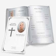
The cover of a funeral program is the first thing guests see when they arrive at the service. It sets the tone for the entire ceremony—welcoming loved ones, reflecting the person’s spirit, and offering a comforting introduction to the memorial ahead.
While the inside pages provide details about the service, the cover creates an immediate emotional connection. A well-designed cover invites reflection, communicates love and respect, and becomes a cherished keepsake long after the day has passed.
Whether you’re creating the design yourself or using a pre-made template, taking time to personalize the cover makes all the difference.
Choosing the Right Photo
A single photo can express more than paragraphs of text. The image on the cover should capture the person’s essence—how they’d like to be remembered.
Photo selection tips:
- Use a clear, high-resolution image. Avoid screenshots or photos taken from social media, as they may print blurry.
- Choose a natural expression. Smiling portraits or relaxed candid shots feel warm and timeless.
- Mind the background. Solid or softly blurred backgrounds make text easier to read.
- Crop carefully. Focus on the face or upper body, avoiding distractions around the edges.
If the only available photo is old, slightly damaged, or darkened with age, it can still be used. Restoration tools and professionals can revive faded colors, remove scratches, and sharpen details—often within a day.
👉 Learn more: Photo Restoration for Funeral Programs
Selecting the Perfect Layout
Once you’ve chosen the photo, it’s time to decide how the overall layout should look. The layout determines how much room you have for text, background imagery, and spacing around the photo.
Common layout options:
- Single-fold: Simple and traditional. Best for one portrait photo with minimal text.
- Tri-fold: Offers more space for creative backgrounds and decorative panels.
- Graduated: Features staggered tabs, ideal for combining a cover photo with small captions or a title line.
The layout you choose should fit the mood of the service—simple for a classic ceremony, modern and colorful for a celebration of life.
👉 Explore examples: Funeral Program Layouts: Single, Tri, Gatefold, Graduated
Wording and Titles for the Front Page
Every program cover includes some form of title or headline, and the wording helps set the emotional tone. The most traditional phrase is “In Loving Memory of…”, but there are many variations that may better match your loved one’s personality or the style of the service.
Common cover phrases:
- A Celebration of Life
- In Loving Memory of
- Forever in Our Hearts
- Honoring the Life of
- Remembering [Name]
Underneath the title, include:
- Full name
- Birth and passing dates
- Optional: location or a short quote
You can also place a small verse, such as “The Lord is my shepherd” or “Your light will forever guide us.”
👉 Find examples here: Funeral Program Wording Examples & Templates
Design and Font Pairings
Typography can completely change the mood of your cover. Serif fonts like Times New Roman or Garamond feel traditional and elegant, while sans-serif fonts like Calibri or Lato give a modern, clean look.
Quick font pairing ideas:
- Classic: Times New Roman (headings) + Calibri (body text)
- Soft and feminine: Garamond (headings) + Georgia (body)
- Contemporary: Lato (headings) + Open Sans (body)
Keep contrast high—dark text on light backgrounds or vice versa—to ensure readability, especially if printing on glossy paper.
Background Themes and Color Palettes
The background is just as important as the main photo—it ties everything together visually and emotionally. The right theme can instantly communicate warmth, peace, or celebration.
Nature-Inspired Backgrounds
- Clouds and skies: symbolize peace and eternity.
- Water scenes: calm lakes, beaches, or waterfalls convey serenity.
- Sunsets: a soft transition from light to dusk, often chosen for spiritual symbolism.
- Floral designs: roses, lilies, or cherry blossoms evoke beauty and remembrance.
These themes work beautifully for loved ones who appreciated nature, gardening, or quiet moments outdoors.
Faith-Based Designs
Families who wish to include religious symbolism may choose:
- Crosses, doves, or angel silhouettes.
- Rays of light or open gates representing heaven.
- Subtle scriptural imagery, such as beams of light or hands in prayer.
When adding religious elements, keep the tone gentle and inclusive—always confirm wording and imagery with the officiant if a specific faith tradition is involved.
Personalized and Hobby Themes
For a deeply custom feel, match the background to a defining interest or passion:
- Golf fairways or fishing lakes for outdoor enthusiasts.
- Musical notes for a singer or instrumentalist.
- Books, pens, or art supplies for creatives or teachers.
- Military or patriotic designs for veterans.
The key is balance—let the imagery support the story without overwhelming the text or photo.
Choosing Colors with Care
Color sets the mood of the cover at a glance. While traditional programs lean toward soft tones, celebration of life services allow for brighter palettes.
Recommended combinations:
- Blue and white: calm, trustworthy, and peaceful.
- Soft cream and gold: warm and dignified.
- Lavender and gray: gentle and elegant.
- Green and beige: natural, grounding tones.
- Black and silver: refined and timeless.
Avoid overly bright or saturated colors, as they can make the text difficult to read once printed. If in doubt, print a test copy to evaluate contrast between background and text.
Enhancing Photo Presentation
Once your background and colors are chosen, position the photo to feel centered and natural. Avoid stretching images to fit the page; instead, resize proportionally and add subtle borders or soft fades.
Tips for framing and presentation:
- Use circular or oval photo frames for a softer, elegant look.
- Add gentle shadowing behind the photo for depth.
- If using a busy background, place the photo in a white or semi-transparent box to improve contrast.
Even minor adjustments—like aligning the eyes one-third from the top—make the composition feel balanced.
👉 For technical clarity tips, read: Funeral Program Photo Quality Guide
Paper Finishes and Printing Style
The type of paper you choose affects how colors and images appear in print. It also changes the tactile experience of the program.
Paper types:
- Matte finish: classic, easy to read, reduces glare under bright light.
- Glossy finish: enhances color depth, ideal for photo-heavy covers.
- Cardstock: durable and professional; often used for folded programs.
If your design includes subtle background textures, matte paper preserves the softness. For vivid images or nature scenes, glossy paper helps the visuals stand out.
Printing at Home vs. Professionally
- Home printing: convenient for small batches (up to 50 copies).
- Professional printing: recommended for large services; ensures consistent color and precision folding.
Always print a single test copy before running the full set—colors often appear darker on paper than on screen.
Design Harmony Checklist
Before finalizing the cover:
- The photo and background complement each other.
- Text is readable from arm’s length.
- Color contrast is high enough for print.
- Borders are even, and elements are centered.
- Fonts and tone match the mood of the service.
Next Steps
After completing your design, the next stage is reviewing your text, testing the layout, and printing your final proof. For those who prefer to start from an editable template instead of designing from scratch, ready-made Microsoft Word templates are available and fully customizable.
👉 Explore designs here: Funeral Program Templates Shop
Cover Title Placement and Balance
Where you position the title and name on the cover can change the entire feel of your design. The goal is balance — ensuring that text complements, not competes with, the photo.
Most common placements:
- Centered below the photo: The most traditional option, giving the portrait full visual focus.
- Overlay on the photo (with faded background): Works well when using a semi-transparent text box or soft gradient.
- Top-centered title with name beneath: Clean and elegant, especially for tri-fold designs.
- Bottom alignment: Adds a modern touch, often used when the upper area features scenic imagery.
Always check legibility: if the title overlays an image, use subtle drop shadows or light outlines for contrast.
Recommended hierarchy
- Large heading (e.g., “In Loving Memory”)
- Full name
- Dates of birth and passing
- Optional: short verse or location line
Keeping a clear hierarchy ensures every reader immediately sees what’s most important.
Font Choices and Pairings
Typography has a quiet emotional influence. The fonts you use can make your design feel traditional, modern, or soft and comforting.
Classic pairings for funeral program covers:
- Times New Roman + Calibri: balanced and familiar.
- Garamond + Georgia: refined, ideal for formal or religious services.
- Lato + Open Sans: minimal and clean for a modern celebration of life.
- Playfair Display + Lora: gentle script look without being hard to read.
Avoid overly decorative fonts, especially for body text. If you use a script style (like Great Vibes or Alex Brush), reserve it for the main name line only.
👉 Learn more about choosing fonts: Funeral Program Fonts in Word
Examples by Style
Below are a few layout and design combinations that help visualize how tone and style align:
1. Classic & Timeless
- Centered portrait with soft white or cream background.
- Serif fonts and minimal color accents.
- “In Loving Memory of” as the title.
- Works beautifully with floral or cross themes.
2. Modern & Minimalist
- Black-and-white portrait with bold sans-serif type.
- Clean lines and generous white space.
- No decorative borders, just clarity and balance.
- Great for professional printing on matte paper.
3. Faith-Based Elegance
- Subtle sky or light-ray background.
- Script heading like “Homegoing Celebration.”
- Cross or dove watermark behind the text.
- Perfect for memorials held in church settings.
4. Celebration of Life (Colorful & Warm)
- Full-bleed photo of the loved one smiling outdoors.
- Accent colors matching favorite hues or hobbies.
- Text placed at the top with open background.
- Ideal for more uplifting, joy-filled ceremonies.
5. Nature or Hobby Theme
- Background image that reflects personal passion: beach, forest, garden, or golf course.
- Minimal wording to let imagery take focus.
- Matte finish to maintain realism and readability.
Printing Proof and Quality Check
Before sending your file for printing, perform a final visual and text check:
1. Spelling and Dates
Double-check names, birthdates, and service times. Typos are easy to miss when emotions run high.
2. Print Alignment
Ensure that folds, margins, and edges line up. Preview the document in “Print Layout” mode in Word to catch any misalignment.
3. Color & Brightness Test
Print one proof on the exact paper you’ll use. Adjust brightness and contrast if the photo looks too dark once printed.
4. Physical Handling
Fold the proof to confirm that no key text or image lands across a crease.
5. Feedback
Ask a family member or friend to review the design before running the full set — a second pair of eyes often catches small issues you may have missed.
When to Use Templates
Creating a cover layout from scratch can take hours of formatting and testing. Microsoft Word templates simplify every step — the design structure, spacing, and text boxes are already in place. You can replace sample images and text while keeping the professional formatting intact.
👉 Explore editable designs here: Funeral Program Templates Shop
Final Checklist Before Printing
Designing a meaningful funeral program cover involves many small details that can easily be overlooked in the moment. Before you print, walk through this checklist to ensure everything is complete and polished:
- High-resolution photo used, properly centered and cropped.
- Title and name clearly readable with strong color contrast.
- Fonts consistent throughout (no more than two styles).
- Margins and folds aligned—nothing important near the edge.
- Birth and passing dates double-checked.
- Printed proof reviewed for brightness, spacing, and accuracy.
- Background and text balanced (neither overpowering the other).
- Order of service confirmed with the officiant or coordinator.
Printing one physical proof copy before running a full batch can prevent costly or emotional last-minute corrections.
Printing at Home vs. Professional Printing
Choosing how to print depends on the number of guests, your available time, and the finish you want.
Home Printing
- Ideal for small gatherings (under 50 attendees).
- Lets you reprint or adjust immediately if needed.
- Use quality photo paper or medium-weight matte paper for a professional feel.
- Always check ink levels—low ink can dull colors or blur details.
Professional Printing
- Recommended for larger services or designs with full-bleed photos.
- Print shops can trim, fold, and score pages cleanly.
- Consistent color quality and accurate margins.
- Choose cardstock or coated paper for a sturdy, elegant keepsake.
If using a local print shop, bring a physical test copy or PDF proof with embedded fonts to ensure alignment and accuracy.
Coordinating the Cover with Inside Pages
The cover should flow naturally into the interior pages, creating a unified memorial piece rather than two separate designs.
Simple coordination tips:
- Color consistency: If the cover uses navy blue, carry that accent color through dividers or section headings inside.
- Font repetition: Use the same heading font for section titles like “Order of Service” or “Acknowledgements.”
- Tone and imagery: If your cover features a garden scene, repeat small floral accents inside instead of switching to new motifs.
- Paper type: Use the same stock and finish throughout; mixing glossy and matte can look inconsistent.
This cohesive approach gives the entire program a polished, professional appearance.
For Bilingual or Multicultural Families
When designing covers for bilingual families, balance simplicity and inclusion. Instead of crowding both languages on the same line, consider:
- Having English on the front cover and Spanish translation on the back page.
- Adding a short bilingual phrase such as “Siempre en nuestros corazones / Forever in our hearts.”
- Linking to a longer translation through a QR code printed discreetly near the bottom corner.
This thoughtful detail ensures everyone can participate fully and understand the meaning of the service.
Final Thoughts
A beautiful funeral program cover tells a story before a single word is read. It’s a visual tribute to the person’s life—a reflection of who they were and how they’ll be remembered. By choosing a meaningful photo, harmonious layout, and balanced color palette, you can create something that feels deeply personal and timeless.
Even small touches—like a favorite quote, symbolic image, or soft background—can turn a simple program into a keepsake families treasure. The goal is not perfection, but authenticity: a design that feels true to your loved one’s spirit.
Start with a Template to Save Time
If you’d like a professional foundation that still allows full customization, editable Microsoft Word templates make it easy to begin. Each design includes space for a portrait photo, headings, and personal text—so you can focus on the details that matter most.
👉 Explore designs here: Funeral Program Templates Shop
FAQ
Q1. What should go on the cover of a funeral program?
The cover usually includes a photo, the person’s full name, birth and passing dates, and a short title such as “In Loving Memory.”
Q2. How do I choose the right photo for a funeral program?
Select a clear, high-resolution portrait that feels natural and warm. Avoid screenshots or group photos unless cropped closely.
Q3. What are the best color themes for funeral covers?
Soft tones like cream, lavender, blue, or white work well. Choose colors that reflect the person’s style and keep text easy to read.
Q4. Can I use hobbies or personal themes on the cover?
Yes. Subtle backgrounds such as gardens, golf courses, or musical notes make the design feel unique without distracting from the text.
Q5. How should I arrange the title and name?
Most families center the name below the photo, with a phrase like “In Loving Memory of” or “Celebrating the Life of” above it.
Q6. Which fonts look best on a funeral program cover?
Serif fonts like Times New Roman or Garamond give a timeless look. Sans-serif fonts such as Calibri or Lato offer a modern feel.
Q7. What type of paper should I use for printing?
Matte paper reduces glare and is easy to read. Glossy paper enhances color but may reflect light; cardstock adds weight and durability.
Q8. Can I design the cover myself in Microsoft Word?
Yes. You can easily personalize ready-made Microsoft Word templates that already have spacing and photo areas formatted for you.
Ashley Giddens is the editor at FuneralPamphlets.com and your first point of contact for support. Since 2013, she’s helped families create clear, print-ready memorial programs—editing wording, fixing layouts in Microsoft Word, restoring photos, and customizing templates so they print correctly the first time. Ashley reviews every guide for clarity and printer specs (paper size, margins, image resolution) and updates articles as formats change. Need help? She handles customer service directly and can make quick edits to your file when you’re short on time.