How to Get a Photo Ready for a Funeral Program: Simple Steps & When to Call in the Experts
Choosing the right photo for a funeral or memorial program is one of the most meaningful parts of planning the service. That single picture often becomes the centerpiece of remembrance — printed on the cover, displayed at the ceremony, and shared with family afterward.
But many families find themselves with only older or damaged photos. Faded colors, scratches, or creases can make it hard to print clearly. That’s where photo restoration comes in — helping bring warmth and life back to treasured memories, so your loved one is represented in the best possible light.
The good news is, restoring a photo for a funeral program doesn’t have to be complicated. With just a few simple steps — and professional help when needed — you can ensure your chosen photo looks beautiful in print and ready for display.
Why a Clear Photo Matters for a Funeral Program
The photo on the cover of a program is often what guests notice first. It sets the tone of the entire memorial — a smile, a favorite expression, a sense of who the person truly was.
A clear, bright photo helps loved ones remember the person vividly. On the other hand, a dark or blurry picture can unintentionally take away from that emotional connection. The goal isn’t perfection — it’s clarity and warmth.
Restoring a photo ensures:
Details are visible — eyes, smiles, and features appear natural.
Colors are balanced — whites look clean, and skin tones appear lifelike.
Printing looks professional — no harsh shadows or faded areas.
Even a small improvement in brightness or sharpness can make a powerful difference when printed on your chosen Microsoft Word funeral program template.
If you’d rather not worry about technical steps, our team offers a professional photo restoration service designed specifically for funeral and memorial use — from removing background clutter to restoring old, worn photos with care and precision.
Simple Checks You Can Do Before Restoring
Before deciding whether you need a full restoration, take a moment to look closely at your chosen photo. Here’s what to check:
Clarity: Can you clearly see your loved one’s face when the photo is small? If not, it might print blurry.
Condition: Look for fading, discoloration, or small cracks in the print.
Lighting: Is the photo too dark or too bright?
Background: Are there distracting objects or people in the background that take focus away?
Size: Is it large enough to fit on your program without losing detail?
If you’re unsure, it’s better to have the photo reviewed before printing. Small touch-ups — like brightening or cropping — often make a big improvement without needing major editing.
Common Types of Photo Restoration (and What’s Possible)
Many people are surprised by how much can be improved in an old photograph. Whether your image was taken decades ago or printed from a phone, the right restoration can bring it back to life.
Here are some of the most common issues that can be fixed:
Faded or Yellowed Photos: Age and sunlight can cause fading, but color correction can restore natural tones.
Scratches, Tears, or Creases: These can often be carefully removed without damaging important details.
Stains or Dust Marks: Old photos frequently have small specks or blotches — these can be smoothed for a clean finish.
Background Distractions: We can remove busy or unwanted backgrounds to keep focus on your loved one.
Cutouts or Group Photos: If you only have a family photo, one person can be isolated and placed against a simple, respectful background.
Lighting Adjustments: Brightening shadows, softening harsh light, or balancing tones for natural skin color.
Smile or Teeth Whitening: Subtle improvements to match how they looked in real life.
Each of these fixes helps ensure the final image prints clearly and beautifully on your chosen template — whether that’s a 4-page graduated program, a tri-fold layout, or a single-fold memorial card.
If your photo needs any of these enhancements, our Photo Restoration & Editing Service can make those adjustments quickly and carefully. Send us your image directly, and we’ll handle the rest.
After Restoration: Getting Your Photo Ready for the Program
Once your photo has been cleaned, brightened, and restored, the next step is preparing it for printing inside your funeral or memorial program. This stage doesn’t require any design experience — just a few thoughtful adjustments so your loved one’s picture prints clearly and fits naturally with the overall layout.
The goal is to make the photo the emotional centerpiece of your printed tribute. The rest of the program — the order of service, poems, and messages — will complement it.
1. Choose the Right Program Layout
Different layouts give your photo a slightly different feel:
Single-fold: Simple and elegant. Ideal when using one strong portrait on the cover.
Tri-fold: Offers extra space for photos inside — often used for families including a younger and older portrait together.
4-page graduated: Our most popular layout at FuneralPamphlets.com. Tabs create clear sections and let you feature both the main portrait and smaller family photos.
If you haven’t chosen your design yet, browse our editable Microsoft Word funeral templates. Each one is formatted for easy photo placement and printing at home or in a local shop.
2. Insert the Restored Photo in Microsoft Word
When you open your chosen template, you’ll see a placeholder image where the main photo belongs. To replace it:
Click the sample image.
Choose Right-click → Change Picture → From File.
Select your restored image from your computer.
Resize by dragging the corners (not the sides) so proportions stay natural.
If you see white space around the edges, don’t worry — it’s better than stretching or distorting the photo. Cropping too tightly around the face can feel unnatural; leave comfortable space above the head and below the shoulders.
For best printing results, use a file at least 300 DPI resolution or around 1 MB or larger in size. Anything much smaller may appear soft or pixelated once printed.
3. Balance the Photo with the Design
Even a beautifully restored image can look off if it’s too dark or too bright next to surrounding text. In Word, you can make small, easy adjustments:
Click the photo → choose Picture Format → Corrections.
Increase or decrease Brightness/Contrast until it feels natural.
Avoid heavy filters — subtlety always prints best.
If your background is now cleaner or a person has been cut out from a group shot (a service we offer through our Photo Restoration & Editing Services), you can place that new portrait on a soft, neutral background in the program. This keeps attention on the face while maintaining a respectful tone.
4. Test Print before Final Copies
Printing is where many people run into frustration — colors that look perfect on-screen sometimes appear darker or cooler on paper. To avoid disappointment:
Print one test copy first.
Use 28 – 32 lb matte paper for a smooth finish.
Select Best or High-Quality settings on your printer.
If printing double-sided, choose Flip on Short Edge so each page aligns properly.
A single test print allows you to spot things like text being too close to the edge, or colors needing slight brightening.
5. Common Photo-Placement Mistakes
Even with a high-quality restored photo, placement errors can reduce impact. Here’s what to avoid:
Cropping the top of the head or chin. Leave gentle space all around.
Placing text over the face or hairline. Use soft backgrounds or photo boxes instead.
Mixing multiple photo shapes. If one is round, keep the others round for consistency.
Printing straight from your phone. Always save the final design to your computer and print from Word or as a PDF.
Following these simple rules ensures your finished program looks cohesive and thoughtfully designed.
6. When to Ask for Professional Help
Some photos need more than quick adjustments. If your loved one’s picture still looks faded, cropped too close, or includes someone you’d prefer removed, professional editing can make a world of difference.
Our photo-restoration team can:
Brighten dark or uneven lighting.
Repair creases, tears, and water stains.
Remove background distractions or other people.
Isolate one person from a group photo.
Soften shadows, smooth glare, and whiten smiles subtly.
All edits are done by hand with care to preserve natural detail — never automated filters. You’ll receive a print-ready file that drops seamlessly into any Microsoft Word template.
You utilize our service at our Photo Restoration & Editing Services page. Most orders are completed within 24 hours, and we’ll guide you through printing if needed.
7. Turning Restored Photos into Keepsakes
After the service, many families reprint their programs or frame the restored photo alongside the printed cover. Because our templates are multipurpose, you can easily reuse them later for:
Memorial anniversaries
Celebrations of life
Photo book dedications
Framed tributes or thank-you cards
Saving both a digital PDF and printed copy ensures the memory remains preserved for future generations.
Closing Thought
The picture you choose represents far more than appearance — it holds personality, warmth, and story. Taking a little time to restore it and place it beautifully in a printed program is one of the most loving tributes you can offer.
Whether you prefer to do it yourself or let us handle the editing, our goal is to make the process gentle and stress-free. Visit our Photo Restoration Service to get expert help, then browse our Microsoft Word funeral templates to design a program that honors your loved one with grace and clarity.
Frequently Asked Questions
How to Personalize a Funeral Program in Microsoft Word (Without a Designer)
Creating a funeral or memorial program can feel intimidating when you’re grieving. Between arranging the service, choosing music, and gathering photos, designing something beautiful might seem overwhelming. The good news is that you don’t need to hire a designer or learn new software to create something heartfelt.
With the editable Microsoft Word templates available in our funeral program shop, you can easily customize a layout that looks professional, prints beautifully, and truly reflects your loved one’s life. Word’s built-in tools let you adjust colors, photos, and text in minutes — even if you’ve never worked with templates before.
This guide walks you through every step, from choosing the right design to editing photos and text, so you can confidently create a meaningful keepsake that honors your loved one with grace and care.
Why Personalization Matters in a Funeral Program
A printed program is more than just an outline of events — it’s a lasting reflection of a person’s story. When guests hold it in their hands, they’re seeing more than names and dates; they’re remembering a smile, a laugh, a legacy.
Personalizing the program allows you to capture that essence in a tangible way. Small details — such as the background color, photo placement, or typeface — communicate emotion just as powerfully as the words themselves.
Think of the program as a small portrait of personality.
A floral design might express gentleness or warmth.
A scenic layout can evoke peace and eternity.
A minimalist theme might feel modern and reflective.
Adding a favorite quote, hymn, or verse makes each copy a keepsake rather than just printed paper. The result is something family members can treasure long after the service.
Before you begin customizing, spend a few moments choosing a template that fits both the tone of the service and your printing setup. The layout and imagery you select will determine how the finished piece looks and feels.
Match the Mood to the Design
Each design style tells its own story:
Religious and spiritual designs often include crosses, doves, or peaceful skies.
Floral and pastel themes feel soft and comforting — perfect for mothers, grandmothers, or gentle personalities.
Scenic or outdoor backgrounds create a calm, reflective atmosphere suitable for anyone who loved nature.
Minimal or modern templates keep focus on text and photo, ideal for contemporary services.
Understand the Layout Types
Funeral Pamphlets offers editable templates in several fold styles, each with unique advantages:
Single-Fold: Classic and simple — easy to print and perfect for short tributes or small gatherings.
Tri-Fold: Adds extra panels for poems, photos, and longer readings.
4-Page Graduated: A professional, booklet-style layout with visible tabs that help organize sections like “Order of Service,” “Obituary,” and “Thank You.”
Every downloadable template in Microsoft Word comes pre-formatted with placeholder text and image boxes. You simply replace the sample content with your own — no re-designing required. The file opens instantly, and everything from font size to color can be adjusted using standard Word features.
When selecting, consider how much information you plan to include. For example, a short service may only need a single-fold program, while a full memorial with tributes, poems, and thank-you sections may suit a 4-page graduated design.
Taking a few minutes to pick the right template upfront will make the editing process smoother and faster later.
Preparing to Edit in Microsoft Word
Once your chosen template is open, it helps to organize your materials first. Gather:
The main photo you’d like to feature
The full name, dates, and order of service details
Any quotes, scripture, or messages you plan to include
A short tribute paragraph or life summary
Keeping everything in one folder makes it easy to copy and paste directly into the template. You’ll spend less time switching between files and more time focusing on design and meaning.
Before you begin editing, save a backup copy of the original file. That way, if you experiment with colors or layout and want to return to the original look, you can do so without re-downloading.
Step-by-Step Guide to Editing in Microsoft Word
Once your materials are gathered and your chosen funeral program template is open in Microsoft Word, personalization becomes an intuitive process. Word’s built-in design tools let you adjust text, images, and color themes quickly — no special design software required.
Below are the five key steps to editing your program, each focused on clarity, readability, and emotional tone.
Step 1 — Replace Sample Text with Personal Details
Every FuneralPamphlets.com template includes pre-filled placeholders such as “Full Name,” “Date of Birth,” and “Order of Service.” Replacing these areas is your first step toward making the program your own.
Click on each text box, highlight the sample words, and type directly over them. Keep the format consistent — names and headers in the same size and color, body text left-aligned or justified for a clean look.
Tips for meaningful wording:
Include a short introduction that captures the essence of your loved one’s life: “A loving mother, devoted friend, and light to all who knew her.”
Keep each section brief; white space helps guests focus on what’s most important.
Confirm spelling of names, dates, and hymns before printing.
The featured photo is the emotional centerpiece of your program, often appearing on the cover and inside pages. Choose a high-resolution image (ideally 300 DPI) for crisp, clear printing.
To replace a placeholder image in Word:
Click the sample photo.
Select Right-click → Change Picture → From File.
Choose your image and resize as needed using corner handles (avoid stretching from side edges).
If your photo looks slightly dark or faded, use Picture Format → Corrections → Brightness/Contrast to enhance visibility.
Avoid over-filtering; gentle adjustments keep the image natural. For additional help improving older or damaged photos, see our Funeral Program Photo Quality Guide for best practices and restoration options.
Layout tips:
Keep at least 0.25″ margins around edges to prevent cutting during printing.
For programs with multiple images, use uniform shapes (all circles or all rectangles) for balance.
Avoid overlaying text directly on busy backgrounds — add a faint shape or box behind text to increase readability.
Step 3 — Change Colors and Backgrounds
Colors help set the emotional tone of your program — and adjusting them in Microsoft Word is simple. Select any colored shape or background, right-click, and choose Format Shape → Fill → Solid Fill (or Gradient Fill if the template supports it).
Color guidance by tone:
Soft pastels: Gentle, comforting atmosphere
Cool blues or greens: Peaceful and calm
Ivory or beige tones: Classic and timeless
Lavender or rose hues: Thoughtful and feminine
Muted gray or navy: Dignified and masculine
Always check contrast between background and text — light text on a light background may look fine on-screen but print poorly.
If your template includes decorative shapes (like borders or banners), match accent colors across all pages for harmony. Avoid using more than two or three color variations within one design.
Step 4 — Choose Fonts That Set the Mood
Typography influences readability and tone. Microsoft Word includes many classic fonts that print beautifully without needing downloads.
Recommended pairings:
Serif fonts (e.g., Times New Roman, Garamond, Georgia): traditional and elegant
Sans-serif fonts (e.g., Calibri, Helvetica Neue, Arial): modern and clean
Script fonts (e.g., Great Vibes, Dancing Script): graceful when used sparingly for names or titles
Use no more than two fonts in your entire program — one for headings and one for body text. Mixing too many styles creates visual clutter and distracts from the message.
To learn how to create tasteful combinations, see our Funeral Program Fonts in Word article for professional-looking pairings.
Step 5 — Review and Test Print
Before printing multiple copies, take time to preview how everything looks in print. In Microsoft Word, go to File → Print → Print Preview to check for alignment, spacing, and color consistency.
For the best results:
Print on 28–32 lb. matte or linen paper to prevent glare.
Use the “Best” or “High Quality” setting on your printer.
For double-sided printing, select Flip on Short Edge so each page aligns correctly.
Review every page before committing to a full batch.
Our Printing a Program Template guide includes detailed steps for home and print-shop setups, plus folding tips for each layout style.
When to Re-Save and Backup
After confirming the layout, save your file under a new name (for example, Johnson-Memorial-Program-Final.docx). Keep a copy both on your computer and in cloud storage. This ensures you can easily update the file for anniversaries, digital memorials, or reprints later.
Common Mistakes to Avoid When Editing a Funeral Program
When you’re working through the emotional process of designing a funeral program, small details can easily slip by. However, avoiding a few common mistakes ensures your final print looks polished and professional — and saves you from stressful last-minute reprints.
1. Overcrowding the Layout
It’s tempting to include every poem, song, and tribute in one place, but too much content can make the design feel cramped. A cluttered program not only overwhelms the reader but also increases the chance of printing errors.
Keep it simple:
Focus on the essentials: service details, order of events, and one heartfelt message or quote.
Use white space intentionally to create breathing room between sections.
If you have more to share, consider printing a second insert page or adding a QR code to a longer digital tribute.
Fonts and colors set the emotional tone, but too much variation distracts from the message. Some families use a mix of script, serif, and bold fonts on the same page, resulting in visual chaos.
Best practice: Limit yourself to one or two fonts across the entire program — one for titles and one for main text. Stick to two complementary colors at most. A consistent look creates a feeling of calm and unity, which aligns with the spirit of remembrance.
3. Ignoring Print Margins and Alignment
What looks centered on-screen can shift slightly during printing. To prevent text or photos from being cut off, ensure margins are at least 0.5 inches on all sides. Use Print Preview before every batch.
If your printer allows borderless printing, test a single copy first. Slight variations between printers can cause misalignment, especially on 4-page graduated templates.
Following the alignment tips in our Printing a Program Template guide ensures each fold and edge lines up cleanly.
4. Forgetting to Check Photo Quality
Low-resolution photos can appear pixelated once printed. Even if they look clear on your computer, they may not translate well on paper. Always choose the highest-quality image available and avoid cropping too tightly.
If your chosen photo is old or damaged, our Photo Restoration for Funeral Programs service can professionally enhance it for printing. Clean, well-lit photos make the entire layout feel more personal and refined.
5. Skipping the Test Print
Never skip a test print. The lighting, color, and tone you see on-screen will always differ slightly from the printed version. Printing one copy helps you spot alignment issues, typos, or faded areas before you commit to the final batch.
Even small adjustments — increasing brightness, tweaking margins, or resizing photos — can dramatically improve the finished result.
Finishing Touches That Make a Lasting Impression
Once your design is finalized, there are several easy ways to elevate it into a keepsake-worthy piece that friends and family will treasure.
Add Subtle Embellishments
Ribbons or ties: Secure the spine of a 4-page program with a thin satin ribbon for an elegant touch.
Paper choice: Try linen-textured or heavyweight matte paper for durability.
Rounded corners or light embossing: Available at most print shops; these small upgrades add sophistication without increasing cost dramatically.
Create Matching Materials
Many families choose to coordinate the funeral program with other printed pieces — such as thank-you cards, bookmarks, or memorial inserts. Since every design in our funeral template shop is built in Microsoft Word, you can easily adapt one design to multiple formats while keeping a cohesive look.
For example:
Use the same floral border and colors from the main program on your thank-you cards.
Reuse the cover image for a framed “In Loving Memory” keepsake or slideshow cover.
Resize the cover layout into a small memorial handout for distant relatives.
Because the templates are multipurpose, they’re not limited to the funeral day — they can also be reused for anniversaries, celebrations of life, and photo memorials.
Save a Digital Version
After printing, it’s worth saving a PDF copy of your program. Not only does this preserve formatting for reprints, but it allows family members abroad to view or print it easily.
To save as a PDF in Word: File → Save As → PDF (.pdf)
Consider emailing the file to close relatives or storing it in a shared cloud folder. This digital version often becomes a cherished part of the family’s memorial collection.
Turn Your Program Into a Long-Term Keepsake
After the service, place a few extra copies in plastic sleeves or archival boxes. Some families even frame the front page beside a favorite photograph. These programs, when thoughtfully designed, become part of a person’s legacy — something that can be passed down, revisited, and remembered.
For a more durable presentation, you can laminate the cover or reprint it on heavier cardstock for framing. Many families later include it in photo albums or memory boxes alongside written letters or eulogies.
Final Thoughts
Personalizing a funeral program doesn’t require professional design experience — only a little patience and love. With today’s editable Microsoft Word templates, you can create something truly special that celebrates life with dignity and grace.
Whether you prefer a floral layout, a scenic landscape, or a simple minimalist design, every small detail tells a part of your loved one’s story. Start with a ready-to-edit design, make it your own, and turn it into a keepsake that brings comfort for years to come.
1. Can I personalize a funeral program without design experience? Yes. All FuneralPamphlets.com templates are editable in Microsoft Word — simply replace sample text and photos to create a custom design.
2. What is the easiest way to edit a funeral program? Open the template in Microsoft Word, replace placeholder text and images, and adjust colors or fonts as needed.
3. Which layout should I choose for my program? Single-fold works best for short services, tri-fold for extra poems or readings, and 4-page graduated for longer memorials.
4. How do I add or change photos? Right-click the sample image, choose Change Picture → From File, and select your photo. Resize carefully to maintain proportions.
5. What are the best fonts for a funeral program? Use serif fonts like Garamond or Times New Roman for tradition, and sans-serif fonts like Calibri for a modern touch. Avoid using more than two fonts.
6. Can I change colors in Microsoft Word templates? Yes. Right-click shapes or backgrounds, select Format Shape → Fill, and choose new colors that suit the tone of the service.
7. How can I prevent printing errors or cut-off edges? Use at least 0.5-inch margins and print a test copy before the final batch. Always preview in Print Layout mode.
8. What paper should I use for the best results? Choose 28–32 lb. matte or linen-textured paper to ensure clear printing and prevent glare.
9. Can I save my design for later use? Yes. Save the file under a new name and export as a PDF for easy reprinting or sharing digitally.
10. Are the templates reusable for other memorial events? Absolutely. Each Microsoft Word file can be updated and reused for anniversaries, celebrations of life, or memorial keepsakes.
Funeral Program Template Styles & Themes: How to Choose the Right Design
When planning a funeral or memorial, one of the most personal choices you’ll make is the design of the program. More than a piece of paper, it’s a tribute — a reflection of the person being remembered. The right design can convey warmth, faith, strength, or peace without a single word.
Choosing that design, however, can feel overwhelming. Should it feature flowers or landscapes? Should it look traditional or modern? The answer depends on your loved one’s personality, values, and the tone of the ceremony itself.
At FuneralPamphlets.com, every Microsoft Word funeral template is crafted to be multipurpose — perfect for both the service and as a lasting keepsake. Whether you’re creating a simple handout for guests or a beautiful booklet to treasure at home, the template’s visual tone sets the emotional atmosphere.
You don’t need design experience to create something meaningful. By understanding the different styles available, you can choose one that feels right — one that quietly says “this looks like them.”
Understanding Funeral Program Design Styles
Every funeral program tells a story. The layout, color, and imagery all work together to express love and remembrance. Below are the most common design styles and the kinds of personalities or services they complement.
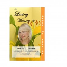
1. Floral & Nature Designs
Gentle, peaceful, and timeless, floral or natural backgrounds are among the most popular themes for memorial programs. Soft petals, leaves, or light landscapes create a sense of serenity and renewal — a visual reminder of life’s beauty and cycle.
These designs are versatile and work beautifully for any age or faith. They’re especially fitting for those who loved gardens, nature walks, or quiet moments outdoors.
Many families also use floral backgrounds for celebration of life services, pairing them with bright colors or uplifting quotes. If you’d like inspiration on tone and format, see our Funeral Program Ideas for a Celebration of Life.
2. Religious & Spiritual Themes
For families who wish to express faith, spiritual templates provide comforting symbolism — crosses, doves, rays of light, and heavenly skies. These designs emphasize peace, guidance, and eternal love.
They’re ideal for church services or any memorial that includes readings, prayers, or hymns. Subtle religious motifs can be paired with scripture or personal messages about hope and faith.
You can view faith-based examples and suggestions in our Religious Funeral Program Orders of Service guide, which explains common readings and formats used in Christian, Catholic, and interfaith services.
Religious Traditional Cross Program Template
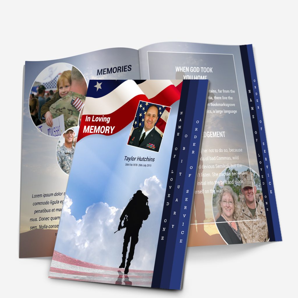
3. Military & Patriotic Designs
For veterans, service members, or patriotic individuals, military-themed programs are a powerful way to honor a life of dedication and courage. Designs often include American flags, eagles, medals, or symbolic colors of red, white, and blue.
These programs can include a short biography highlighting military rank, years of service, or awards received. Families sometimes print them on heavier paper for framing or long-term keepsakes.
Military & Veteran Funeral Program Template Example
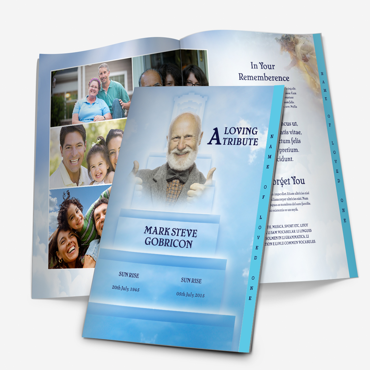
4. Minimalist & Modern Styles
Not every tribute needs intricate imagery. Some families prefer a clean, contemporary look that focuses on typography and spacing rather than graphics. These minimalist templates convey elegance and quiet sophistication — ideal for professional individuals or families who value simplicity.
Think muted backgrounds, refined fonts, and subtle color accents like gray, ivory, or soft blue. Modern designs pair well with both traditional services and private memorial gatherings.
They’re also ideal when you need to print quickly or want something timeless that won’t distract from the written message.
5. Outdoor & Scenic Backgrounds
Scenic templates use peaceful landscapes — sunsets, mountains, beaches, or open fields — to evoke reflection and calm. These backgrounds often resonate with those who loved travel, fishing, or the outdoors.
A sunrise over water or golden sky fading into clouds can symbolize peace and continuity. Pairing scenic imagery with a favorite poem or short quote makes the program deeply personal without being overly complex.
Families often choose these designs for celebration of life ceremonies, where the mood is hopeful rather than somber.
How to Use Design as a Tribute
When selecting a style, think of it as telling the story of who they were.
A garden lover might be represented by floral tones.
A lifelong traveler might fit a horizon or beach theme.
A quiet soul might feel best reflected through minimalist design.
A faithful believer might be honored through a cross or light motif.
Design isn’t decoration — it’s memory in visual form.
Choosing a Theme That Matches the Person
Selecting a template design isn’t just about visual appeal — it’s about personality, memories, and message. When the tone of the program reflects who someone truly was, it helps guests feel connected and comforted. Even small details — like the shade of a background or a symbol in the corner — can make a program feel deeply personal.
Before choosing a funeral template, take a few quiet moments to think about the person you’re honoring. How would you describe them in a single word — peaceful, strong, joyful, devoted, adventurous? That single word often guides the best design choice.
1. For the Peaceful and Reflective
If your loved one lived with calmness and grace, a floral or scenic theme conveys that same serenity. Gentle colors like lavender, light green, or cream work beautifully for quiet, introspective personalities.
Floral templates capture a sense of renewal and life’s continuing beauty, while scenic designs — such as skies, sunsets, or meadows — bring visual stillness. These programs feel soothing at first glance, reminding guests of the person’s steady presence and inner peace.
For someone guided by faith, a religious or spiritual template is a natural fit. Crosses, doves, rays of light, and angelic motifs speak gently of devotion and eternal rest.
If you’re including scripture or hymns, use a program that incorporates enough space for text while maintaining clean margins — the 4-page graduated layout is ideal. Its layered tabs organize sections like Order of Service, Readings, and Thank-You Message without clutter.
A faith-centered program doesn’t have to feel solemn; it can reflect joy, gratitude, and hope. You’ll find helpful examples in our Religious Funeral Program Orders of Service.
3. For the Brave and Dutiful
A military or patriotic design honors those who served their country or lived with strong civic pride. These programs often include American flags, service seals, or symbolic imagery such as eagles and stars.
Beyond military recognition, these designs also suit public servants — firefighters, police officers, and community leaders — whose lives reflected courage and service.
Consider including details such as rank, years of service, or a quote about sacrifice and honor. Our Military & Veteran Funeral Program Templates show several respectful ways to include these tributes.
4. For the Creative and Modern
Minimalist templates, with soft backgrounds and clear typography, speak volumes through simplicity. They reflect individuals who valued clarity, artistry, or modern taste — designers, musicians, educators, or anyone who preferred understated elegance.
These layouts draw attention to the text itself, letting the life story and chosen words take center stage. Use high-contrast fonts like Georgia or Calibri for easy reading, and accent with one muted tone — gray, blush, or navy.
You can pair this aesthetic with a favorite quote, line from a song, or personal mantra that captures their spirit. For typography guidance, see our Funeral Program Fonts in Microsoft Word.
5. For the Joyful and Full of Life
For someone known for laughter, energy, or adventure, an outdoor or celebration-style theme feels right. These templates use brighter tones and natural light — beaches, gardens, skies, or rolling hills. They tell guests that this is not only a farewell, but also a celebration of life well lived.
You can complement these layouts with upbeat poems, song lyrics, or anecdotes that capture joy and gratitude. If your service follows a “celebration of life” format, our Celebration of Life Program Ideas article offers examples that balance warmth and sincerity.
6. When in Doubt, Choose Meaning Over Style
If you’re uncertain which design feels “right,” ask yourself which one would make them smile. A program doesn’t have to be elaborate to be meaningful — it just has to be true.
Sometimes the simplest choice — a calming sky or gentle floral — says more than a detailed illustration ever could. And because every template on FuneralPamphlets.com is fully editable, you can customize any layout to add photos, color accents, or symbols that make it feel unique to your family.
Emotional Resonance Matters
People rarely remember fonts or borders, but they remember how something made them feel. A thoughtfully chosen design becomes part of the memory it preserves — something family members may revisit years later as a comforting reminder of that day.
When the design reflects the person, it transforms the program from a handout into a keepsake.
Layout Options and When Each Works Best
After selecting a theme or style that reflects your loved one, the next step is choosing the layout — how the information will physically appear once printed and folded. The layout determines how much space you’ll have for photos, readings, and personal notes, as well as the flow of the story from front cover to back page.
Even with similar designs, the experience changes dramatically depending on whether you choose a single-fold, tri-fold, or 4-page graduated template. Each has its strengths, and understanding those differences helps ensure your finished piece looks polished, balanced, and easy to read.
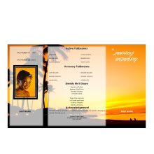
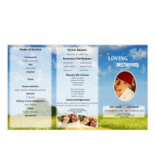
1. Single-Fold Funeral Program
The single-fold design is the most straightforward and traditional layout — a single sheet of paper printed on both sides and folded once down the middle.
Best for:
Simple services or private gatherings
Short obituaries or single-page tributes
Families printing at home or on short notice
Despite its simplicity, a single-fold program can look elegant and professional when paired with the right imagery and paper weight. A subtle floral or sky theme can make it feel refined, while minimalist backgrounds keep the focus on the text.
Inside, the left panel typically lists the Order of Service, while the right contains a short life story or favorite poem. The back page is often reserved for acknowledgments or a thank-you message.
Because it uses only one sheet, this layout is both budget-friendly and time-efficient, ideal for last-minute arrangements or when guests already have digital memorials. For reference, our Funeral Program Layouts: Single, Tri-Fold, Gatefold & Graduated guide provides visual examples of each structure.
2. Tri-Fold Funeral Program
The tri-fold design offers more panels for text and photos without becoming bulky. It’s created by folding a letter-sized sheet into three equal sections, much like a brochure.
Best for:
Services with multiple readings, hymns, or musical performances
Families who want to include extra photos or quotes
Churches and event spaces printing large quantities
Each fold serves a purpose. The front panel usually carries the photo and service title, the middle panels hold the order of service and tributes, and the final inside panel often features poems or scripture.
The extra surface area allows for creative flexibility — you can highlight key moments in your loved one’s life or include a timeline of memorable events.
Tri-fold templates are also a great fit for religious or military designs, since the structured columns help organize text-heavy content in a visually appealing way.
Although slightly more complex to print, tri-folds remain easy to assemble at home with standard printers. Use a light card stock or matte paper to prevent ink from showing through the folds.
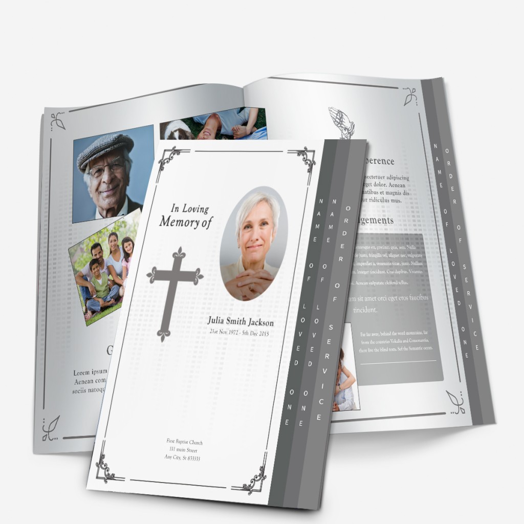
3. 4-Page Graduated Template (Layered Tab Style)
The graduated program is one of the most visually striking formats available — and it’s also the most popular layout on FuneralPamphlets.com.
It’s built from two sheets printed double-sided, folded, and nested together, with the right edge of each inner page offset slightly to form visible tabs. These tabs act as gentle dividers, guiding readers through each section of the service.
Best for:
Full memorial services or celebration-of-life events
Families including detailed tributes, longer readings, or multiple poems
Those wanting a keepsake-quality presentation
Each page can serve a clear role:
Page 1 (Cover): Photo, full name, birth and passing dates
Page 2 (Order of Service): Schedule, songs, and readings
Page 3 (Life Story & Tributes): Short obituary, personal notes, or favorite quotes
Page 4 (Thank-You & Closing): Acknowledgments, special thanks, and optional photo collage
This layered design gives the program a professional, booklet-like feel that stands out beautifully when printed on thicker paper. Because every tab is labeled, guests can easily find specific sections without flipping through pages.
Many families choose graduated templates as keepsakes — their structure feels more permanent, and the elegant layering makes them ideal for framing or archiving.
Pairing Layout with Theme
Each layout can complement a different aesthetic:
Single-Fold: Best with minimalist or floral designs; ideal for small gatherings.
Tri-Fold: Great for detailed religious or military programs with multiple sections.
4-Page Graduated: Works beautifully with scenic, spiritual, or celebration-of-life themes.
The goal isn’t to choose the “fanciest” layout — it’s to choose the one that matches your message and printing setup. Even a simple single-fold design can feel luxurious with quality paper and thoughtful imagery.
Design + Layout = Storytelling
A program’s design expresses emotion, but the layout determines rhythm — how guests move through the story of your loved one’s life. Together, they form a complete narrative: from the cover photo that greets guests to the final thank-you message that sends them home with gratitude.
When chosen thoughtfully, your layout ensures that no detail feels rushed or overlooked.
Customizing and Personalizing the Design
Once you’ve chosen the right layout and theme, the next step is turning the template into something unmistakably personal. Every program on FuneralPamphlets.com is built in Microsoft Word, making customization simple and approachable even for beginners.
The goal isn’t to make it look “perfect.” It’s to make it feel right. A few thoughtful touches — a favorite quote, a meaningful photo, or a small color change — can transform a ready-made template into a one-of-a-kind memorial keepsake.
1. Selecting Fonts That Reflect the Mood
Fonts carry emotion just like images do. The typography you choose should complement your overall theme.
Classic & Traditional: Serif fonts such as Times New Roman, Garamond, or Playfair Display convey dignity and warmth.
Modern & Minimalist: Sans-serif fonts like Calibri or Helvetica Neue create a clean, peaceful tone.
Script Accents: For names or headings, use decorative fonts sparingly — just enough to add softness or grace without sacrificing readability.
When using multiple fonts, limit yourself to two per design: one for headings, one for body text. This keeps the layout cohesive and polished. For additional inspiration, review our Funeral Program Fonts in Microsoft Word guide.
2. Incorporating Color and Imagery
Colors influence emotion, and the right palette can make your program feel more personal.
Warm neutrals (beige, soft gold, ivory) create a sense of comfort.
Cool tones (blue, lavender, gray) evoke calm and reflection.
Avoid overly bright or saturated hues that could distract from the text or photographs. You can adjust background tinting or image brightness directly in Word by selecting “Format Picture” → “Corrections” or “Color Options.”
If you’re using scenic or floral templates, consider aligning the imagery with the person’s favorite season or flower. Small visual cues like this help the program resonate more deeply.
3. Choosing and Editing Photos
The cover photo is the emotional centerpiece of every funeral program. Select an image where your loved one looks peaceful, natural, and expressive of who they truly were.
For older or faded images, basic photo editing or restoration can make a significant difference. If you’d like help preparing pictures for print, visit our Photo Restoration for Funeral Programs page — it explains how to enhance clarity and color while preserving authenticity.
When adding multiple photos, keep spacing consistent. You can insert them into framed boxes or align them along the bottom of a page to maintain balance.
4. Writing the Personal Details
Personalization isn’t only visual — it’s written. Your words carry as much meaning as your images. Include:
Keep paragraphs short and conversational. Avoid overloading a single page with text; white space improves readability and makes each section feel intentional.
5. Paper, Printing, and Finishing Touches
Even the best design can lose impact if printed on thin or glossy paper. For the most professional results:
Use 28–32 lb. matte paper for home printers.
Choose premium text or card stock if printing at a local shop.
Set print mode to “High Quality” or “Best” for crisp images.
Always print a single test page before producing multiples.
For 4-page graduated templates, select “flip on short edge” when printing double-sided. This ensures each page aligns perfectly when folded.
After printing, fold carefully along the center line, using a ruler edge for sharp creases. Some families add a satin ribbon or paper band for a gentle finishing touch.
6. Turning the Program into a Keepsake
When the service ends, the program becomes something much more — a memento that preserves memories for years to come. To make it last:
Store extra copies in clear sleeves or shadow boxes.
Scan a digital version for sharing with family members abroad.
Add a small handwritten note inside for children or grandchildren.
Because all of our Microsoft Word templates are fully editable, you can later adapt them for anniversaries or memorial gatherings. These designs are truly multipurpose, suitable for both immediate use and long-term remembrance.
Final Thoughts
The best funeral program design doesn’t try to impress; it comforts. It reflects love, gratitude, and the unique light of the person it represents.
By selecting the right style, layout, and personal details, you create something timeless — a printed expression of memory and meaning.
1. What are the most popular funeral program styles? Floral, religious, military, minimalist, and scenic designs are the most common styles for funeral and memorial programs.
2. How do I choose the right funeral program theme? Choose a design that matches your loved one’s personality, faith, and tone of service — peaceful, patriotic, spiritual, or joyful.
3. Can I personalize these templates? Yes. All templates on FuneralPamphlets.com are fully editable in Microsoft Word, allowing you to add photos, colors, and custom text.
4. What’s the difference between layout and style? Style refers to the visual theme (like floral or religious), while layout determines how content is arranged — single-fold, tri-fold, or graduated.
5. What layout works best for longer programs? The 4-page graduated template is ideal for full services and tributes, offering extra space and elegant layered tabs.
6. What kind of paper should I use? For best results, use matte or premium text-weight paper (28–32 lb.) to prevent glare and enhance photo clarity.
7. Can I print a funeral program at home? Yes. Use the “flip on short edge” setting for double-sided printing and test one copy before mass printing.
8. How can I include multiple photos? Insert images evenly spaced or aligned at the bottom of the page for balance. Our templates include ready-to-use photo frames.
9. Are these templates suitable for celebrations of life? Absolutely. Each design is multipurpose and can be used for funerals, celebrations of life, or memorial keepsakes.
10. Can I reuse a template for anniversaries or remembrances? Yes. Every file is editable and reusable for future events or memorial updates.
How to Create a Memorial Program After the Funeral
Why Families Create a Memorial Program Later
Many families find that after the funeral, they want to create something lasting—something that tells the full story of their loved one’s life. A memorial program serves that purpose beautifully. It can be shared at a later remembrance service, mailed to distant relatives, or kept as a printed tribute for the home.
Unlike a funeral program, which focuses on the order of service, a memorial program is more flexible. It can be printed days or even weeks later and include favorite photos, personal stories, or details that weren’t ready before the funeral. It’s a chance to honor the person’s memory without the time pressure that often accompanies funeral planning.
💡 A memorial program doesn’t have to follow a specific religious or formal format. Families often choose a warmer, reflective tone that celebrates moments of joy rather than focusing solely on loss.
Creating one is also healing—it allows you to process memories, gather thoughts, and share them with others in a more relaxed way.
How Memorial Programs Differ from Funeral Programs
A funeral program typically includes the schedule for the service—readings, hymns, prayers, and names of pallbearers. A memorial program, on the other hand, often focuses on remembrance rather than ceremony.
Here are a few key differences:
Element
Funeral Program
Memorial Program
Timing
Distributed at the funeral service
Created and shared after the funeral
Tone
Formal or faith-based
Reflective, celebratory, or casual
Content
Order of service, clergy names, hymns
Life story, poems, quotes, and photos
Purpose
Guides guests through the ceremony
Serves as a keepsake and tribute
Some families hold a second memorial gathering, while others simply mail the printed program to loved ones or include it with thank-you notes. Either way, the result is a tangible reminder of the person’s legacy.
What to Include in a Memorial Program
You can include nearly anything that captures the person’s essence. Common sections are:
Front Cover: Full name, dates, and a favorite photo or title line such as “In Loving Memory of” or “Celebrating the Life of.”
Life Story or Biography: A short summary of milestones, hobbies, and relationships.
Favorite Quotes or Poems: Uplifting or reflective lines that express who they were.
Photo Collage: 3–6 images showing different stages of life or family moments.
Acknowledgments: A short message of thanks to friends, guests, or charitable organizations.
You can find inspiration for the writing portion in our Funeral Program Wording Examples, which also work beautifully for memorials.
🕊️ Confirm with the officiant or event host before printing if you plan to include readings, dedications, or quotes shared during a memorial gathering.
Choosing a Design That Fits the Tone
When it comes to design, memorial programs allow greater creativity. Instead of somber tones, families often use brighter themes—flowers, landscapes, or nature scenes—to reflect the person’s life and personality.
If your loved one enjoyed the outdoors, a nature or waterscape design adds calm and serenity. For someone spiritual, a cross, angel, or light-themed design may feel right. Minimalist or photo-centered templates suit modern or casual remembrance events.
Our Funeral Program Layouts Guide explains the most common formats—single-fold, tri-fold, and graduated—and how to choose one based on your content length.
💡 All templates on FuneralPamphlets.com can be used for either funeral or memorial services. Each Microsoft Word design is fully editable—you can adjust wording, colors, and photos to reflect the tone of your event.
Bringing Comfort Through Design
Creating a memorial program isn’t about perfection—it’s about reflection. The most meaningful programs often come from a simple layout, a well-chosen photo, and a few heartfelt lines.
Take your time, revisit your favorite memories, and build something that feels true to who they were. It’s okay if it’s different from the funeral program—this is your opportunity to focus on remembrance rather than ceremony.
Using Photos to Tell a Story
The heart of a memorial program often lies in its photos. Each image captures a piece of your loved one’s life—moments of laughter, milestones, and the people who mattered most. When arranged thoughtfully, these photos transform a printed handout into a visual story of love and memory.
1. Start with One Central Portrait
Choose a single image to serve as the program’s main focal point. This is typically a smiling portrait that feels natural and familiar. Avoid harsh lighting or heavy shadows, and make sure the person’s face fills most of the frame.
If you don’t have a recent photo, a clear older one works just as well—especially if it represents how family and friends remember them best.
💡 You can easily replace the cover image in any Microsoft Word template by clicking on the existing photo and selecting “Change Picture.”
2. Build a Small Photo Collage Inside
Inside the memorial program, use 3–5 supporting photos to highlight different parts of their life. These can include childhood memories, hobbies, family moments, or travel photos.
If you have more images than you can fit, choose a few favorites that tell the story without overwhelming the layout. Keep spacing even and maintain consistent image sizes for a clean, balanced look.
Tip: Consider arranging photos chronologically—from early years to recent times—so readers naturally follow the story of their life.
3. Enhance Clarity and Color
If a photo looks faded or slightly blurry, gentle editing can make a big difference. Increase brightness and contrast just enough to restore clarity, and crop carefully to maintain focus on the subject. Avoid filters that alter colors unnaturally.
When scanning printed photos, aim for 300 DPI or higher. For guidance, see our Funeral Program Photo Quality Guide for step-by-step scanning and editing tips.
Adding Words That Bring Meaning
After selecting photos, pair them with brief, heartfelt text. These written sections connect the images and create flow from one page to the next.
Include a Short Biography
This doesn’t need to read like an obituary. Focus on warm details that remind people who they were—where they grew up, what they enjoyed, who they loved, and what values they stood for.
Example opening line:
“Mary’s laughter filled every room she entered. She loved music, fresh flowers, and long talks on the porch with friends.”
If you’d like more examples or tone options, our Funeral Program Wording Examples can help you adapt phrasing to fit a memorial’s reflective style.
Add a Quote or Poem
Many families choose to include a short quote or scripture that reflects peace, faith, or gratitude. Even a single line can carry great emotional weight.
Consider these options:
“Those we love don’t go away; they walk beside us every day.”
“Forever loved, forever remembered.”
A line from a favorite song or book.
If including scripture, keep it short and confirm with the family or officiant that it aligns with the tone of the service.
Write a Note of Thanks
Since memorial programs are often shared after the funeral, it’s thoughtful to include a small acknowledgment section thanking guests for their support.
Example:
“The family of James wishes to thank you for your love, kindness, and continued support during this time of remembrance.”
You may also include a note about preferred charities or organizations for memorial donations.
Printing Options and Timing
One advantage of creating a memorial program after the funeral is flexibility. You’re not racing against time—you can focus on presentation and print quality.
Home Printing vs. Local Print Shops
If you own a good-quality color printer, you can print at home using 28 lb. matte or satin paper. For thicker card stock or bulk quantities, local print shops often offer same-day turnaround.
Before ordering, print one proof copy and check:
Color balance (does it match your screen?)
Spacing between text and photos
Fold alignment, if using a bi-fold or tri-fold design
You can also save a digital version as a PDF to share with friends or family online.
For fast turnaround or inspiration, browse our Same Day Funeral Program collection—each template can be edited and printed in minutes using Microsoft Word.
Personalizing Your Template
Every family’s story is different. That’s why all templates on FuneralPamphlets.com are fully editable. You can replace photos, rewrite text, adjust fonts, or even change background colors to match the tone of your memorial.
For example:
Replace “Funeral Service” with “Celebration of Life” or “Memorial Gathering.”
Add new event details, such as the date and location of the remembrance.
Include a QR code linking to an online photo album or tribute video.
💡 Even if the template is labeled “funeral,” it can easily be adapted for a memorial or celebration of life—just adjust the text to reflect your event’s tone.
Common Mistakes to Avoid Even with heartfelt intent, small design or content errors can affect how your finished memorial program looks and reads. Taking a few extra minutes to proof and format carefully ensures your final piece honors your loved one beautifully. Below are the most common mistakes families make—and how to fix them before printing.
1. Using Funeral-Specific Language A memorial program is typically more reflective than ceremonial. Phrases like “order of service,” “pallbearers,” or “officiating clergy” may not fit a post-funeral event. ✅ Fix: Replace formal language with softer headings such as “In Loving Memory,” “A Celebration of Life,” or “Sharing Memories.” If you’re reusing a funeral template, simply edit the text fields—our Word templates make this easy.
2. Forgetting Updated Dates or Event Details Many families reuse an existing funeral program file but forget to update the event date, location, or photo captions. These small oversights can lead to confusion or require costly reprints. ✅ Fix: Review every text box—especially the cover page and acknowledgment section—before printing or sharing digitally.
3. Overcrowding the Layout It’s tempting to include every photo and every poem, but too much information can overwhelm the design. Crammed pages reduce readability and make key images less impactful. ✅ Fix: Use white space strategically. Limit the number of photos per page and focus on 2–3 strong visuals. If you have more memories to share, create a second page or digital slideshow instead.
4. Printing Without a Proof Copy Skipping the proof stage is one of the most common and costly mistakes. Colors may print darker, margins can shift, or folds might cut into text boxes. ✅ Fix: Print one copy first. Fold it, hold it under natural light, and double-check: Are all margins even? Is the main photo centered? Are names, dates, and headings correct? If you spot an issue, fix it in Word and reprint the proof before running the final batch.
5. Choosing the Wrong Paper or Finish Glossy paper can cause glare, especially under indoor lighting, and fingerprints show easily. Lightweight paper feels less professional and can wrinkle. ✅ Fix: Choose matte or satin paper (28–32 lb.) for a polished, soft-touch finish. If printing at home, use the “best quality” print setting and feed pages one at a time to prevent smudging.
6. Using Low-Resolution Photos Photos taken from text messages or social media often print blurry or pixelated. ✅ Fix: Always use the original digital file, or scan printed photos at 300 DPI or higher. Refer to our Funeral Program Photo Quality Guide for help restoring older images.
7. Inconsistent Fonts and Alignment Mixing too many fonts or alignment styles (centered, left, justified) makes a layout look uneven. ✅ Fix: Choose one readable serif font for body text and a simple sans-serif font for headings. Keep all headings the same size and style. Align text consistently across all pages.
8. Forgetting to Confirm Quotes and Readings If you include poems, lyrics, or scriptures, confirm accuracy and permissions where needed. Misquoting or omitting attribution can feel careless. ✅ Fix: Double-check all text for spelling, attribution, and punctuation. If using religious verses, confirm appropriateness with the officiant or host.
Final Touches for a Meaningful Presentation Once you’ve edited and proofed your program, consider how it will be presented. A few thoughtful details elevate the experience for guests and family alike: Print a few extra copies for close relatives who may want keepsakes. Slip programs into protective sleeves or envelopes to keep them neat during transport. Save the digital file as both a Word (.docx) and PDF version for easy reprinting later. Add a personal touch—a hand-signed message, small ribbon, or printed bookmark—if time allows. If you want professional polish, your local print shop can often trim and fold programs for a minimal cost. Bring your test copy for reference.
Turning Reflection Into Remembrance Creating a memorial program after the funeral isn’t just about layout—it’s about connection. It allows friends and family to slow down, remember, and share stories that might have been too difficult to tell earlier. Whether you choose a classic folded layout or a modern photo-centered design, each page becomes part of your loved one’s legacy. For ideas and ready-to-edit templates that can be used for funeral, memorial, or celebration of life services, visit the FuneralPamphlets.com homepage. Every Microsoft Word design can be personalized quickly—so you can focus less on formatting and more on honoring the life being remembered.
Closing Thought “A memorial program is more than paper—it’s a reflection of love, gratitude, and every memory that remains.” Take your time creating it. When it’s finished, you’ll have something that speaks not just for one day, but for a lifetime.
FAQ
Q1. Can I create a memorial program weeks after the funeral? Yes. Many families design a memorial program later to share memories with those who couldn’t attend and to create a lasting keepsake.
Q2. What’s the difference between a memorial program and a funeral program? Funeral programs guide a service; memorial programs focus on remembrance—photos, life story, quotes—and can be shared anytime after.
Q3. What should I include in a memorial program? A cover photo and dates, a brief life story, a few favorite photos, a quote or poem, and a short acknowledgment or donations note.
Q4. How many photos should I use? Choose one main portrait plus 3–5 supporting images. Leave white space so the layout stays readable and elegant.
Q5. Can I repurpose a funeral program template for a memorial? Yes. Simply update headings, dates, and sections. Most templates are fully editable and work for memorials or celebrations of life.
Q6. What paper and finish look best? Matte or satin cardstock (28–32 lb) reduces glare and prints text clearly, giving a refined, keepsake feel.
Q7. Should I print at home or use a local print shop? Either works. Print one proof first; use a shop for heavier paper, trimming, and bulk quantities.
Q8. Can I also share a digital version? Yes. Save a PDF to email or post on a memorial page so distant friends and family can view and download.
How to Choose the Right Photo for a Funeral Program (and Mistakes to Avoid)
Why the Photo Matters in a Funeral Program
A single photo can set the entire tone of a funeral program. It’s often the first thing guests notice and the image that family members hold onto afterward. The chosen picture represents not just what your loved one looked like, but who they were — their warmth, their spirit, their presence.
Whether you’re creating a folded handout, a tri-fold brochure, or a multi-page memorial, the photo anchors every design decision. A bright, centered portrait can make a minimalist layout feel warm and inviting, while a softly lit candid shot adds intimacy to a nature-themed background.
Because this image becomes part of a printed keepsake, it’s worth spending a few extra minutes choosing the right one. Below are the most important considerations for photo selection and how to avoid common mistakes that can diminish the final result.
Choosing the Right Photo
1. Start with clarity and lighting
The photo should be clear, evenly lit, and free from heavy shadows or glare. Indoor photos with natural light or outdoor portraits taken on cloudy days tend to reproduce best when printed. Avoid snapshots that look overly bright or have harsh flash highlights — these can make faces appear washed out once transferred to paper.
If possible, use the original photo file instead of a screenshot or social media download. Images pulled from Facebook or text messages are often compressed and lose sharpness during printing.
💡 Tip: If you only have an older printed photograph, scan it at a minimum of 300 DPI so it retains enough quality for print.
2. Choose a background that supports, not distracts
Busy backgrounds — like patterned walls, crowds, or bright signs — can draw attention away from the person being remembered. Neutral or softly blurred backgrounds keep focus on the subject’s face and expression.
For templates that include a full-cover photo or large portrait section, look for pictures with balanced space around the person’s head and shoulders. Cropping too tightly can make text overlays difficult to position later.
If your image’s background is distracting but meaningful (for example, a beach where your loved one often spent time), lightly fade or soften it instead of removing it entirely.
3. Dress and posture matter more than you think
Formal photos such as wedding portraits or professional headshots may work well for traditional programs, while relaxed, candid images often fit modern or celebration-of-life layouts.
Before you decide, consider the tone of the service:
Formal or religious: a portrait in dress clothes or uniform feels appropriate.
Celebration of life: a smiling outdoor photo or casual pose can convey warmth and personality.
Youth or child memorial: photos showing natural expressions or favorite activities feel most authentic.
Ultimately, the best photo is one that captures the person as loved ones remember them — not necessarily their most “perfect” picture.
4. Match the image with your program design
Your choice of template should complement the photo rather than compete with it. For example:
A nature-themed layout pairs beautifully with outdoor portraits.
A floral background softens formal attire or vintage photos.
A minimalist or light-colored design enhances high-contrast black-and-white images.
If you’re still choosing a layout, browse examples in our Funeral Program Layouts Guide to see how different styles emphasize portraits. Matching tone and imagery early will save time and prevent reformatting later.
5. Use color intentionally
Color photos feel familiar and vibrant, but black-and-white images can evoke timelessness and focus emotion on expression.
If your photo has inconsistent tones — for instance, strong yellow lighting or mixed color balance — try converting it to black-and-white instead of over-editing. It’s often easier to achieve a clean, even look this way.
You can also use color harmony between the photo and background: a soft blue sky or light tan sand can subtly echo the color of a pastel background or frame.
Confirm the Emotional Fit
Before finalizing, print a small proof or show the photo to close family members. Ask, “Does this feel like them?” Sometimes, a technically perfect picture doesn’t carry the warmth or familiarity people expect.
Choosing a photo that makes people smile through their tears is far more important than choosing one with flawless lighting.
Editing and Cropping Tips for a Perfect Fit
Even a great photo can look off if it’s cropped too tightly, stretched, or poorly positioned in the template. Proper editing ensures your loved one’s image looks natural and polished on both screen and paper.
1. Maintain the Original Proportions
Never drag the photo’s corners unevenly in Microsoft Word to make it “fit.” This distorts the face and body, especially when printing. Instead, use the “Lock Aspect Ratio” option in Word’s image formatting tools. Resize proportionally until it sits comfortably within the image box.
If you’re filling a rectangular placeholder with a square image (or vice versa), crop gently — keeping at least the person’s shoulders and upper chest visible. This framing feels balanced and professional.
2. Center the Subject’s Eyes
The most natural placement is with the eyes roughly one-third of the way down from the top of the frame. This composition rule, called the “rule of thirds,” draws focus immediately to the face.
When you import your photo into a Word template, check that the image doesn’t sit too low or high within its placeholder. Slight adjustments of just a few pixels can make a noticeable difference.
3. Use Light Editing, Not Filters
Soft retouching — like gently brightening, adjusting contrast, or removing small dust marks — is fine. However, avoid heavy filters or strong color effects. Oversaturated edits can make skin tones appear unnatural or clash with the program’s overall color scheme.
💡 Tip: When editing, view the photo at 100% zoom (actual size). This helps you see how details and sharpness will appear on the printed page.
4. Keep File Sizes Practical
High-resolution images are great, but files that are too large (5–10 MB or more) can slow down printing or cause formatting errors in Word. If your photo exceeds 3000 pixels wide, resize it to around 2000–2500 pixels before inserting.
This balance keeps clarity high without bloating the document.
5. Use Non-Destructive Editing
Always save a copy of the original photo before making changes. This ensures that if you crop too tightly or over-edit, you can easily start again.
If you’re working in Word, you can also insert the same image twice — one cropped for the cover and another full version for an inside memory page or collage.
Common Mistakes to Avoid
Even with the best intentions, it’s easy to make choices that lead to disappointing print results. Here are the most frequent issues and how to prevent them.
1. Using Low-Resolution Photos
Photos saved from text messages or social media often appear crisp on screen but pixelated in print. If you see jagged edges or fuzziness when zooming in, the resolution is too low.
✅ Fix: Always use the original digital photo or a 300 DPI scan of a printed one.
2. Over-Cropping
Cutting too close to the face removes natural breathing room in the design and makes text placement harder. Give the portrait space so it feels calm and centered.
✅ Fix: Leave some background visible — even if it’s later softened — for balance.
3. Overusing Filters or Effects
Trendy filters can distort tone and feel out of place in printed memorials. What looks stylish on a phone may print harshly or unevenly.
✅ Fix: Stick with minor color correction and basic contrast adjustments.
4. Choosing a Distracting Background
Bright walls, multiple people, or clutter behind the subject draw the eye away from what matters most.
✅ Fix: Select photos with simple, non-competing backgrounds. If unavoidable, gently blur or vignette the edges before inserting into the program.
5. Mixing Lighting Styles
When using multiple photos (for example, one on the cover and one inside), try to choose images with similar lighting — both natural, both indoor, or both softly lit. Mismatched tones can make the layout feel uneven.
✅ Fix: Adjust brightness and color temperature to maintain visual consistency.
When to Get Professional Help
If the only available photo is faded, torn, or low-quality, professional restoration can make a dramatic difference. Even subtle fixes — removing creases, balancing color, or sharpening edges — can turn an old photograph into a clear, print-ready keepsake.
Before printing multiple copies, do a single test print on the same paper you’ll use for the final programs. This helps you see how colors translate from screen to print — monitors often show images brighter than printers do.
If the photo looks dull, slightly increase brightness and contrast by about 5–10%. Small changes often bring printed photos back to life.
Printing and Proofing Checklist
Once you’ve chosen and edited your photo, the final step is making sure it prints beautifully. Even a perfect layout can lose impact if colors, brightness, or paper stock don’t translate well in print. Below is a simple checklist to help you produce a polished, professional result.
1. Use the Right Paper Finish
Matte or satin finishes work best for funeral programs because they reduce glare and make text easier to read. Glossy paper can cause unwanted reflections under lighting and may emphasize fingerprints.
If your template includes full-page photos or color backgrounds, consider a heavier-weight paper (28 lb. or thicker). It prevents ink from showing through and gives the program a quality feel.
2. Always Print a Single Proof Copy First
Before running a full batch, print one copy and inspect it closely. Look for:
Is the photo centered and proportionate?
Are the colors accurate and skin tones natural?
Does text near the image appear crisp and readable?
Sometimes what looks perfect on screen appears darker in print. If so, lightly increase brightness and contrast before finalizing.
3. Review Alignment Across Panels
If your program is folded, confirm that images and text align correctly after folding. Misalignment often happens when margins are adjusted late in editing.
💡 Tip: Fold your test print gently by hand before printing in bulk. This quick step prevents the “half-face” effect where the crease cuts across the subject’s image.
4. Save Both the Editable and Print-Ready Versions
Keep your Microsoft Word file (.docx) for future edits and export a clean PDF copy for printing. The PDF version locks formatting, ensuring that nothing shifts when opened on another device or at a print shop.
Create two clearly named versions, such as:
funeral-program-editable.docx
funeral-program-final.pdf
This way, if someone in the family later finds a better photo or wants to add a poem, you can make quick adjustments without starting over.
When to Consider Photo Restoration
Sometimes the only available picture is old, faded, or slightly damaged. Rather than settling for poor quality, consider having the image restored.
Professional restoration can correct discoloration, remove small tears or creases, and enhance details without changing the person’s natural appearance. Even smartphone tools can handle light fixes like:
Adjusting faded colors
Removing red-eye
Cropping out borders from scanned photos
For deeper damage, refer to our detailed guide on Photo Restoration for Funeral Programs, which explains how to prepare your image for digital editing and what to expect from a restoration service.
Matching the Photo to the Overall Layout
Once your image is finalized, make sure it complements the rest of your program design. Here are a few ways to bring visual harmony:
1. Balance Photo Size with Text Density
If the front cover photo is large and full-color, keep interior pages lighter — a small image paired with quotes or readings creates contrast and elegance.
2. Use Borders or Frames When Needed
Adding a soft border or thin frame can help the photo blend smoothly with the background. Choose neutral tones like beige, light gray, or off-white that don’t overpower the image.
3. Repeat Color Elements
Pull one color from the photo — such as a shirt or flower hue — and echo it in the text headings or divider lines. This subtle repetition makes the entire layout feel cohesive.
4. Keep Spacing Consistent
Align photos, text boxes, and headings evenly throughout the program. Consistency builds professionalism and helps the eye move comfortably across the page.
Emotional Considerations
Beyond design, the photo carries emotional weight. It can bring comfort to grieving guests and serve as a centerpiece for remembrance long after the service ends.
Take time to confirm the choice with close family members. Sometimes, one person’s favorite candid may not resonate with others. A short conversation now prevents uncertainty later.
“Does this feel like them?” is often the only question that matters.
This emotional alignment ensures that every printed copy becomes a heartfelt keepsake — not just a document, but a tangible memory of love and presence.
Bringing It All Together
Choosing and preparing a photo for a funeral program blends practical and personal decisions. The right image reflects the spirit of the person you’re honoring, while thoughtful design and printing preserve that memory beautifully.
If you’re still deciding how to structure your layout or where to place the photo, explore examples and ready-made templates on the FuneralPamphlets.com homepage. You’ll find designs specifically crafted to highlight portraits — from minimalist modern styles to floral and faith-inspired themes.
Each template is fully editable in Microsoft Word, helping you create a polished program quickly without design experience. With a few clicks, you can adjust images, colors, and text while keeping professional balance across every page.
Final Thought: A well-chosen photo tells a life story in a single glance. When paired with the right design and attention to detail, it becomes more than an image — it becomes a reflection of love that endures.
Frequently Asked Questions
Q1. What kind of photo works best for a funeral program? A clear, well-lit portrait with a simple background prints best and keeps the focus on your loved one’s expression.
Q2. Should I use color or black-and-white? Both are appropriate. Choose color for familiarity; use black-and-white if lighting or color balance is uneven.
Q3. What resolution do I need for print? Aim for ~300 PPI at the final print size. Avoid screenshots or social media downloads, which are often too compressed.
Q4. Can I use an old printed photo? Yes. Scan at 300 DPI or higher. Lightly adjust brightness/contrast, and consider gentle restoration for scratches or fading.
Q5. How should I crop the photo? Keep shoulders and head visible, and center the eyes about one-third from the top. Avoid stretching or distorting proportions.
Q6. What if the background is busy? Use a photo with a cleaner background or soften the background slightly so text and the face remain readable.
Q7. How do I ensure the photo prints correctly? Print a single proof on your chosen paper. If it looks dark, increase brightness/contrast slightly and recheck alignment.
Q8. When should I consider professional restoration? If the only available photo is torn, discolored, or very soft, restoration can recover detail while keeping a natural look.
Funeral Program Timeline: How Long It Takes and What to Prepare
Understanding the Funeral Program Process
Creating a funeral program is one of the most meaningful tasks in preparing a service. It brings together the details of a loved one’s life—the dates, memories, and order of the ceremony—into something family and friends can hold onto long after the day ends.
Most families start their funeral program once the service arrangements and obituary are confirmed. This usually happens within one to three days after meeting with the funeral home or officiant. Because time can move quickly, knowing what to expect helps you stay organized and avoid last-minute stress.
If you’re planning a traditional or religious service, it’s always best to confirm the order of service before finalizing your layout or printing. Each faith and officiant may follow a slightly different sequence of readings or hymns. For reference, see our detailed Funeral Program Order of Service Guide.
Typical Timeline from Start to Print
Every family’s schedule is different, but here’s a general outline of how long it usually takes to create a complete, print-ready funeral program.
Day 1 – Gather Key Details
Begin by collecting the essentials:
Full name of the deceased, birth and passing dates
Location, date, and time of the service
Officiant’s name and participants (readers, singers, pallbearers)
Obituary or brief life summary
Favorite poems, prayers, or quotes
High-resolution photos
Having everything in one folder or email thread makes the next day’s design step much smoother. Families often spend the first evening simply locating and scanning photos. If any need cleanup or color correction, allow extra time for photo editing or restoration.
Day 2 – Design and Review
Once you have the text and images ready, you can start laying out the program in Microsoft Word or another editing platform. This part typically takes 2–4 hours if you’re creating a layout manually, and much less if you’re using a pre-formatted template.
During this stage:
Insert the obituary and order of service in readable font sizes (11–12 pt)
Keep text blocks consistent across columns or folds
Proofread names carefully—spelling errors are the most common issue
Print a single proof on regular paper before using card stock
If other family members are involved, schedule a brief review together to approve the final text and placement. A single round of feedback prevents repeated edits later.
Day 3 – Printing and Assembly
Printing can take anywhere from one to several hours depending on the method you choose:
Home printer: fastest if you already have ink, paper, and access to a double-sided printer.
Local print shop: allow at least a few hours for proof approval and production.
Online printer: often 1–2 business days plus shipping—less ideal for same-week services.
Be sure to confirm paper type, quantity, and folding preference before printing. For more detailed information on paper weights, finishes, and sizing, visit our Funeral Program Sizes, Paper, and Printing Guide.
When You’re on a Tight Schedule
Families working within 24 hours often turn to ready-made Microsoft Word templates. These pre-aligned files eliminate the need for complex formatting or margin adjustments. You can simply drop in your text and photos, preview on screen, and print at home or through a local shop.
How Long It Takes with Pre-Designed Templates
If you’re short on time, using a pre-designed Microsoft Word template can save several hours while maintaining a polished, professional look. Families who start from scratch often spend most of their time aligning text boxes, resizing photos, and correcting folds that don’t print evenly. A pre-formatted template handles those details for you, so you can focus on the content rather than the layout.
Average time comparison:
Task
Creating from Scratch
Using a Pre-Designed Template
Formatting layout & folds
2–3 hours
Already done
Choosing fonts & colors
30–60 minutes
Coordinated by design
Inserting photos & resizing
1–2 hours
15–30 minutes
Proofing & print setup
1 hour
20–30 minutes
Total estimated time
4–6 hours
30–60 minutes
Templates are ideal for families handling arrangements on their own. Each file already includes consistent margins, photo placeholders, and text boxes that align properly for single-fold, tri-fold, or graduated designs.
Even with a pre-formatted template, preparation makes all the difference. Gather your materials before you open Word, so the process feels smooth and uninterrupted. Here’s a concise checklist:
1. Personal Details
Include the person’s full name, birth and passing dates, and a recent photo. If you’re unsure about photo quality, use our Photo Quality Guide to ensure clear printing.
2. Order of Service
Confirm the sequence with the officiant before finalizing it. This might include a welcome, prayers, readings, eulogy, and closing remarks.
3. Obituary or Life Summary
Write or copy the text into Word before importing it. Having it ready avoids formatting errors later.
4. Acknowledgements and Thank-Yous
Many families add a short thank-you note at the end—either to attendees, caregivers, or clergy. Keep it brief and heartfelt.
Once all of these elements are ready, open your chosen file from the Funeral Program Templates Shop and paste in the text. You can replace placeholder photos by right-clicking the image frame and selecting “Change Picture.”
Time-Saving Tips for a Smooth Process
Proof before printing: Print one draft copy on plain paper to check folds, alignment, and margins.
Check printer settings: Always choose “actual size” or 100% scaling so Word’s layout matches the printed page.
Use high-quality paper: Matte or light-gloss cardstock gives a refined finish and prevents ink smudging.
Save two versions: Keep one editable Word file and one exported PDF for professional printers.
Families who follow this method often complete their program in under one hour, including proofreading. The design stays balanced, and the print outcome looks clean and centered—no need to troubleshoot formatting or spacing at the last minute.
When You’re Working Against the Clock
Even if you receive a late request for printed programs, it’s still possible to produce elegant copies in time for the service. Choose a single-fold or two-page design to minimize printing time, and print extras so each guest has a keepsake.
In the next section, we’ll cover last-minute proofreading and print strategies—what to double-check before you hit “Print” and how to manage urgent reprints if you’re short on copies.
Last-Minute Tips for Tight Deadlines
Even when time is limited, a few careful checks before printing can make your program look clean and professional. Families often underestimate how small errors—like name typos or cut-off lines—can appear more noticeable once printed. These final steps take only a few minutes but prevent hours of reprinting and frustration later.
1. Print a Proof on Regular Paper First
Before loading your cardstock or photo paper, print one copy on standard paper to confirm:
Fold alignment falls directly in the center (not on text)
Page margins appear balanced on both sides
All text boxes and photos stay within printable areas
Hold your draft under good light and fold it as if it were the final version. If you see text too close to an edge, shift it inward by ⅛ inch.
2. Double-Check Names and Dates
Review the spelling of every name, especially middle names, pallbearers, and clergy. Many families catch minor errors only after multiple prints. Ask another family member to proofread as well—fresh eyes often catch what you may miss.
3. Inspect Photo Quality One Last Time
Photos may look crisp on screen but can appear darker once printed. Brighten slightly before printing or test one image on your chosen paper type. For best results, use photos around 300 PPI (pixels per inch) at their printed size.
4. Prepare Backup Copies
Always print 10–15% more programs than your expected attendance. Some guests keep multiple copies as keepsakes, and extras help cover unexpected visitors.
Managing Reprints and Urgent Fixes
If you spot an error after printing, don’t panic. Minor text changes—such as names or titles—can often be corrected and reprinted within minutes.
Tips for fast reprints:
Keep your template saved as a Word file rather than a PDF so you can edit instantly.
Label your final draft clearly (for example, “FinalPrint_Approved.docx”) to avoid mixing versions.
If a professional printer handled the job, call immediately; most shops can reprint within an hour if paper stock is available.
For home printing, test a few copies first to make sure the ink isn’t running low. Even a small shift in color or streaking can affect the overall look of a folded design.
Helpful Extras to Include If You Have Time
If your timeline allows an extra hour or two, small touches can make the program more meaningful:
Front cover tribute line: Add a phrase such as “Forever in Our Hearts” or “Celebrating a Life Well Lived.”
Back cover quote: Include a favorite poem, lyric, or brief thank-you note.
Keepsake version: Print a few copies on premium matte stock for close family members.
Every additional detail adds warmth, but don’t feel pressured to perfect everything before the service. The most important part is that your program reflects love and care, not design complexity.
Confirm Final Details with the Officiant
Before sending the file for print, review one final time with your officiant or coordinator. Confirm that the sequence of readings, songs, and acknowledgements matches the actual service. A short confirmation now prevents confusion later—especially if changes were made to readings or speakers.
If you’re still editing while funeral home deadlines approach, choose a simpler fold or fewer pages to stay on schedule. The clarity of your design matters far more than decorative extras.
Closing Thoughts
Preparing a funeral program within a few days can feel overwhelming, but it doesn’t have to be. With a little planning and the right tools, you can create something beautiful that honors your loved one and arrives on time for the service.
Whether you’re working ahead or handling last-minute details, our Funeral Program Templates Shop offers ready-to-edit Microsoft Word designs sized perfectly for home or print-shop use. Each template includes text placeholders, photo areas, and professional layouts so you can focus on what matters most—remembering your loved one with dignity and grace.
FAQ
Q1. How long does it take to make a funeral program? Most programs can be created within one to three days, depending on how quickly you gather photos, wording, and service details.
Q2. Can I make a funeral program in one day? Yes. Using a ready-made Microsoft Word template allows you to design, proof, and print your program within a few hours.
Q3. What do I need before I start creating the program? You’ll need the obituary, service details, names of participants, and at least one clear photo of your loved one.
Q4. When should I start working on the funeral program? Begin as soon as service arrangements are confirmed, ideally within 24–48 hours of scheduling the funeral.
Q5. How many funeral programs should I print? Print one per guest plus 10–15% extra for keepsakes or unexpected attendees.
Q6. Should I use a professional printer or print at home? Either option works. Home printing offers speed and control, while local print shops provide heavier paper and color accuracy.
Q7. What’s the fastest way to make a funeral program? Choose a pre-formatted Microsoft Word template—everything is already aligned for folds, margins, and image placement.
Q8. What paper is best for printing funeral programs? Matte or light-gloss cardstock works best; it prevents smudging and looks professional for both black-and-white and color prints.
Funeral Program Cover Ideas: Photos, Layouts, and Design Tips
Why the Cover Matters
The cover of a funeral program is the first thing guests see when they arrive at the service. It sets the tone for the entire ceremony—welcoming loved ones, reflecting the person’s spirit, and offering a comforting introduction to the memorial ahead.
While the inside pages provide details about the service, the cover creates an immediate emotional connection. A well-designed cover invites reflection, communicates love and respect, and becomes a cherished keepsake long after the day has passed.
Whether you’re creating the design yourself or using a pre-made template, taking time to personalize the cover makes all the difference.
Choosing the Right Photo
A single photo can express more than paragraphs of text. The image on the cover should capture the person’s essence—how they’d like to be remembered.
Photo selection tips:
Use a clear, high-resolution image. Avoid screenshots or photos taken from social media, as they may print blurry.
Choose a natural expression. Smiling portraits or relaxed candid shots feel warm and timeless.
Mind the background. Solid or softly blurred backgrounds make text easier to read.
Crop carefully. Focus on the face or upper body, avoiding distractions around the edges.
If the only available photo is old, slightly damaged, or darkened with age, it can still be used. Restoration tools and professionals can revive faded colors, remove scratches, and sharpen details—often within a day.
Once you’ve chosen the photo, it’s time to decide how the overall layout should look. The layout determines how much room you have for text, background imagery, and spacing around the photo.
Common layout options:
Single-fold: Simple and traditional. Best for one portrait photo with minimal text.
Tri-fold: Offers more space for creative backgrounds and decorative panels.
Graduated: Features staggered tabs, ideal for combining a cover photo with small captions or a title line.
The layout you choose should fit the mood of the service—simple for a classic ceremony, modern and colorful for a celebration of life.
Every program cover includes some form of title or headline, and the wording helps set the emotional tone. The most traditional phrase is “In Loving Memory of…”, but there are many variations that may better match your loved one’s personality or the style of the service.
Common cover phrases:
A Celebration of Life
In Loving Memory of
Forever in Our Hearts
Honoring the Life of
Remembering [Name]
Underneath the title, include:
Full name
Birth and passing dates
Optional: location or a short quote
You can also place a small verse, such as “The Lord is my shepherd” or “Your light will forever guide us.”
Typography can completely change the mood of your cover. Serif fonts like Times New Roman or Garamond feel traditional and elegant, while sans-serif fonts like Calibri or Lato give a modern, clean look.
Quick font pairing ideas:
Classic: Times New Roman (headings) + Calibri (body text)
Soft and feminine: Garamond (headings) + Georgia (body)
Contemporary: Lato (headings) + Open Sans (body)
Keep contrast high—dark text on light backgrounds or vice versa—to ensure readability, especially if printing on glossy paper.
Background Themes and Color Palettes
The background is just as important as the main photo—it ties everything together visually and emotionally. The right theme can instantly communicate warmth, peace, or celebration.
Nature-Inspired Backgrounds
Clouds and skies: symbolize peace and eternity.
Water scenes: calm lakes, beaches, or waterfalls convey serenity.
Sunsets: a soft transition from light to dusk, often chosen for spiritual symbolism.
Floral designs: roses, lilies, or cherry blossoms evoke beauty and remembrance.
These themes work beautifully for loved ones who appreciated nature, gardening, or quiet moments outdoors.
Faith-Based Designs
Families who wish to include religious symbolism may choose:
Crosses, doves, or angel silhouettes.
Rays of light or open gates representing heaven.
Subtle scriptural imagery, such as beams of light or hands in prayer.
When adding religious elements, keep the tone gentle and inclusive—always confirm wording and imagery with the officiant if a specific faith tradition is involved.
Personalized and Hobby Themes
For a deeply custom feel, match the background to a defining interest or passion:
Golf fairways or fishing lakes for outdoor enthusiasts.
Musical notes for a singer or instrumentalist.
Books, pens, or art supplies for creatives or teachers.
Military or patriotic designs for veterans.
The key is balance—let the imagery support the story without overwhelming the text or photo.
Choosing Colors with Care
Color sets the mood of the cover at a glance. While traditional programs lean toward soft tones, celebration of life services allow for brighter palettes.
Recommended combinations:
Blue and white: calm, trustworthy, and peaceful.
Soft cream and gold: warm and dignified.
Lavender and gray: gentle and elegant.
Green and beige: natural, grounding tones.
Black and silver: refined and timeless.
Avoid overly bright or saturated colors, as they can make the text difficult to read once printed. If in doubt, print a test copy to evaluate contrast between background and text.
Enhancing Photo Presentation
Once your background and colors are chosen, position the photo to feel centered and natural. Avoid stretching images to fit the page; instead, resize proportionally and add subtle borders or soft fades.
Tips for framing and presentation:
Use circular or oval photo frames for a softer, elegant look.
Add gentle shadowing behind the photo for depth.
If using a busy background, place the photo in a white or semi-transparent box to improve contrast.
Even minor adjustments—like aligning the eyes one-third from the top—make the composition feel balanced.
The type of paper you choose affects how colors and images appear in print. It also changes the tactile experience of the program.
Paper types:
Matte finish: classic, easy to read, reduces glare under bright light.
Glossy finish: enhances color depth, ideal for photo-heavy covers.
Cardstock: durable and professional; often used for folded programs.
If your design includes subtle background textures, matte paper preserves the softness. For vivid images or nature scenes, glossy paper helps the visuals stand out.
Printing at Home vs. Professionally
Home printing: convenient for small batches (up to 50 copies).
Professional printing: recommended for large services; ensures consistent color and precision folding.
Always print a single test copy before running the full set—colors often appear darker on paper than on screen.
Design Harmony Checklist
Before finalizing the cover:
The photo and background complement each other.
Text is readable from arm’s length.
Color contrast is high enough for print.
Borders are even, and elements are centered.
Fonts and tone match the mood of the service.
Next Steps
After completing your design, the next stage is reviewing your text, testing the layout, and printing your final proof. For those who prefer to start from an editable template instead of designing from scratch, ready-made Microsoft Word templates are available and fully customizable.
Where you position the title and name on the cover can change the entire feel of your design. The goal is balance — ensuring that text complements, not competes with, the photo.
Most common placements:
Centered below the photo: The most traditional option, giving the portrait full visual focus.
Overlay on the photo (with faded background): Works well when using a semi-transparent text box or soft gradient.
Top-centered title with name beneath: Clean and elegant, especially for tri-fold designs.
Bottom alignment: Adds a modern touch, often used when the upper area features scenic imagery.
Always check legibility: if the title overlays an image, use subtle drop shadows or light outlines for contrast.
Recommended hierarchy
Large heading (e.g., “In Loving Memory”)
Full name
Dates of birth and passing
Optional: short verse or location line
Keeping a clear hierarchy ensures every reader immediately sees what’s most important.
Font Choices and Pairings
Typography has a quiet emotional influence. The fonts you use can make your design feel traditional, modern, or soft and comforting.
Classic pairings for funeral program covers:
Times New Roman + Calibri: balanced and familiar.
Garamond + Georgia: refined, ideal for formal or religious services.
Lato + Open Sans: minimal and clean for a modern celebration of life.
Playfair Display + Lora: gentle script look without being hard to read.
Avoid overly decorative fonts, especially for body text. If you use a script style (like Great Vibes or Alex Brush), reserve it for the main name line only.
Below are a few layout and design combinations that help visualize how tone and style align:
1. Classic & Timeless
Centered portrait with soft white or cream background.
Serif fonts and minimal color accents.
“In Loving Memory of” as the title.
Works beautifully with floral or cross themes.
2. Modern & Minimalist
Black-and-white portrait with bold sans-serif type.
Clean lines and generous white space.
No decorative borders, just clarity and balance.
Great for professional printing on matte paper.
3. Faith-Based Elegance
Subtle sky or light-ray background.
Script heading like “Homegoing Celebration.”
Cross or dove watermark behind the text.
Perfect for memorials held in church settings.
4. Celebration of Life (Colorful & Warm)
Full-bleed photo of the loved one smiling outdoors.
Accent colors matching favorite hues or hobbies.
Text placed at the top with open background.
Ideal for more uplifting, joy-filled ceremonies.
5. Nature or Hobby Theme
Background image that reflects personal passion: beach, forest, garden, or golf course.
Minimal wording to let imagery take focus.
Matte finish to maintain realism and readability.
Printing Proof and Quality Check
Before sending your file for printing, perform a final visual and text check:
1. Spelling and Dates Double-check names, birthdates, and service times. Typos are easy to miss when emotions run high.
2. Print Alignment Ensure that folds, margins, and edges line up. Preview the document in “Print Layout” mode in Word to catch any misalignment.
3. Color & Brightness Test Print one proof on the exact paper you’ll use. Adjust brightness and contrast if the photo looks too dark once printed.
4. Physical Handling Fold the proof to confirm that no key text or image lands across a crease.
5. Feedback Ask a family member or friend to review the design before running the full set — a second pair of eyes often catches small issues you may have missed.
When to Use Templates
Creating a cover layout from scratch can take hours of formatting and testing. Microsoft Word templates simplify every step — the design structure, spacing, and text boxes are already in place. You can replace sample images and text while keeping the professional formatting intact.
Designing a meaningful funeral program cover involves many small details that can easily be overlooked in the moment. Before you print, walk through this checklist to ensure everything is complete and polished:
High-resolution photo used, properly centered and cropped.
Title and name clearly readable with strong color contrast.
Fonts consistent throughout (no more than two styles).
Margins and folds aligned—nothing important near the edge.
Birth and passing dates double-checked.
Printed proof reviewed for brightness, spacing, and accuracy.
Background and text balanced (neither overpowering the other).
Order of service confirmed with the officiant or coordinator.
Printing one physical proof copy before running a full batch can prevent costly or emotional last-minute corrections.
Printing at Home vs. Professional Printing
Choosing how to print depends on the number of guests, your available time, and the finish you want.
Home Printing
Ideal for small gatherings (under 50 attendees).
Lets you reprint or adjust immediately if needed.
Use quality photo paper or medium-weight matte paper for a professional feel.
Always check ink levels—low ink can dull colors or blur details.
Professional Printing
Recommended for larger services or designs with full-bleed photos.
Print shops can trim, fold, and score pages cleanly.
Consistent color quality and accurate margins.
Choose cardstock or coated paper for a sturdy, elegant keepsake.
If using a local print shop, bring a physical test copy or PDF proof with embedded fonts to ensure alignment and accuracy.
Coordinating the Cover with Inside Pages
The cover should flow naturally into the interior pages, creating a unified memorial piece rather than two separate designs.
Simple coordination tips:
Color consistency: If the cover uses navy blue, carry that accent color through dividers or section headings inside.
Font repetition: Use the same heading font for section titles like “Order of Service” or “Acknowledgements.”
Tone and imagery: If your cover features a garden scene, repeat small floral accents inside instead of switching to new motifs.
Paper type: Use the same stock and finish throughout; mixing glossy and matte can look inconsistent.
This cohesive approach gives the entire program a polished, professional appearance.
For Bilingual or Multicultural Families
When designing covers for bilingual families, balance simplicity and inclusion. Instead of crowding both languages on the same line, consider:
Having English on the front cover and Spanish translation on the back page.
Adding a short bilingual phrase such as “Siempre en nuestros corazones / Forever in our hearts.”
Linking to a longer translation through a QR code printed discreetly near the bottom corner.
This thoughtful detail ensures everyone can participate fully and understand the meaning of the service.
Final Thoughts
A beautiful funeral program cover tells a story before a single word is read. It’s a visual tribute to the person’s life—a reflection of who they were and how they’ll be remembered. By choosing a meaningful photo, harmonious layout, and balanced color palette, you can create something that feels deeply personal and timeless.
Even small touches—like a favorite quote, symbolic image, or soft background—can turn a simple program into a keepsake families treasure. The goal is not perfection, but authenticity: a design that feels true to your loved one’s spirit.
Start with a Template to Save Time
If you’d like a professional foundation that still allows full customization, editable Microsoft Word templates make it easy to begin. Each design includes space for a portrait photo, headings, and personal text—so you can focus on the details that matter most.
Q1. What should go on the cover of a funeral program? The cover usually includes a photo, the person’s full name, birth and passing dates, and a short title such as “In Loving Memory.”
Q2. How do I choose the right photo for a funeral program? Select a clear, high-resolution portrait that feels natural and warm. Avoid screenshots or group photos unless cropped closely.
Q3. What are the best color themes for funeral covers? Soft tones like cream, lavender, blue, or white work well. Choose colors that reflect the person’s style and keep text easy to read.
Q4. Can I use hobbies or personal themes on the cover? Yes. Subtle backgrounds such as gardens, golf courses, or musical notes make the design feel unique without distracting from the text.
Q5. How should I arrange the title and name? Most families center the name below the photo, with a phrase like “In Loving Memory of” or “Celebrating the Life of” above it.
Q6. Which fonts look best on a funeral program cover? Serif fonts like Times New Roman or Garamond give a timeless look. Sans-serif fonts such as Calibri or Lato offer a modern feel.
Q7. What type of paper should I use for printing? Matte paper reduces glare and is easy to read. Glossy paper enhances color but may reflect light; cardstock adds weight and durability.
Q8. Can I design the cover myself in Microsoft Word? Yes. You can easily personalize ready-made Microsoft Word templates that already have spacing and photo areas formatted for you.
Bilingual Funeral Program Wording & Layouts (English–Spanish)
Planning a funeral or memorial service is a deeply personal task. When family members and friends speak different languages, a bilingual funeral program can provide comfort and inclusivity. By presenting details in both English and Spanish, everyone can follow the service, reflect on the readings, and feel connected to the tribute. This guide walks through practical ways to design a clear, respectful bilingual program in Microsoft Word. Always confirm specific service elements with the officiant before finalizing your program.
Decide Your Bilingual Format
Before typing the first line, consider how the two languages will appear together on the page. The most common approaches are:
Side-by-side translation: English in one column, Spanish in the other. This works well for single-fold and tri-fold layouts. It lets readers easily match sections line by line. The challenge is keeping text lengths balanced; Spanish translations often run slightly longer. Adjust font sizes or margins so neither side looks cramped.
Stacked translation: English followed by Spanish. This approach is simpler to format, especially when space is limited. It is also helpful for older readers who may find narrow columns harder to read. Stacked translations require more vertical space, so they are better suited to larger folded layouts.
Mixed approach: Major headings are bilingual (e.g., “Order of Service / Orden del Servicio”), but individual readings or acknowledgements are presented only in the language most relevant to that section. This method can help save space while still signaling inclusivity.
Because bilingual text doubles the amount of content, the program size matters. Standard letter-size paper works for most families, but adding folds allows more room for translations.
Single-fold programs (four panels) work best for short services or if the Spanish sections are condensed.
Tri-fold brochures offer six panels, giving room for longer readings or multiple photos.
Graduated layouts are elegant and provide tabs that help readers navigate bilingual headings quickly.
When printing, use heavier paper (at least 32 lb or 120 gsm) to reduce show-through between panels. Matte paper often reads better under church lighting. A full overview is available in the paper and printing guide.
Sample Bilingual Order of Service
An order of service outlines the flow of the ceremony. In bilingual programs, clarity is key. Below is a sample structure where each item is listed in English, followed by Spanish. Confirm exact order and content with the officiant.
Processional / Procesión
Opening Prayer / Oración Inicial
Scripture Reading / Lectura Bíblica
Eulogy / Elogio
Musical Tribute / Tributo Musical
Acknowledgements / Agradecimientos
Committal & Closing / Clausura
This sequence mirrors common Christian and non-denominational services, but your officiant may adjust based on faith tradition or family preference. For a more detailed walkthrough, see the funeral order of service guide.
Bilingual Wording: Ready-to-Edit Lines
Families often struggle to phrase short sections in two languages. Here are a few starting points you can edit:
Front Cover Name & Dates In Loving Memory of / En Memoria de [Full Name] [Date of Birth – Date of Passing]
Obituary Paragraph He will be remembered for his kindness and dedication to family. / Será recordado por su bondad y dedicación a la familia.
Donation Line In lieu of flowers, the family requests donations to… / En lugar de flores, la familia solicita donaciones a…
Reception Note Please join us for a reception immediately following the service. / Favor de acompañarnos a una recepción inmediatamente después del servicio.
These short samples keep translation balanced without overcrowding. For a larger bank of editable lines, visit funeral program wording examples.
Photos, Captions, and Readability
Images carry deep emotional weight, and including bilingual captions ensures all attendees understand the significance. Keep captions short—no more than one line in each language. Avoid placing captions too close to lengthy bilingual text blocks; white space improves readability.
Photo clarity is critical, especially when printing. For help preparing images, see the photo quality guide. If you only have older or damaged images, you can use photo restoration for funeral programs to improve quality before printing.
Where to Place the Spanish Translation in Each Layout
How you position English and Spanish text depends heavily on the type of program you select. Microsoft Word templates make it easier to experiment, but each fold style has unique strengths.
Single-Fold Programs
A single sheet folded in half creates four panels. These programs are often chosen for small, intimate services. For bilingual needs:
Option 1: English on the left inside panel, Spanish on the right.
Option 2: Stack both languages within each section, keeping translations close together.
The first option makes navigation easier for bilingual readers, while the second ensures equal emphasis for each language.
Tri-Fold Programs
With six panels, a tri-fold is one of the most flexible layouts. Consider:
Outside panels: Cover (EN/ES title), back panel for acknowledgements, one flap for donations or reception notes.
Inside panels: Use columns for English and Spanish side-by-side.
Gatefold Programs
Gatefolds open from the center, offering dramatic presentation. You can:
Place headings in English with Spanish directly beneath.
Keep mirrored panels balanced so both languages receive equal visual weight.
Graduated Programs
Graduated designs feature visible tabs that act as section dividers. They are excellent for bilingual services because the tabs can include both English and Spanish headings. Example: Obituary / Obituario or Order of Service / Orden del Servicio.
Even if you print, a digital copy can be shared with relatives who cannot attend. A bilingual PDF ensures both English and Spanish-speaking loved ones can follow the service. Some families also post the PDF on a memorial page or email it after the ceremony. Read more in the digital funeral program guide.
Optional QR Code Panel for Additional Languages
If space is tight, or if you want to provide extended translations, a QR code can help. Guests can scan the code to access:
A longer bilingual obituary.
A digital photo gallery.
Video recordings or memorial tributes.
Best practice is to place the QR code on the back panel or inside back flap, away from core readings. Avoid shrinking text to make room. For design placement tips, see QR codes in funeral programs.
Time-Saver: Start from a Clean, Reverent Template
Formatting two languages can be overwhelming. A pre-designed Microsoft Word template with thoughtful spacing reduces stress. Look for templates with:
When time is short, pre-written bilingual sections save families hours of work. Below are short, respectful blocks you can copy and adjust in Microsoft Word. Always confirm with the officiant before printing.
Acknowledgements / Agradecimientos
The family of [Name] wishes to thank you for your prayers, presence, and support during this time. La familia de [Nombre] agradece sus oraciones, presencia y apoyo en estos momentos.
Your kindness has been a source of comfort. May God bless you. Su amabilidad ha sido una fuente de consuelo. Que Dios los bendiga.
We are deeply grateful for your love and compassion as we remember [Name]. Estamos profundamente agradecidos por su amor y compasión al recordar a [Nombre].
Donations Line / Donaciones
In lieu of flowers, donations may be made to [Charity Name]. En lugar de flores, se pueden hacer donaciones a [Nombre de la organización].
The family requests memorial contributions to [Fund/Charity] in honor of [Name]. La familia solicita contribuciones en memoria a [Fondo/Organización] en honor a [Nombre].
Reception / Recepción
Please join us for a reception following the service at [Location]. Favor de acompañarnos a una recepción después del servicio en [Lugar].
You are warmly invited to a meal of fellowship immediately after the service. Está cordialmente invitado a una comida de convivencia inmediatamente después del servicio.
Final Review Checklist (Bilingual Programs)
Before sending your program to print, run through this checklist to ensure accuracy and readability:
Headings are bilingual and consistent
Example: Order of Service / Orden del Servicio appears the same way throughout.
Reading order is clear
Avoid placing English on one panel and its Spanish translation far away. Keep translations close together.
Names, dates, and places double-checked
Verify spelling in both languages. Even one incorrect accent mark can change meaning.
Fonts are legible
Avoid shrinking Spanish text to fit; consider expanding to an extra fold if needed.
Photos are high quality
Use restored images where necessary, with short bilingual captions beneath.
Panels are balanced
Ensure one language doesn’t look secondary or crowded compared to the other.
Acknowledgements and reception notes are included
These sections often get forgotten under time pressure.
Proof in print
Print one test copy, fold it, and review with a family member fluent in both languages.
Why a Bilingual Program Matters
Creating a funeral program is not just about sharing details of the service; it is about honoring everyone present. A bilingual program:
Bridges families where parents, children, or grandparents are most comfortable in different languages.
Provides comfort by allowing each guest to reflect in their heart language.
Preserves memory in a way that future generations can understand, especially when bilingual families look back on these keepsakes.
Including both English and Spanish demonstrates respect and unity, ensuring the service is welcoming to all.
Suggested Flow for a 4-Page Graduated Program
If you choose a graduated layout like the Traditional Cross – 4-Page Graduated, here is one suggested bilingual flow:
Cover Tab: Name of deceased, “In Loving Memory / En Memoria.”
Inside Left Tab: Obituary in English, followed by Spanish.
Inside Right Tab: Order of Service, bilingual headings throughout.
Back Tab: Acknowledgements, donations line, and reception details in both languages.
This flow keeps translations paired while preserving balance across panels.
Real-World Scenarios for Bilingual Programs
Scenario 1: Family With Older Spanish-Speaking Relatives
In many households, younger generations may prefer English while grandparents or great-grandparents are most comfortable in Spanish. For this audience:
Use a stacked translation style so older eyes can follow without scanning narrow columns.
Print with larger font sizes, even if it requires reducing the number of readings or condensing acknowledgements.
Consider placing the Spanish text first in the obituary panel, to show respect for elders.
Scenario 2: Large Bilingual Church Service
Some churches conduct services in both English and Spanish, often switching between languages during hymns and prayers. For this setting:
Use a side-by-side translation for the order of service so choir members and congregants know when to join in.
Provide bilingual headings for each musical cue (Hymn / Himno).
Place acknowledgements and repast details in both languages at equal prominence.
Scenario 3: Outdoor Celebration of Life
Outdoor or beachside memorials often use shorter services. In this case:
Keep text concise. Provide only headings, a brief poem, and acknowledgements in print.
Use a QR code to link to a longer bilingual obituary, photo gallery, or video.
Choose a simple program design that won’t be affected by wind or uneven surfaces, such as a single-fold handout.
Common Mistakes to Avoid
Creating bilingual programs can be straightforward, but several pitfalls can reduce clarity or cause stress on the day of the service.
Inconsistent Translation Style Mixing formal and informal Spanish (usted vs. tú) within the same program feels unprofessional. Decide early whether to use formal Spanish throughout.
Overcrowding Panels Families often try to fit every detail into one program. With bilingual text, this leads to cramped pages. Avoid this by trimming non-essential content or moving longer tributes online.
Ignoring Diacritical Marks Leaving out accent marks or ñ can confuse meaning. For example, “año” (year) vs. “ano” (anatomical). Double-check special characters before printing.
Last-Minute Printing Changes Rushing often results in cut-off Spanish lines, missing pages, or incorrect folds. Always print and fold a test copy before sending the final file to a printer.
Practical Workflow in Microsoft Word
Microsoft Word has built-in tools that make bilingual formatting smoother if used correctly.
Headings and Styles
Create a bilingual heading style that includes both English and Spanish. Example: Acknowledgements / Agradecimientos.
Apply this heading style consistently across the document. This prevents mismatched formatting later.
Columns and Tables
For side-by-side translations, use two-column layouts or a simple two-column table without visible borders.
Adjust column width so Spanish translations, which tend to be longer, have slightly more space.
Section Breaks
Use section breaks if Spanish sections need to flow longer than their English counterpart.
This ensures text doesn’t shift into unrelated panels when folded.
Proofing Tools
Enable Word’s language proofing. Set English paragraphs to English (US) and Spanish sections to Spanish (Mexico or Spain, depending on family preference). This helps with spell check and accent accuracy.
Collaboration & Final Checks
Designing a bilingual program often involves multiple people. Setting clear roles prevents errors.
Proofreader in Spanish Even if you use bilingual templates, ask a fluent Spanish speaker to review the final file. Automated translations may miss nuance.
Family Approval Circulate a draft among close relatives to ensure names, dates, and acknowledgements are correct in both languages.
Officiant Confirmation Confirm scriptural passages, hymns, or prayers in both languages with the officiant. Different Bible versions or hymnals may use slightly different wording.
Printer Coordination If using a professional printer, tell them the program is bilingual and check a printed proof. Sometimes fonts with accents do not render correctly unless embedded.
Extended Bilingual Checklist
Here is a practical list to tape next to your computer while preparing the program:
Headings bilingual and styled consistently.
Font sizes: minimum 11–12 pt for text, 14+ for headings.
English and Spanish aligned closely (side-by-side or stacked).
Proofed by fluent Spanish reader.
Photos checked for clarity, captions translated.
QR code tested, if used.
Test copy printed and folded.
Final Perspective
A bilingual funeral program is more than a printed guide. It is a statement of unity, showing equal respect for both English- and Spanish-speaking loved ones. By avoiding common mistakes, using Word’s layout tools wisely, and collaborating on translation checks, families can create a program that is both beautiful and functional.
When done carefully, the program becomes a cherished keepsake that future generations—whether they read English, Spanish, or both—can understand and treasure.
FAQ
Q1: What is a bilingual funeral program? A bilingual funeral program is a printed guide to the service that includes headings, readings, and details in two languages—commonly English and Spanish.
Q2: Why should I create a bilingual funeral program? It ensures that all family members and guests, regardless of language preference, can follow the service and feel included.
Q3: How do I format English and Spanish text together? Use either side-by-side columns or stacked translations. Keep headings bilingual throughout for clarity.
Q4: Which program layouts work best for two languages? Graduated and tri-fold layouts provide the most space. Single-fold programs can work for shorter services.
Q5: How can I avoid overcrowding the text? Use concise wording, limit the number of readings, and consider linking to longer tributes with a QR code.
Q6: What font size is best for bilingual programs? At least 11–12 pt for body text and 14 pt or larger for headings. Larger sizes help readability for older guests.
Q7: Can I make a bilingual program in Microsoft Word? Yes. Word templates allow you to format two columns, apply bilingual headings, and adjust spacing easily.
Q8: What should I double-check before printing? Verify names, dates, accents, headings, and translations. Print a folded test copy to check alignment.
Same-Day Funeral Program Sprint: From Photos to Print-Ready PDF in 24 Hours (Microsoft Word)
When you have to finish a program today, clarity and a simple plan reduce stress. This guide gives you a step-by-step timeline you can follow, from gathering details and photos to exporting a crisp PDF in Microsoft Word (DOCX). Traditions vary by faith and culture; if you’re unsure about specific readings, music, or symbols, confirm with the officiant before printing.
Hour 0–1: Gather the essentials (fast checklist)
Service details
Full name (and preferred name if different), birth and passing dates.
Venue, date, time, and officiant/celebrant.
Confirm the order of events (welcome, readings, eulogy/tributes, music, committal/benediction). If you need structure, use this primer on order of service format and adapt to your tradition.
One poem, prayer, scripture, or quote (keep it brief for readability).
Acknowledgements and, if desired, a donations line (“In lieu of flowers…”).
Photos
Pick 1 hero portrait for the cover and 3–6 supporting images for inside.
Prefer the sharpest originals you can find. If you must mix decades and cameras, plan on consistent cropping and simple layouts.
Layout decision
For true same-day speed, choose single-fold (Letter size, one fold) or a 2-page graduated (clear sections, easy to read). If you’re unsure which layout fits your content, scan this overview of funeral program layouts and pick the simplest option that holds your text.
Photo quality reality check
Most photos print cleanly at ~300 PPI at final size. If you need quick sizing ideas or you’re enlarging a small original, this guide to photo resolution for printing will help you avoid softness.
If your cover portrait is damaged or very faded and you can’t fix it fast, consider a quick professional pass: our photo restoration and editing service can return a clean, print-ready image you can drop into Word.
Hour 1–3: Choose a template and set up Word (DOCX)
Pick a design that favors speed and legibility
Minimal backgrounds, strong type hierarchy, and generous margins scan and print better—especially in low-light venues.
A two-page graduated layout is a great same-day option because it groups content logically without forcing tiny type.
Start from a DOCX template
If you want a design that’s easy to customize, this two-page graduated funeral program template keeps sections clear and leaves room for one strong cover image and a simple inside layout.
Set up your document correctly (before placing anything)
Open the template or a new document in Word.
Go to File → Options → Advanced → Image Size and Quality. Check Do not compress images in file and set Default resolution to High fidelity (or 220–300 ppi).
Use Insert → Pictures to place images (avoid pasting from the clipboard).
Size photos by inches so you maintain target print resolution (e.g., a 2400-px-wide scan prints cleanly at about 8 inches wide: 2400 ÷ 300 ≈ 8).
Keep important details at least 0.25 in from edges and folds.
Type and readability
Use clear families (a classic serif or a clean sans). This reference on best fonts for funeral programs will help you pick sizes that remain readable for older eyes: body 11–12 pt, headings larger, and 1.15–1.3 line spacing.
Avoid light text on photos; if you must overlay, place a small white rectangle under the text for contrast.
New to Word layout?
A quick walkthrough of frames, panels, and export is here: create a funeral program in Word. You’ll only need a fraction of it for a same-day sprint, but the images will help you avoid mis-folds.
Hour 3–6: Draft the text and lock your section structure
Write the short bio/life sketch first (150–250 words)
Focus on name, family, a few milestones, and what the person loved (people, places, activities). Short, concrete, readable sentences are your friend.
Add the order of service
Keep labels consistent and clear. Example: Welcome, Opening Prayer, Reading, Tribute/Eulogy, Music, Committal/Benediction. If a choir or soloist performs, credit them by name and piece.
Drop in a poem, reading, or verse (brief)
If your community uses specific texts, confirm with the officiant. Keep excerpts short to preserve large, readable type.
Acknowledgements and donations line (copy-ready)
“The family of {{Name}} thanks you for your presence, prayers, and support.”
“In lieu of flowers, gifts may be made to {{Organization}} in memory of {{Name}}.”
Need phrasing inspiration?
Skim clean examples and plug-and-play snippets in program wording examples and adapt them to your tone. Keep paragraphs short for easy scanning.
Etiquette matters
Phones, photos, and technology expectations vary by venue. If you’re adding a QR code to a livestream or album, place it discreetly on the back panel and add a small note: “Please silence your phone after scanning.” For more practical norms, see etiquette for printed programs.
Hour 6–10: Place photos without losing quality (fast, safe method)
Lock in image quality settings (once per file)
In Word, go to Archivo/File → Options → Advanced → Image Size and Quality. Check Do not compress images in file and set Default resolution to High fidelity (or 220–300 ppi).
Insert photos with Insert → Pictures (avoid pasting). Size by inches so you hit ~300 PPI at print size.
Safe zones and folds
Keep faces and key details ≥0.25 in from folds and edges.
On a single-fold, think in four panels: cover, two inner panels, back. On a 2-page graduated, keep headings clear on each tab and reserve the final panel for acknowledgements or a discreet QR label (optional).
Simple, reliable layout patterns
Cover: one strong portrait with breathing room; title below or above.
Inside spread: either (A) one photo + short caption, or (B) a calm 3-up grid with equal gutters (⅛–¼ in).
Back panel: acknowledgements, donations line, optional QR label.
Quick sizing cheatsheet (~300 PPI at print size)
Scan width (pixels)
Max print width (inches)
1800 px
~6.0 in
2100 px
~7.0 in
2400 px
~8.0 in
2700 px
~9.0 in
3000 px
~10.0 in
If your math comes in under ~200 PPI, print that photo smaller or place it inside instead of on the cover. For a deeper dive on pixels vs. paper, see paper sizes and printing settings.
Keep consistency
Use the same corner radius or border for all images.
Align tops or centers; avoid mixing tilted photos with straight ones.
If images span decades, convert a spread to black-and-white to unify the look.
Optional: add a QR discreetly If you include a livestream, album, or map, place a small, clear label under the code and remind guests to silence phones after scanning. For practical options and placement, skim the digital funeral program guide.
Hour 10–14: Build a clean layout fast (readable in low light)
Type sizes that pass the “arm’s-length” test
Body 11–12 pt; headings 14–18 pt; line spacing 1.15–1.3.
High contrast (dark text on light background) is easier for older eyes.
Page structure that guides the reader
Cover: Name, dates, optional subtitle (“A Celebration of Life”).
Inside left: Order of Service (keep labels consistent; no long paragraphs).
Inside right: Short life sketch (150–250 words) and, if space allows, one brief reading or quote.
Back panel: Acknowledgements, donations line, reception details, optional QR label.
If you already started with a 2-page graduated, stay the course—don’t switch layouts late.
Tone and etiquette
Avoid doctrinal claims or long theological notes unless approved by the officiant.
Keep device usage guidance gentle (“Please silence your phone after scanning.”)
Avoid these time-killers
Overcrowding the cover with quotes and long subtitles.
Busy collages on the cover—save multiple photos for the inside.
Tiny text to “fit more”—better to cut a sentence than shrink readability.
For common pitfalls and quick fixes, this checklist of funeral program mistakes can save you from last-minute reprints.
Hour 14–18: Proof once, then export a crisp PDF
Two-person proof (15 minutes)
Spellings of names, titles, dates, times, venue address.
Order of service sequence—confirm with the officiant if anything changed.
Print a single proof on the stock you’ll use
Check faces first (eyes and smiles reveal blur or over-sharpening).
If photos look soft, reduce their print size slightly or convert to black-and-white for a cleaner impression.
Export settings that preserve detail
File → Export → Create PDF/XPS
Choose Standard (publishing online and printing) (not “Minimum size”).
Open the PDF and zoom to 150–200%: edges should look clean, not blocky.
If the printer dialog mangles margins
Export the PDF first, then print from the PDF viewer with “Actual Size” or “Fit to printable area” (whichever keeps your safe margins).
For tri-folds or complex folds, mark panel breaks faintly on a proof to ensure alignment before the run.
Troubleshooting fast
Photos “muddy” on glossy stock → switch to matte or lift midtones slightly.
Dark backgrounds swallowing text → move text off the image or add a white box behind it.
Jagged images after export → reinsert the original PNG/TIFF, confirm Do not compress images is on, re-export.
Hour 18–22: Print today (home printer or local shop)
At home (fastest handoff)
Use Letter-size paper; choose a heavier sheet if your printer supports it.
Print one copy, fold, and check panel order; then run the remaining set.
Let ink dry fully before stacking to avoid scuffs.
Local print shop (same-day pickup)
Email the final PDF with a short note: “Please avoid additional image compression; trim tolerance ±1/16″; one proof before the full run.”
Ask for matte finish to reduce glare at the service and improve legibility.
Approve the proof on site; then run your quantity plus 10–15 extras for keepsakes.
If you used a template
Some cutters shift slightly—keep all critical content ≥0.25 in inside the edge.
For graduated pieces, verify tab reveals after trimming on the proof.
If you’re on the fence about paper weight and fold behavior, this detailed reference on printing a program template covers real-world tips for home and shop printers.
Hour 22–24: Final touches and pack-out
Back panel finishing
Acknowledgements: “The family of {{Name}} thanks you for your presence, prayers, and support.”
Donations line (optional): “In lieu of flowers, gifts may be made to {{Organization}} in memory of {{Name}}.”
Reception details: location, time, parking note.
If you used a QR, add “Please silence your phone after scanning.”
Pack for the service
Programs (quantity + 10–15 extras), a few pens, and a safe folder to prevent creases.
If a slideshow is planned, keep a backup on a USB drive and in email/cloud.
Archive for the family
Save the final PDF and a folder of the selected photos.
If time allowed any restoration, keep the original scans separate from working copies for future reprints.
Hour 22–24: What to do if details change at the last minute
If a reader or soloist cancels
Keep the program intact and add a brief line on the back panel: “Order of service may vary.”
If you have time, replace the line item with “Music” or “Reading,” without naming a person.
If start time or location shifts
Update only the front cover and back panel. Leave the inside panels untouched to avoid cascading layout changes.
Print a small batch with the corrected details and place a sign at the entrance with the change.
If a family member requests a longer tribute
Keep the printed program short. Invite the longer text to be shared verbally or posted online. A discreet note works: “Full tribute available after the service.”
If the cover photo is contested
Swap to a neutral portrait or a symbolic image (landscape, floral, cross, or favorite place). Do not rebuild the inside.
Short life sketch (150–200 words) {{Name}} was born on {{Birthdate}} in {{City}}. Loved by {{spouse/partner, children, family/friends}}, {{he/she/they}} found joy in {{hobbies, community, work}}. {{Name}} will be remembered for {{qualities—kindness, humor, integrity}} and for the time spent {{with family/serving others/exploring the outdoors}}. We are grateful for the care of {{care team/hospice}} and the support of friends and community. Thank you for honoring {{Name}} with your presence today.
Order of service labels (clean and flexible)
Welcome
Opening Prayer/Reflection
Reading
Tribute/Eulogy
Music
Committal/Benediction
Acknowledgements
The family of {{Name}} thanks you for your presence, prayers, and support.
With gratitude, we acknowledge the care of {{Caregiver/Hospice}}.
Donations (in lieu of flowers)
In memory of {{Name}}, gifts may be made to {{Organization}}.
If you wish, please consider a donation to {{Cause}} in honor of {{Name}}.
Reception details
Please join us for a reception at {{Location}} immediately following the service.
Light refreshments will be served at {{Location}} after the service.
QR label microcopy
Scan to view the livestream
Scan to open the photo album
Scan for reception directions (Optional small line: Please silence your phone after scanning.)
Captions (short and respectful)
“{{Name}} at {{place}}, {{year}}.”
“{{Name}} with {{relative}} at {{occasion}}.”
“From the family’s collection.”
If the family requests transparency about edits
“Photo restored from the original print; used with permission.”
“Colorized from a black-and-white original at the family’s request.”
Turn Do not compress images ON; Default resolution High fidelity
Place text styles (H1/H2/body); set body 11–12 pt
Hour 3–6
Write 150–250 word life sketch
Add order of service labels
Drop in one brief reading or quote
Acknowledgements + optional donations line
Hour 6–10
Insert photos via Insert → Pictures; size by inches (~300 PPI)
Keep faces ≥0.25 in from folds/edges
Simple cover + calm inside layout
Hour 10–14
Two-person proof: names, titles, times, venue
Print one proof on final stock; adjust if soft or low contrast
Hour 14–18
File → Export → Create PDF/XPS → Standard
Recheck PDF at 150–200% zoom
Hour 18–22
Print at home or send PDF to local shop
Approve one physical proof; run final quantity (+10–15 extras)
Hour 22–24
Back panel final: acknowledgements + reception details
Pack programs safely; back up PDF + selected photos
Quick fixes for common problems (no redesign needed)
Text runs long
Trim adjectives, split paragraphs, and remove non-essential dates.
Increase line spacing slightly instead of shrinking font below 11 pt.
Photo looks soft on paper
Reduce print size by 10–20%.
Convert to black-and-white for a cleaner impression.
Use matte stock to hide minor softness.
Dark background + light text is hard to read
Move text off the image or add a small white rectangle behind it.
Keep headings dark on light whenever possible.
Tri-fold alignment is off
Reprint from the PDF viewer with “Actual Size.”
If still misaligning, choose single-fold or a simple two-page graduated; rebuilds take longer than a format swap.
Names or titles changed
Update only the lines affected and re-export the PDF.
Do not re-flow the whole document unless absolutely necessary.
Accessibility and readability (helps everyone)
Use a body size of 11–12 pt with generous leading (1.15–1.3).
Prefer sentence case for headings; ALL CAPS is harder to read.
Keep line length moderate (50–75 characters).
High contrast: dark text on a light background.
Avoid dense walls of text; short paragraphs improve comprehension in low light.
Minimal design rules that travel well between printers
Leave ≥0.25 in margin on all sides.
Keep a consistent gutter between photos (⅛–¼ in).
Limit to two fonts (one for headings, one for body) and 1–2 accent sizes.
Use a single accent color with adequate contrast; avoid text over photos.
Do one physical proof before the full run—every printer behaves a bit differently.
If a photo needs last-minute polish
If a treasured portrait is torn, stained, or extremely faded—and you’re up against the clock—outsource just the hero image for the cover. A focused repair on that one photo yields the biggest quality win with the least delay. If helpful, you can use our photo restoration and editing service to return a clean, print-ready portrait sized for Word the same day: https://www.funeralpamphlets.com/photo-restoration/
Graceful closing lines (pick one)
Thank you for honoring {{Name}} with your presence today.
We are grateful for your prayers, support, and shared memories.
Your kindness and care are a comfort to our family.
After the service (five-minute wrap-up)
Save the final PDF and the selected photos to a family cloud folder.
If you used a QR, keep the linked page live for at least two weeks.
Note any corrections for reprints or thank-you cards.
Return borrowed originals to relatives in labeled sleeves.
This sprint plan keeps decisions simple, preserves readability, and gets you to a crisp, respectful PDF today. Use a calm layout, short text blocks, and one strong portrait on the cover. Test once on the paper you’ll use, print, and bring a few extras for keepsakes.
One-page emergency version (45–90 minutes, start to finish)
When time is extremely tight, build a single-page (front) handout you can print and fold in half if desired. Keep type large and the layout calm.
Document setup
Letter size, portrait orientation, margins ≥0.5 in.
Body 11–12 pt; headings larger; line spacing 1.15–1.3.
Order of sections (top to bottom)
Title: “In Loving Memory” or “A Celebration of Life”
Name + dates
Service details: venue, date, time, officiant
Order of service (labels only; no long descriptions)
Short life sketch (80–120 words)
Acknowledgements + donations line
Reception note (if applicable)
Optional
One small portrait (2.5–3.5 in wide) aligned to a column; keep text off the face area.
A discreet QR label for livestream/album on the lower margin (ask guests to silence phones).
Service details {{Venue Name}} · {{City, State}} {{Day, Month Day · Time}} Officiant: {{Name}}
Order of service Welcome Reading Tribute/Eulogy Music Benediction
Life sketch (short) {{Name}} was loved by {{family/friends}} and found joy in {{hobbies/work/community}}. We remember {{qualities}} and the time spent {{favorite activity or place}}. Thank you for honoring {{Name}} with your presence today.
Acknowledgements & donations The family thanks you for your prayers, support, and kindness. In lieu of flowers, gifts may be made to {{Organization}} in memory of {{Name}}.
Reception Please join us for a reception at {{Location}} following the service.
Phone-only fallback (no computer available)
If you must build from a phone and print or share a PDF:
Tile many tiny images; they print soft and look busy.
Angle or overlap photos unless that style is used consistently everywhere.
Common emergency swaps (no redesign required)
Photo is too soft on paper → reduce print size 10–20% or convert to B&W.
Text overruns → cut adjectives; split into two short paragraphs; keep font ≥11 pt.
Dark background hides text → move text to a light panel or add a small white box behind it.
Tri-fold misaligns → switch to single-fold or one-page; rebuilds take longer than a format change.
Wrong name spelling discovered → fix that line only, re-export PDF, reprint; don’t reflow other pages.
Printer handoff note (paste into your email)
Hello {{Shop Name}},
Attached is a funeral program PDF (Letter size). • Please print on matte stock and avoid additional image compression. • Keep trim tolerance tight; key content sits ≥0.25 in from edges. • Provide one proof before running the full quantity.
Thank you, {{Your Name}} · {{Phone}}
Final five-minute QA before you leave
Names, dates, times, and venue correct.
Order of service labels are consistent.
Body text 11–12 pt; headings larger; strong contrast.
Faces and titles ≥0.25 in from folds/edges.
One extra proof skim under room-like lighting.
Aftercare: what to save and how to reuse
Save the final PDF and the selected photos in a family folder.
Keep a simple text file with captions (who/where/year).
If you used a QR to an album or obituary, keep that link live for at least two weeks.
Note any corrections for potential reprints or thank-you cards.
Grace notes that add comfort (optional and brief)
A single favorite quote centered on the inside panel.
A quiet line on the back panel: “With gratitude to everyone who shared memories of {{Name}}.”
If appropriate, a short request: “Please share a memory with the family at the reception.”
Ultra-condensed same-day checklist (print or screenshot)
Gather (0–1 hr): Names/dates/venue; order of service; 1 cover photo + 3–6 inside. Set up (1–3 hr): Pick DOCX template; compression off; body 11–12 pt. Draft (3–6 hr): Life sketch 150–250 words; labels; short reading; acknowledgements. Place photos (6–10 hr): Insert via Insert → Pictures; size by inches (~300 PPI); keep safe zones. Layout (10–14 hr): Simple cover; calm inside; back panel for thanks/donations/QR (optional). Proof & export (14–18 hr): Two-person proof; single print proof; export PDF (Standard). Print (18–22 hr): Home or shop; approve one physical proof; run final + extras. Finish (22–24 hr): Back panel finalized; pack programs; back up files.
You now have a pillar-level same-day plan that balances speed with clarity and respect. Keep sentences short, type large, and photos simple. When in doubt, reduce elements rather than shrinking them—the program stays readable, and you make your deadline.
Frequently Asked Questions
Can I make a funeral program in one day? Yes. Use a Microsoft Word(DOCX) template, keep the layout simple (single-fold or 2-page graduated), and follow a proof-then-print workflow.
What’s the fastest layout for a same-day funeral program? Single-fold (Letter size) or a 2-page graduated program—both keep type readable and are quick to assemble and print.
Do I need Microsoft Word (DOCX) for a same-day program? Word (DOCX) is ideal because it’s familiar, prints reliably, and exports a high-quality PDF most print shops accept.
What should I include if I’m short on time? Name and dates, service details, a brief order of service, a 150–250 word life sketch, acknowledgements, and optional donations line.
How do I keep photo quality high in a rush? Insert images via Insert → Pictures, size by inches for ~300 PPI at print size, and turn on “Do not compress images” in Word.
What if my cover photo is damaged or low quality? Print it smaller, convert to black-and-white, or outsource a quick restoration for the hero portrait to keep the deadline.
Is it better to print at home or use a local shop for same-day service? Both work. Print one proof first. Local shops with matte stock often deliver cleaner results with faster finishing.
What paper and font sizes should I use for readability? Matte paper; body text 11–12 pt with high contrast. Keep faces and titles at least 0.25 in from folds and edges.
Can I add a QR code for a livestream or photo album? Yes—place it discreetly on the back panel with a short label (e.g., “Scan to view the livestream”) and ask guests to silence phones.
How do I handle last-minute changes without starting over? Edit only the affected lines (e.g., time, name), re-export the PDF, and reprint. Avoid reflowing the entire document.
QR Codes in Funeral Programs: What to Link, Where to Place, and How to Add in Word (DOCX)
QR codes can gently extend a printed funeral program—linking guests to a livestream, a shared photo album, or a donation page without crowding the paper. This guide explains what to link, where to place a code by layout, how large it should be, and the exact steps to add one in Microsoft Word. Customs vary by venue and faith tradition, so confirm with the officiant if you’re unsure about including technology or links during the service.
What should a funeral program QR code link to?
Choose one purpose per code so guests know exactly what they’ll get when they scan.
Livestream of the service. Helpful for relatives who can’t attend in person.
Shared photo album. A single, view-only album (Google Photos, iCloud, etc.) avoids inbox clutter and keeps memories in one place.
Online obituary or memorial page. Centralizes details and guest messages.
Donation or charity page. If the family prefers donations “in lieu of flowers.”
Reception directions or parking map. Useful when the reception is off-site.
Video tribute. If the slideshow is hosted online, let guests rewatch it later.
Privacy tip: Use view-only links and hide personal contact details. For albums, turn off location data and face-tagging where possible. If linking to sacred texts or hymn lyrics, confirm with the officiant that the link is appropriate for your tradition.
Where to place the QR code (by layout)
The best spot is visible but unobtrusive—usually a corner or the back panel. Keep it away from folds and busy backgrounds.
Single-fold (front/back cover + inside spread)
Back cover, lower-right is the most reliable.
Use a short label (see microcopy below) and leave margin space around the code.
If the code links to a photo album, a small icon or line like “Scan to view the full album” sets clear expectations.
Tri-fold brochure (six panels)
Inside last panel (far right when opened) works well; it won’t interrupt reading flow.
Back panel, bottom is also fine if you need the inside panels for readings.
Graduated/stacked tabs (multi-page)
Final page, bottom corner. Avoid placing on the tab itself.
If linking to the livestream, consider a small mention on the Order of Service (“Livestream link on back page”) so guests know where to look.
Gatefold
Back panel or outside flap (not across a fold). Avoid the center reveal area, which often has a full-bleed image.
Memorial or prayer card
Reverse side, centered works best. Keep the label to one line to preserve the keepsake feel.
Small codes are the #1 cause of scan failures. Use these print-safe rules:
Minimum size: ~0.8 in (20 mm) square for typical viewing at arm’s length.
Larger rooms or low light:1.0–1.2 in (25–30 mm) square improves reliability.
Quiet zone: Leave 4+ modules (the tiny squares) of blank space around the code—don’t crop too tight.
Contrast: Dark code on a light, non-textured background. Avoid placing codes directly on photos or gradients.
Surface: Matte paper reduces glare from overhead lights.
If you plan to show the code on a screen (e.g., slideshow), test from the back of the room and increase size until it scans instantly.
Microcopy: what to write under the code
Clear labels boost scan rates and set expectations. Pick one line.
Scan to view the livestream
Scan to open the photo album
Scan for obituary & service details
Scan to donate in memory of {{Name}}
Scan for reception directions
Optional second line (small text): Please silence your phone after scanning.
Step-by-step: add a QR code in Microsoft Word (DOCX)
You don’t need special software—just generate a PNG/SVG from a trusted generator, then place it with precise sizing.
Create your link. Copy the full URL for your livestream, album, obituary, or donation page. If you can, use a branded short link that you control (e.g., your domain’s shortlink). Avoid links that might change later.
Generate the QR code.
Choose a reputable generator that exports PNG or SVG without adding logos or frames.
Use black on white, no decorative patterns. Download at 300 dpi or as SVG.
Insert in Word.
Open your program DOCX. Go to Insert → Pictures and select the QR file.
With the image selected, set Layout Options → In Front of Text (or Square) so you can position it freely.
In Picture Format → Size, type an exact width/height: 0.8–1.2 in (see sizing rules above).
Add the label.
Insert a text box beneath the code. Type a short label (e.g., “Scan to open the photo album”).
Use a simple, legible font (same family as your body text). Keep it to one line.
Check margins and folds.
Place the code at least 0.25 in from edges and away from fold lines.
On tri-folds, keep it inside a single panel (don’t span a fold).
Test on paper before finalizing.
Print one copy on the intended printer and paper.
Test with two different phones (iOS and Android) at normal holding distance and under similar lighting.
Export to PDF for printing.
Go to File → Export → Create PDF/XPS.
In Options, ensure image quality is high and fonts are embedded.
Re-scan the code from the PDF to confirm nothing changed.
If you’re brand-new to Word layouts, this walkthrough will help you structure pages and panels: create a funeral program in Word.
Sizing, print, and paper choices that affect scan quality
Even a perfect code fails if the paper or finish works against it.
Paper weight: Heavier stocks (e.g., 80–100 lb cover) feel substantial and resist show-through behind the QR.
Finish:Matte is best for scanning; gloss can cause glare and camera exposure issues.
Ink coverage: Avoid placing codes over dense photos or colored backgrounds. If the back panel is dark, create a small white box behind the code for contrast.
Edge safety: Keep the code away from trim; a small quiet zone is easily shaved off by the cutter. For broader specs and panel measurements, see paper sizes and printing settings.
Photo-heavy programs: balancing images and a QR code
If your design features full-bleed photos or collages, reserve a small, light area for the code. You can:
Place the code on an otherwise blank back cover.
Use a subtle white rectangle behind the code (no border) to preserve contrast on photo backgrounds.
Keep faces and important details away from the code and its quiet zone.
If you’d like a clean, readable layout with space for a QR code and clear headings, start with this Word design: Minimal Color funeral program template (Microsoft Word, DOCX).
Accessibility and etiquette
A QR code should help, not distract. Keep these considerations in mind.
Be respectful of the setting. Some houses of worship prefer printed hymn numbers or books and may not want phones out during the service. If you’re unsure, confirm with the officiant before including a QR code.
Readable text sizes. Use at least 11–12 pt for labels under the code. High contrast (dark text on a light background) is easier for older eyes.
Simple, direct language. “Scan to view the livestream” is clearer than “Scan here.”
Minimize phone use. Add a small line such as “Please silence your phone after scanning.”
Placement matters. Avoid putting a code on the front cover if the design is solemn or photo-forward; the back panel or a small inside corner is more discreet.
One primary code. Multiple codes can confuse guests. If you need more than one, separate them on the page and label each clearly.
Troubleshooting QR code scan issues
If the code doesn’t scan instantly, diagnose in this order.
It’s too small. Increase the size to at least 0.8–1.2 in square. Tiny codes fail first.
Not enough quiet zone. Leave a margin of white space around the code (about 4+ modules). Don’t crop close.
Low contrast. Move the code off dark photos or busy patterns. Use a white box behind it if needed.
Glare on glossy paper. Gloss reflects overhead lights. Matte stock scans more reliably.
Low-resolution export. Reinsert a 300 dpi PNG or SVG and re-export your PDF at high quality.
Camera focus issues. Test with different phones at arm’s length. If older phones struggle, size up the code.
Long or changing URLs. If your link redirects through multiple hops or expires, some scanners time out. Use a stable, final URL.
Fold or trim interference. Move the code away from folds and edges; even a small trim can cut into the quiet zone.
Sample wording blocks for different QR uses
Use one clear label under the code. Add an optional second line if needed.
Livestream
Primary line: Scan to view the livestream
Optional line: Please silence your phone after scanning.
Shared photo album
Primary line: Scan to open the photo album
Optional line: Uploads are welcome after the service.
Obituary or memorial page
Primary line: Scan for obituary & service details
Optional line: Messages and memories may be shared online.
Donations “in lieu of flowers”
Primary line: Scan to donate in memory of {{Name}}
Optional line: Thank you for supporting {{Organization}}.
Reception directions
Primary line: Scan for reception directions
Optional line: Map and parking information included.
Privacy and security tips (quick guide)
Use view-only links for albums unless you truly need guest uploads.
Turn off location data and face tagging where possible.
Avoid personal contact details on public pages. Use a family email alias if needed.
Confirm usage rights for any poems, lyrics, or music you link. When in doubt, ask the officiant about what’s appropriate for your tradition.
Keep the link stable. Don’t use private links that expire midweek; guests often revisit the album in the days after the service.
Recommended sizes by placement (print-friendly table)
Placement
Suggested size (square)
Notes
Back cover, corner (single-fold)
1.0 in (25 mm)
Most reliable; easy to test and scan under low light
Inside last panel (tri-fold)
0.9–1.1 in
Keep inside one panel; don’t straddle a fold
Final page (graduated booklet)
1.0–1.2 in
Extra size helps when guests scan after the ceremony
Prayer/memorial card (reverse)
0.8–1.0 in
Keep centered; use a short, single-line label
Gatefold (outside flap)
1.0 in
Avoid the center reveal; keep a clean white box behind if needed
If the venue is dim or large, size up to the next step.
Pre-press checklist (print this section)
Link opens correctly on your phone and a second device (iOS + Android).
URL is stable and final (no drafts, no temporary shorteners).
QR file is 300 dpi PNG or SVG; code is black on white.
Code measures ≥ 0.8–1.2 in square on the page.
Quiet zone: visible white space on all sides (not touching photos or borders).
Label text is clear (11–12 pt+) and high contrast.
Placement is away from folds and edges (≥ 0.25 in).
Paper choice: matte if possible; test on the actual stock.
Test print done; both devices scan from arm’s length instantly.
PDF export completed; re-test the code from the final PDF.
Final proof read; officiant confirmed that using a QR code is appropriate.
Common mistakes to avoid
Decorative “designer” codes. Fancy patterns and logos reduce readability. Use a standard code.
Multiple tiny codes. Two small codes are worse than one clear, well-labeled code.
Front-cover dominance. A large code on the cover can compete with the photo or title—use a back panel instead.
Dark backgrounds. Even medium gray can hurt scan reliability; keep codes on white.
Changing links after printing. If the URL will change, don’t print the code. Update the page content at the same URL instead.
After the service: maintaining the link
Keep the album online for several weeks so distant relatives can revisit memories.
Archive safely. Download a backup of the album to local storage or a family cloud.
Close uploads after a set period if you allowed contributions, then switch the link to view-only.
Update the memorial page with thanks, eulogy text, or a recording if one was made (subject to family preference).
Consider printing a small batch of memorial/prayer cards with the same URL for those who request keepsakes later.
Short template for a QR-friendly back panel
You can paste this block into your program and customize.
Scan to view the photo album Uploads are welcome after the service. Please silence your phone after scanning.
Reception to follow at {{Location}} at {{Time}}. In lieu of flowers, gifts may be made to {{Organization}} in memory of {{Name}}.
If you need a clean layout with room for a code and a simple label, the template you chose earlier should work well. Test on your intended paper, confirm with the officiant if technology is appropriate during the service, and print one proof before the full run.
Advanced Word setup for crisp, scannable codes
Small export or compression settings can quietly ruin a perfectly good QR. Set these before you place or resize the image.
Turn off compression in Word. File → Options → Advanced → Image Size and Quality → check Do not compress images in file. Set Default resolution to High fidelity or 220–300 ppi.
Insert at final size. Place the PNG/SVG and size it to 0.8–1.2 in square using Picture Format → Size. Avoid repeatedly resizing; every downscale/re-scale risks soft edges.
Use “Standard (publishing online and printing)” when saving as PDF. File → Export → Create PDF/XPS → pick Standard (not “Minimum size”) so the raster doesn’t get overly compressed.
Keep it vector when possible. If your generator provides SVG, insert that. Vector shapes stay razor-sharp in the PDF at any size.
Avoid transparency and effects. No drop shadows, gradients, or overlays. Keep the code solid black on white for maximum contrast and clean module detection.
Real-world placement scenarios (quick guides)
These examples summarize common program situations so you can decide in seconds.
Church service with printed hymn numbers
Placement: Back cover, lower-right.
Size: 1.0 in square.
Label: “Scan to view the livestream.”
Etiquette note: Add “Please silence your phone after scanning.” Phones away during readings and prayers.
Celebration of life with photo-heavy design
Placement: Back cover inside a small white rectangle (no border).
Size: 1.0–1.2 in if photos dominate the page.
Label: “Scan to open the photo album.”
Design tip: Keep faces at least 0.25 in from the code and quiet zone.
Short graveside service with reception off-site
Placement: Inside panel, bottom corner.
Size: 0.9–1.0 in.
Label: “Scan for reception directions.”
Backup line: “Map also posted at the entrance.”
Private family service with donations preferred
Placement: Final page, centered low.
Size: 1.0 in.
Label: “Scan to donate in memory of {{Name}}.”
Optional: One sentence about the organization’s mission.
Memorial/prayer card keepsake
Placement: Reverse side, centered.
Size: 0.8–1.0 in.
Label: One concise line only—keeps the card elegant.
Sample back-panel blocks you can paste (pick one)
Livestream + phone etiquette Scan to view the livestream. Please silence your phone after scanning.
Photo album + upload note Scan to open the photo album. Uploads are welcome after the service.
Obituary + service details Scan for obituary & service details. Messages and memories may be shared online.
Donations (in lieu of flowers) Scan to donate in memory of {{Name}}. Thank you for supporting {{Organization}}.
Reception directions Scan for reception directions. Parking information is included on the map.
Troubleshooting deep-dive (when the first fixes don’t work)
Blurry after export: Reinsert the original PNG/SVG. In Word, confirm Do not compress images is checked. Re-export as PDF (Standard). Re-scan from the PDF.
Scans on iPhone but not on some Android models (or vice versa): Increase size to 1.1–1.2 in. Ensure high contrast and a visible quiet zone. Some devices are stricter about module clarity.
Code works in daylight but not indoors: Matte paper + stronger lighting near entrances helps. Avoid glossy covers under bright ceiling lights.
Printer trimmed the quiet zone: Move the code farther from the edge (≥0.25 in). Ask the print shop about their trim tolerance and adjust accordingly.
URL changed after printing: Keep the original page live and update its contents instead of changing the address. If you must redirect, ensure the redirect is immediate and reliable.
Guests don’t recognize the purpose of the code: Rewrite the label to be action-specific (e.g., “Scan to view the slideshow” vs “Scan here”). Short and literal wins.
Quick measurement references (no calculator needed)
Quiet zone: roughly the width of the code’s smallest square × 4 on all sides. If guessing, leave at least 1/8 in white space around the code.
Minimum size for hand-held scanning:0.8 in square; 1.0–1.2 in is safer for dim rooms or older phones.
Edge safety: keep the outermost code pixels ≥0.25 in from any trim or fold.
Printer handoff script (copy into your email)
Hello {{Shop Name}},
We’re printing a funeral program with a QR code on {{panel/page}}. Could you please:
Print on matte stock (preferred) at the attached PDF’s resolution.
Avoid any additional downsampling or compression that could soften the QR.
Keep trim consistent; the QR sits ≥0.25 in from the edge.
Provide a single proof so we can test-scan before the full run.
Thank you, {{Your Name}} {{Phone/Email}}
If QR codes aren’t appropriate for your setting
Some families or venues prefer a fully analog service.
Replace the code with a short web address (e.g., example.com/{{name}}). Use mixed case for readability.
Provide a small take-home card with the same URL for guests who don’t want to type during the service.
Consider posting the album or recording after the service and noting “Links will be shared with family by email.”
Post-event maintenance (light but important)
Album moderation: If uploads were allowed, review and remove duplicates or misdirected images.
Access settings: After a week or two, switch to view-only if you enabled uploads.
Thank-you updates: Add a short thank-you line, obituary text, or the officiant’s reading to the memorial page if the family wishes.
Backups: Save a local copy of key media (slideshow video, selected photos, PDF of the program).
Compact checklist to keep with your draft
Link is final and opens fast on mobile.
QR file is SVG or 300 dpi PNG (black on white).
Code size: ≥0.8 in (prefer 1.0–1.2 in for large rooms).
Quiet zone is clear; no borders, textures, or photo behind the code.
Label is specific (“Scan to…” + action) and 11–12 pt minimum.
Placement away from folds/edges (≥0.25 in).
Matte paper preferred; one test print scanned on iOS + Android.
PDF export at Standard quality; re-test from the PDF.
Officiant confirmed phones/QR use is acceptable in this setting.
Final proof read by two people; quantities confirmed.
This completes the guide. With a single, well-labeled QR code sized correctly on matte stock, guests can access livestreams, albums, maps, or donation pages without crowding the printed program. Test once, print confidently, and adjust the online content later as the family’s needs evolve.
FAQ
What should a funeral program QR code link to? A single, clear destination like a livestream, shared photo album, obituary page, donation page, or reception directions.
Where is the best place to put a QR code in a program? Back cover or a lower corner of the final page/panel. Keep it away from folds and at least 0.25 in from edges.
How big should the QR code be for reliable scanning? At least 0.8 in (20 mm) square; 1.0–1.2 in (25–30 mm) is safer for dim rooms or older phones.
Can I print a QR code on a photo background? Use a solid white box behind the code for contrast, or move it to a light, non-textured area.
Should I include more than one QR code? Use one primary code. If you need more, separate them and label each clearly (e.g., “Scan for photo album,” “Scan for directions”).
What label should go under the code? A direct action line such as “Scan to view the livestream” or “Scan to open the photo album,” 11–12 pt minimum.
Do QR codes work on glossy paper? They can, but matte stock scans more reliably because it avoids glare from overhead lights.
What if the link changes after printing? Keep the original URL live and update that page’s content. Avoid short links that expire.
Is it appropriate to use QR codes in all services? Not always. Some venues prefer no phone use. Confirm with the officiant before including a code.
How do I test before printing all copies? Print one proof, scan with at least two phones (iOS and Android) from arm’s length, then export to PDF and re-test the code from the PDF.
Religious Funeral Program Orders of Service: At-a-Glance Guide
Why this guide
Services vary by denomination and community. Use these common outlines as a starting point, then confirm specifics with your priest, minister, rabbi, imam, or officiant.
Quick comparison (six traditions at a glance)
Tradition
Typical length
Core elements (summary)
Tone / notes
Catholic Funeral Mass
~60–90 min
Introductory rites; Liturgy of the Word (readings, Psalm, Gospel, homily); Prayers of the Faithful; Liturgy of the Eucharist; Final Commendation & Farewell; recessional.
Formal, liturgical; Eucharist is central. Committal often follows.
Map it to panels (front, interior tabs, back) using the layout notes.
Copy the wording cues and edit to fit names, readings, music, and venue details.
Catholic Funeral Mass (Requiem)
Traditional Cross — 4-page graduated
Overview
A Catholic Funeral Mass follows a defined liturgy. Families personalize readings, hymns, obituary/acknowledgements, while the priest or deacon leads the prayers.
Order of Service (ready to paste)
Entrance & Introductory Rites
Processional Hymn
Greeting & Sprinkling with Holy Water (placing of the pall if applicable)
Opening Prayer (Collect)
Liturgy of the Word
First Reading (Old Testament)
Responsorial Psalm (sung or spoken)
Second Reading (New Testament)
Gospel Acclamation
Gospel Reading
Homily
Prayers of the Faithful
Intercessions for the deceased, family, Church, and community
Liturgy of the Eucharist
Offertory Hymn & Presentation of the Gifts
Eucharistic Prayer
The Lord’s Prayer
Sign of Peace
Communion Hymn
Final Commendation & Farewell
Song of Farewell
Prayer of Commendation
Recessional Hymn
Committal often follows at the cemetery.
Panel map for a 4-page graduated program
Panel
What to place there
Front Cover
Full name, dates, photo, “Mass of Christian Burial,” church name/address, service date/time. Optional subtitle: “A Celebration of Life.”
Interior Tab 1
Liturgy of the Word: list the readings (book/chapter/verse), Psalm refrain, and Gospel reference.
Interior Tab 2
Prayers of the Faithful & Liturgy of the Eucharist: short bullets for intercessions; note “Offertory,” “Eucharistic Prayer,” “Communion.”
Back Cover
Acknowledgements; brief obituary or life story; favorite prayer or hymn stanza; committal and reception details.
Wording cues (copy, then customize)
Front cover subtitle “Mass of Christian Burial for [Full Name]”
Acknowledgements (short) “Our family is deeply grateful for your prayers, presence, and every expression of kindness during this time.”
Prayers of the Faithful (examples)
“For [Name], who in baptism was given the pledge of eternal life: may he/she be admitted to the company of the saints. We pray to the Lord.”
“For family and friends who grieve: may they be consoled in their sorrow and strengthened by faith. We pray to the Lord.”
Hymn placement tips
Entrance: solemn or hopeful processional
Offertory: reflective
Communion: gentle, prayerful
Recessional: confident, sending-forth
Practical tips
If including Latin/English responses, keep lines short; use two columns only if space allows.
Print readings as references (book/chapter/verse) to save space.
Place donations or reception details on the back cover, below acknowledgements.
Christian (Non-Denominational / Many Protestant Churches)
Stairway to Heaven Funeral Program
Overview
Christian services vary by church. This structure balances readings, music, tributes, and a eulogy. Coordinate the final order with your pastor or officiant.
Opening prayer (short) “Gracious God, we thank You for the gift of [Name]’s life. Be near to us as we remember with gratitude and entrust him/her to Your care. Grant comfort and hope. Amen.”
Tributes guidance (program note) “Please keep tributes to two minutes so all who wish to share may do so.”
Donations line (tasteful) “In lieu of flowers, gifts may be made to [Charity] in memory of [Name].”
Closing blessing (short) “May the Lord bless you and keep you; may His peace be with you.”
Practical tips
Print only names/order for speakers; keep longer tributes spoken.
List song titles and performers; avoid printing full lyrics unless public domain.
Below are concise, family-friendly outlines with panel maps and wording cues. Treat these as starting points and confirm details with your officiant.
Homegoing Service (Black Christian Tradition)
Overview
A Homegoing celebrates a believer’s life and homegoing to God. Expect lively worship, testimonies, and a strong musical presence alongside Scripture and a sermon/eulogy.
Order of Service (ready to paste)
Call to Worship & Processional
Praise & Worship (congregational or choir)
Opening
Invocation / Opening Prayer
Scripture Readings (Old & New Testament)
Music & Tributes
Musical Selection(s)
Obituary or Life Story Reading
Tributes / Reflections (2–4 short remarks)
Message
Eulogy / Sermon
Prayer of Comfort
Closing
Acknowledgements
Recessional (choir or recorded song)
Committal / Repast details
Panel map (4-page graduated)
Panel
What to place there
Front Cover
Full name, dates, photo, church/location, service date/time. Optional line: “Homegoing Celebration.”
Tributes & Message: order of tribute speakers, eulogy title or preacher’s name.
Back Cover
Acknowledgements, repast information, donations line, favorite hymn lyric or Scripture.
Wording cues
“Homegoing Celebration for [Full Name]”
“Please keep reflections to two minutes so all who wish to share may do so.”
Practical tips
Print song titles and soloists; keep full lyrics brief or use a single stanza.
If including a choir, list “Mass Choir” or group name rather than every vocalist.
Jewish Funeral Service (High-Level)
Overview
Services are typically brief and modest. Psalms and readings are followed by eulogies, memorial prayers, and the Mourner’s Kaddish. Burial commonly follows promptly.
Order of Service (ready to paste)
Gathering & Readings
Opening Psalms / Readings
Eulogies & Prayers
Eulogies
Memorial Prayer (El Malei Rachamim)
Concluding
Mourner’s Kaddish
Procession to Burial (details noted)
Panel map (4-page graduated)
Panel
What to place there
Front Cover
Full name, Hebrew name if desired, dates, photo (optional), venue/date/time.
Interior Tab 1
Readings & Eulogies: list psalms/readings and speakers.
Interior Tab 2
Prayers: note “El Malei Rachamim” and “Mourner’s Kaddish.”
Back Cover
Shiva information or memorial gathering details, acknowledgements, charitable donations line (tzedakah).
Wording cues
“Funeral Service for [Full Name]”
“The family appreciates gifts to [Charity] in memory of [Name].”
Practical tips
Keep the program simple; avoid lengthy lyrics or graphics.
If including Hebrew, use a clear font and ensure right-to-left text displays correctly.
Muslim Janazah (High-Level)
Overview
Simple and dignified. The core is Salat al-Janazah (funeral prayer) followed by supplications and burial.
Order of Service (ready to paste)
Gathering
Brief words of remembrance or reading (optional)
Salat al-Janazah
Takbirs, Al-Fatiha, salawat upon the Prophet, supplication (dua) for the deceased
Concluding
Additional supplications
Funeral Procession & Burial (details noted)
Panel map (4-page graduated)
Panel
What to place there
Front Cover
Full name, dates, mosque/location, service date/time.
Interior Tab 1
Salat al-Janazah: brief note that the prayer will be offered; space for transliteration if desired.
Interior Tab 2
Supplications: short dua or space to print one concise supplication.
Back Cover
Burial location and time, community acknowledgements, donation information if applicable.
Wording cues
“Janazah Prayer and Burial for [Full Name]”
“Please proceed to [Cemetery] following the prayer.”
Practical tips
Keep design modest; avoid figurative imagery if your community prefers.
Use clear headings so attendees unfamiliar with Janazah know the flow.
Buddhist Funeral (High-Level)
Overview
Customs differ by school/temple. Services often include chanting, offerings, a Dharma reading or sermon, remembrances, and closing chants or merit dedication.
Order of Service (ready to paste)
Opening
Chant(s) / Sutra Reading
Offerings
Remembrance & Teaching
Eulogies or Reflections
Dharma Reading / Short Talk
Closing
Closing Chant(s)
Dedication of Merit
Panel map (4-page graduated)
Panel
What to place there
Front Cover
Full name, dates, serene image, temple/location, service date/time.
Interior Tab 1
Chanting & Offerings: list chant names or sutra titles.
Interior Tab 2
Remembrances & Teaching: speakers for reflections; note Dharma talk.
Back Cover
Acknowledgements, memorial gathering details, suggested charities.
Wording cues
“Memorial Service for [Full Name]”
“With gratitude to our sangha and friends for their presence and support.”
Practical tips
Keep text minimal and legible; avoid heavy backgrounds behind chants.
If printing transliterations, choose a clear, readable type size.
Final notes for all traditions
Always confirm order, readings, and music with your officiant.
Keep long texts (full lyrics, lengthy tributes) spoken; print concise references in the program.
Place reception/repast or donations information on the back cover, below acknowledgements.
FAQ
Q1. What’s the main difference between a Catholic Funeral Mass and a Christian service? A Catholic Mass follows a set liturgy (Word, Eucharist, Final Commendation). Many Christian services are flexible, typically including prayer, readings, music, tributes, and a eulogy.
Q2. Can we use a neutral template for any tradition? Yes. Minimalist, floral, and landscape designs work across traditions. Add the appropriate readings, prayers, and service elements your officiant requests.
Q3. Where should readings, prayers, and hymns go in the program? List the order on the interior panels. Put long text (full lyrics, long tributes) in the spoken service and print only titles, references, or short stanzas in the booklet.
Q4. How long do services usually last? Catholic Mass is often 60–90 minutes. Christian services range ~45–75 minutes; Homegoing may be longer. Jewish, Muslim, and Buddhist services vary by community and officiant.
Q5. What should we say for donations or “in lieu of flowers”? Keep it brief: “In lieu of flowers, donations may be made to [Charity] in memory of [Name].” Place this on the back panel near acknowledgements.
Q6. How many programs should we print? Estimate attendees (family, friends, community) plus 10–20% extra. Print more if the service is large, public, or includes a choir or community group.
Q7. Can we include non-religious elements like poems or photo collages? Yes—most families include a short poem, favorite quote, and a small collage. Keep text legible and avoid placing dense text over busy photos.
Q8. Do we need permission to print song lyrics? Use public-domain hymns or obtain permission/licensing for modern lyrics. When unsure, print only the title and credit instead of full lyrics.
Q9. How do we adapt the program for two languages? Use concise text and consistent headings. Either place languages in side-by-side columns or alternate sections (e.g., English order on the first panel, second language on the next).
Q10. Where do reception or burial details go? Add them to the back panel beneath acknowledgements, or include a small “Next Steps” box with time, location, and directions.
How to Write an Obituary for a Funeral Program (Simple Guide)
Writing about a loved one is hard. You want the words to be kind, true, and easy to read. This guide will help you write a short obituary that fits inside a funeral program. It uses plain language and simple steps so you can finish with less stress.
Think of an obituary as a small life story. It tells who your loved one was, the people they loved, and what made their life special.
What Is an Obituary in a Program?
In a funeral program, the obituary is usually one short section. It is not as long as a newspaper obituary. It’s a warm snapshot of a life. Families often place it before or after the Order of Service. (If you’re planning the flow of the day, this service outline guide can help you organize the program without guesswork: read the step-by-step overview.)
Before You Start: Gather the Basics
Write down the key facts first. Keep the list simple.
Full name (and nickname if used often)
Age
Date of birth and date of passing
City and state of birth (optional)
City and state where they lived most recently
Close family (list a few: spouse/partner, children, parents, siblings, grandchildren)
A few life highlights (work, hobbies, faith, service)
If you’re also announcing the service online or by card, these announcement tips may help with wording the details: see this short guide.
A Simple 5-Step Writing Formula
Use short sentences. Aim for 100–150 words if space is tight.
1) Start with the most important fact
“[Full Name], [age], passed away on [month day, year] in [city, state].”
Example: Mary Ann Thompson, 78, passed away on March 15, 2025, in Madison, Wisconsin.
2) Share a few family ties
Mention the closest loved ones. You don’t need every name.
Example: She is survived by her husband, John; her children, Lisa and Kevin; and four grandchildren. She was preceded in death by her parents, Robert and June.
3) Add two or three life highlights
Pick the parts that show who they were—work, service, hobbies, or faith.
Examples:
Mary taught second grade for 30 years and loved helping children learn to read.
She enjoyed gardening, Sunday dinners, and cheering for the Badgers.
Her faith was strong, and she served at Grace Lutheran Church.
4) Include one warm detail
This is the “heart” line—something small but real.
Example: Friends remember her laughter, her handwritten notes, and her famous blueberry pie.
5) Close with a gentle note
You can add a short quote, a thank-you, or service details if you have space.
Examples:
“Forever in our hearts.”
The family thanks the care team at Willow Grove.
A reception will follow in the church hall.
If you need wording for other parts of the handout (poems, headings, thank-yous), you can pull ideas from this sample text collection: browse wording options here.
Short Obituary Templates You Can Copy
Use these as a starting point. Swap in your names and details.
Classic & Simple
[Full Name], [age], passed away on [date] in [city]. [He/She] is survived by [closest family list]. [First name] worked as [job/role] and enjoyed [hobby or interest]. [He/She] will be remembered for [kind trait or memory].
Faith-Friendly
[Full Name], [age], went home to be with the Lord on [date]. [He/She] is survived by [family]. [First name] loved [church or faith activity] and showed kindness to everyone [he/she] met. “[Short verse/line].”
For a Veteran
[Full Name], [age], passed away on [date]. A proud [branch] veteran, [First name] served from [years]. [He/She] is survived by [family]. [First name] enjoyed [hobby] and will be remembered for [trait].
Very Short (when space is tight)
[Full Name], [age], passed away on [date]. [He/She] is survived by [family]. We remember [his/her][kind trait] and [beloved hobby or role].
If you’re building the program in Microsoft Word and want your text to look clean and readable, these font tips can help you pick sizes and styles that print well: see the font advice. For a full step-by-step on laying it out in Word, this walkthrough is handy: make a program from scratch.
Common Mistakes to Avoid
Too long. Remember, program space is small. Keep it focused.
Hard words or long sentences. Use plain language so all ages can read it.
Missing names or dates. Double-check spellings and numbers.
All facts, no heart. Add one warm detail to make it feel personal.
Need design ideas so the obituary sits nicely with photos and headings? These program examples show different layouts and styles: see real-world ideas.
Where Does the Obituary Go in the Program?
Most families place it near the front, before or after the Order of Service. If you want to print a short version in the program and a longer version for a keepsake table, that works too. If you’re also planning a celebration of life service, this page shows themes that match different moods and designs: explore celebration styles.
Ready to Place Your Text?
You can drop your finished obituary into a design in minutes using a print-ready handout. If you’d like a no-cost starter file, try this editable download and paste your text right in: use a free printable program template.
More Mini Obituary Examples by Tone
Use these to match different feelings or personal styles.
Friendly & Uplifting
[Full Name], [age], went to heaven on [date]. A joyful friend and neighbor, [he/she] was known for big hugs and homemade apple pie. [He/She] leaves behind [family], and will be dearly missed by everyone who knew [him/her].
Quiet & Faith-Based
[Full Name], [age], passed peacefully on [date] while surrounded by family. A faithful member of [church name], [his/her] gentle spirit and prayerful heart touched many. [Surviving family] mourns [him/her] deeply.
Veteran Tribute
[Full Name], [age], of [military branch] service, entered eternal rest on [date]. A proud soldier and loving parent, [he/she] raised a family after returning home. [He/She] leaves [family], and will be remembered as both hero and heart.
Loving & Creative
[Full Name], [age], passed away on [date]. [He/She] was a painter at heart, always creating beauty in every brushstroke. [He/She] is survived by [family], and the world feels a little less colorful without [him/her].
Comforting & Poetic
[Full Name], [age], on [date], began a new journey beyond. We remember [his/her] voice, [his/her] laughter, and the quiet strength [he/she] showed. [Family] will keep those memories close.
Obituary Quick Checklist
Use this to make sure nothing important is missed:
Step
What to Check
1)
Include full name and age
2)
Add dates of birth and passing
3)
Mention close family members
4)
Share one or two life highlights
5)
Add one gentle personal detail
6)
Sign off with a brief closing line
7)
Keep sentences short and clear
8)
Proofread for names and dates
9)
Place in program near service order or remembrance section
Mini FAQ for Writing Obituaries
Q: Is it okay to write your own obituary? Yes. Many people write their own obituary or talk with family beforehand so everyone knows how they wish to be remembered.
Q: Can I include the obituary on social media too? Absolutely. You can use the same text on memorial pages or social posts—just make sure contact or event details belong where they make sense.
Q: How long should it be for a two-page program? About 100–130 words works well. Short programs need simpler obituaries; longer handouts can hold up to 180 words.
Final Thought
Putting your loved one’s life into words takes courage and love. Your obituary is a way to share their story—from their smile to their special habits. Keep it respectful, simple, and true. The rest of the program—photos, order, readings—builds around that heart.
If you’re ready to place this text into a beautiful layout, our editable and printable handouts make it easy to drop in your words and photos with style: start your template here.
FAQ
Q1: What makes a good obituary for a funeral program? A good obituary is short, easy to read, and shares the most important details about your loved one’s life. It should include basic facts (name, birth/death date, surviving family) and a few sentences that highlight what made them special.
Q2: How long should an obituary be in a funeral program? Most funeral programs only have space for a short obituary—usually between 150–300 words. Longer obituaries are better placed in a newspaper or online tribute page.
Q3: Can I include a poem or scripture with the obituary? Yes. Many families include a short poem, prayer, or Bible verse right after the obituary. This adds comfort and personal meaning to the program.
Q4: Do I need to follow a specific format for a funeral program obituary? There’s no strict format, but it’s best to start with the basics (dates, survivors) and then add a short story or memory. Keep it easy for guests to read during the service.
Q5: Where can I find templates for funeral programs? You can use free and editable templates from our printable program library to make creating an obituary and layout much easier.
{
“@context”: “https://schema.org”,
“@type”: “FAQPage”,
“mainEntity”: [
{
“@type”: “Question”,
“name”: “What makes a good obituary for a funeral program?”,
“acceptedAnswer”: {
“@type”: “Answer”,
“text”: “A good obituary is short, easy to read, and shares the most important details about your loved one’s life. It should include basic facts and a few sentences highlighting what made them special.”
}
},
{
“@type”: “Question”,
“name”: “How long should an obituary be in a funeral program?”,
“acceptedAnswer”: {
“@type”: “Answer”,
“text”: “Most funeral programs only have space for 150–300 words. Longer obituaries are better suited for newspapers or online tributes.”
}
},
{
“@type”: “Question”,
“name”: “Can I include a poem or scripture with the obituary?”,
“acceptedAnswer”: {
“@type”: “Answer”,
“text”: “Yes. Many families add a short poem, prayer, or Bible verse right after the obituary to give comfort and meaning.”
}
},
{
“@type”: “Question”,
“name”: “Do I need to follow a specific format for a funeral program obituary?”,
“acceptedAnswer”: {
“@type”: “Answer”,
“text”: “There’s no strict format, but starting with basic facts and adding a short memory or story works best for readability.”
}
},
{
“@type”: “Question”,
“name”: “Where can I find templates for funeral programs?”,
“acceptedAnswer”: {
“@type”: “Answer”,
“text”: “You can download free and editable templates from FuneralPamphlets.com to simplify obituary writing and design.”
}
}
]
}
 Customization Services
 Photo
Retouching Services
Photo
Retouching Services Live
Support
Live
Support