Customization Services
 Photo
Retouching Services
Photo
Retouching Services Live
Support
Live
Support

Losing someone dear brings an ache that words rarely capture. Yet, when the time comes to plan a service or memorial, most families want to create something tangible — a piece that reflects a lifetime of love, laughter, and memories.
That’s where a memorial booklet, sometimes called a memorial keepsake, becomes so meaningful. It’s more than a schedule of events; it’s a personal story told through photos, words, and quiet details that feel uniquely theirs. When handed to family and friends, it offers comfort during the ceremony — and becomes something they can hold onto long afterward.
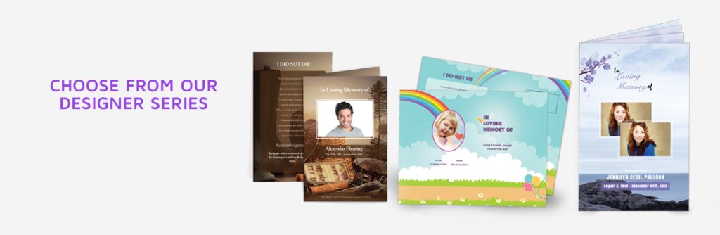
At FuneralPamphlets.com, every one of our Microsoft Word templates is multipurpose — designed for both funeral service programs and memorial booklets. You can begin with a layout that guides guests through the service, then expand it into a full keepsake by adding tributes, additional photos, or a longer life story. Because our templates are editable, printable, and easy to re-open later, many families revisit them months later to create a more complete memory book.
👉 Explore editable, ready-to-use designs here: Funeral Program Templates
Why Families Choose a Memorial Booklet
Some families print a short two-page program for the service and stop there. Others prefer to create a booklet — a more detailed printed keepsake that tells the person’s story with the care it deserves.
A memorial booklet allows space for:
- A longer narrative of the person’s life — their passions, milestones, and relationships.
- Multiple photographs — from childhood through recent years.
- Poems, favorite quotes, or comforting verses.
- Sections where family members can write notes or personal reflections.
These additions transform the booklet from a schedule into a cherished remembrance. Many families describe it as “something we can look at when we miss them,” which makes it worth the few extra pages and effort.
Because every template is built in Microsoft Word, you can adjust the number of pages or panels as needed — expanding a 4-page layout into an 8-page booklet simply by inserting pages and maintaining the same consistent design.
Memorial Booklet vs. Funeral Program: What’s the Difference?
The distinction can feel subtle, but understanding it will help you choose the right format for your needs.
A funeral program is typically concise. It lists the order of service — who speaks, what music plays, and the sequence of readings or prayers. Its purpose is guidance: helping guests follow along during the ceremony.
A memorial booklet, by contrast, often includes the same service details plus extended sections that go beyond the event. It may feature a written obituary, a full-page collage of photos, or several pages of poetry and reflections. Think of it as both a service guide and a keepsake — something meant to be read long after the service ends.
If you’d like a deeper comparison of formats and terminology, visit our detailed reference:
➡️ Funeral Pamphlet vs. Program vs. Order of Service
When to Create a Booklet Instead of a Program
- For memorials held weeks after a passing. Families often have more time to gather stories and photos, allowing for a fuller narrative.
- When celebrating a life with many chapters. Booklets are ideal for those whose experiences span generations — veterans, community leaders, or devoted grandparents.
- If distance separates family members. Printed booklets can be mailed or saved as PDFs for those who couldn’t attend in person.
- When you want something lasting. A memorial booklet remains a physical reminder — a reflection of care that digital slideshows or social posts can’t replace.
How Long It Takes to Design One
Many people assume creating a memorial booklet requires professional software or design expertise. In reality, most families complete their first draft in a few hours using editable Word templates. The process is simple:
- Choose a layout that fits your page count.
- Replace placeholder text with names, dates, and readings.
- Insert photos and adjust spacing.
- Proofread and print a sample copy.
Because templates handle the alignment and design work, you can focus entirely on the words and images that matter most. Later in this guide, you’ll find suggestions for structure, printing, and page flow to make your project even smoother.
Laying the Foundation for a Meaningful Keepsake
Before you start filling pages, think about the overall tone you want to convey. Do you envision something formal and traditional, or warm and conversational? Is the design minimalist, or filled with color and photos?
Answering these questions first helps you decide how many sections to include and which layouts will feel most natural. Our templates offer both clean modern designs and soft, classic styles — each one customizable for faith-based or secular services.
In the next section, we’ll explore the essential content to include — the pages, sections, and small personal touches that transform a simple printed guide into a truly meaningful memorial keepsake.
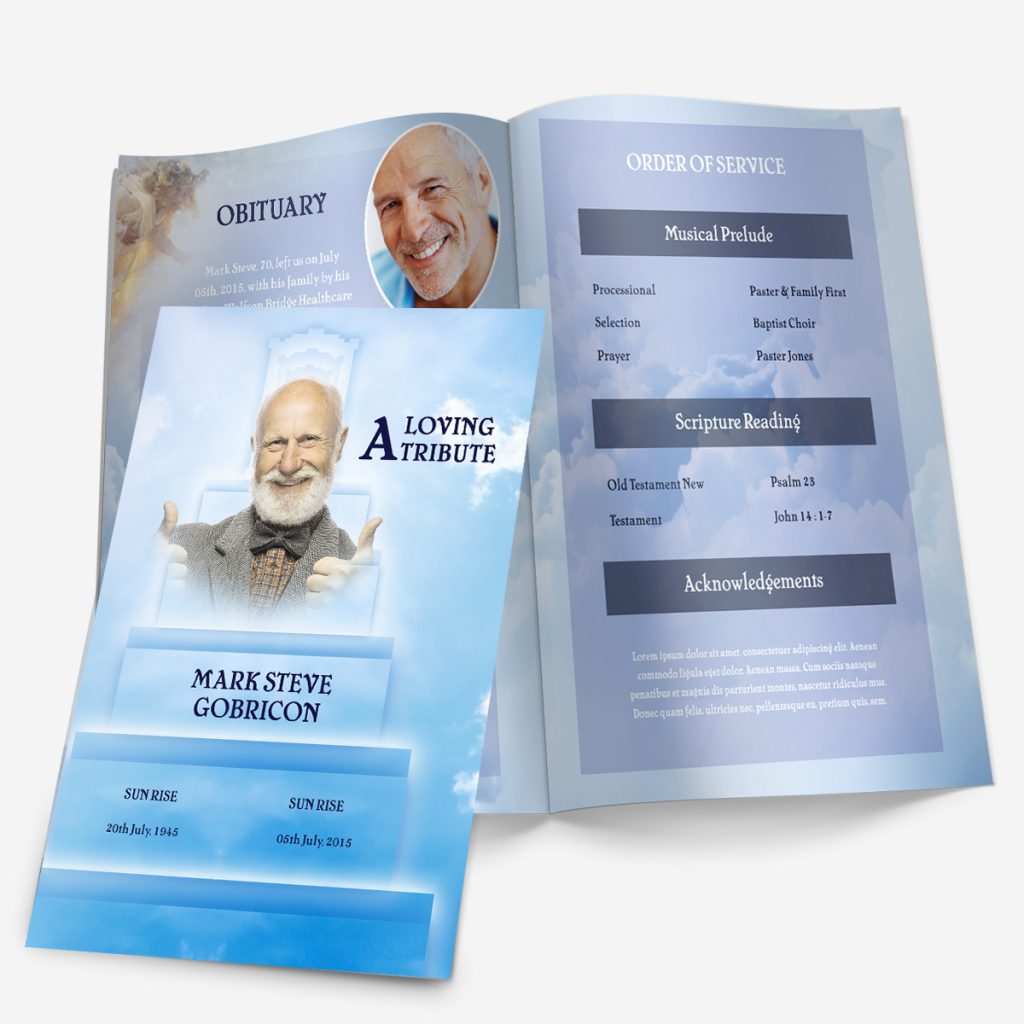
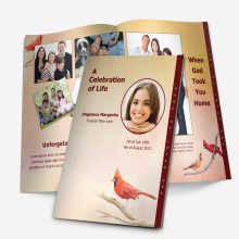
Building a Memorial Booklet with a 4-Page Graduated Template
Many families assume they need a thick, multi-page booklet to tell their loved one’s story, but our 4-page graduated templates already provide all the space you need. Each panel is carefully organized so that, together, they read like a small keepsake book—complete, balanced, and easy to print at home or with a local shop.
Graduated designs are recognizable by their layered side tabs, which help readers move naturally through the program: from the cover, to the order of service, to the life story, and finally to a closing note of thanks. Those subtle steps make the piece feel thoughtful and substantial without adding extra pages or printing costs.
Every Microsoft Word template on FuneralPamphlets.com follows this same logic—professional formatting that’s multipurpose for both funeral services and memorial keepsakes.
Page 1 – Front Cover
The front cover introduces the tone of the entire booklet.
Include:
- The full name of your loved one, with nickname if appropriate.
- Birth and passing dates—you can also use “Sunrise” and “Sunset.”
- One high-quality portrait that reflects their personality.
- A short, meaningful phrase, such as “Celebrating a Beautiful Life” or “Forever in Our Hearts.”
You can learn more about how these visual formats are structured in our
➡️ Funeral Program Layouts: Single, Tri-Fold, Gatefold & Graduated.
When editing, keep the photo centered and avoid cluttering the cover with long quotes—simplicity makes it elegant and printer-friendly.
Page 2 – Order of Service Tab
The second page begins the story. This tab usually lists the schedule of events for the ceremony or memorial gathering. Typical sections include:
- Opening music or welcome remarks
- Readings or scripture
- Eulogy or life tribute
- Closing message or prayer
This section also helps guests follow along during the service and gives future readers a sense of how the day unfolded.
You can view formatting ideas and detailed examples in the
➡️ Funeral Order of Service Guide.
If your ceremony is private or informal, you can repurpose this space for a favorite poem or quote instead—the flexibility of Word templates allows you to tailor each tab however you like.
Page 3 – Life Story & Tributes Tab
This is the emotional heart of your memorial booklet. Use it to share a condensed life story, highlight key memories, or combine short tributes from family members.
Suggested structure:
- A few sentences about early life and upbringing.
- Major milestones—career, family, passions, or community service.
- A closing paragraph describing personal values or how they’ll be remembered.
You can follow the tone and examples from
➡️ How to Write an Obituary for a Funeral Program.
Below or beside the text, consider adding one or two favorite photos and a single-line dedication such as “Your kindness lives on in every heart you touched.”
More short caption ideas appear here:
➡️ In Memoriam Examples: Short Tributes.
The tab title naturally appears along the right edge of the page, so readers instantly know where they are within the program—an elegant touch unique to graduated layouts.
Page 4 – Poems and Thank-You Tab
The final page offers closure. It’s where reflection meets gratitude.
You can divide the space into two sections:
1. Reflection or Poem
Select one short poem or verse that mirrors your loved one’s beliefs or outlook. A few lines are enough to bring calm and meaning without overwhelming the design.
For inspiration and ready-to-copy text samples, visit
➡️ Funeral Program Wording Examples & Templates.
2. Family Thank-You Message
Close with a note of appreciation for those who attended, offered support, or sent condolences.
Example:
The family of Maria Lopez wishes to thank everyone for your love, prayers, and kind words. Your presence today brings comfort that will be remembered always.
You can find additional text variations here:
➡️ Funeral Thank-You Message Templates.
Leave a bit of white space beneath the closing text so the page feels calm and readable—a quiet ending to a heartfelt piece.
Design Tip – Why Graduated Layouts Make Perfect Keepsakes
Unlike a standard single-fold program, the staggered tabs in a 4-page graduated design create a built-in navigation system. Each page reveals a portion of the next, signaling a new section before it’s opened. This layered look gives depth and professionalism—ideal for memorials where guests will treasure the booklet long after the service.
Because each tab is pre-formatted in Microsoft Word, you can simply replace the placeholder titles with your own section names or leave them as is. The result feels custom-made while remaining quick to edit and print.
Printing, Paper Choices, and Photo Placement for a 4-Page Graduated Booklet
Once your memorial booklet is written and formatted, the final step is preparing it for print. The right paper, photos, and printer settings can make the difference between something that feels temporary and something worthy of being kept. Our 4-page graduated templates were designed to deliver professional, keepsake-level results — even from a home printer.
Understanding How the 4-Page Graduated Layout Prints
Each template prints on a single sheet of 8.5” × 11” paper, double-sided, and then folded once down the center. The staggered tabs appear automatically because the pages are offset within the design.
When folded, the four visible panels stack in order:
- Front cover (with the person’s photo)
- Order of Service tab
- Life Story tab
- Poems or Thank-You tab
This structure makes it simple: one piece of paper, two printed sides, one center fold. No special cutting or binding is needed. You’ll get a booklet that feels layered, substantial, and perfectly aligned every time.
If you’re new to printing, review our full walkthrough here:
➡️ Printing a Program Template
Choosing Paper for Keepsake Quality
The paper you choose is as important as the design itself. Too thin and it feels disposable; too thick and it won’t fold cleanly. We recommend:
- 28–32 lb. paper (for inkjet printers) or
- 80–100 lb. text weight (for laser printers or local print shops)
A smooth matte finish brings out soft colors and text clarity. Glossy paper works well for photo-heavy designs, but test first — darker colors may appear slightly brighter on screen than in print.
If you want something archival, ask your printer for acid-free or bright-white stock. This ensures the colors won’t fade or yellow over time, keeping the booklet beautiful for years to come.
For more detailed sizing and folding recommendations, visit our
➡️ Funeral Program Sizes & Paper Printing Guide
Home Printing vs. Professional Printing
Both methods can produce excellent results if you prepare properly.
Home Printing
Ideal when you need only a few copies or want complete control over timing.
- Use the “Print on Both Sides” or duplex setting, choosing Flip on Short Edge.
- Always print one test copy first to check margin alignment.
- Let ink dry completely before folding to avoid smudges.
If your printer doesn’t support duplex printing, print one side at a time and feed the paper manually. Keep pages stacked in the correct orientation — graduated templates are already designed to line up once folded.
Professional Printing
For larger quantities or premium paper, a local print shop can handle it quickly. Bring your file in PDF format to lock in fonts and spacing. Mention that the file is “two-sided, center-folded, 4-page graduated layout.”
Most shops can trim slightly along the right edge to accentuate the tabs if you’d like a sharper, layered effect.
Photo Selection: Choosing Images That Print Well
Your 4-page graduated template allows space for 2–3 carefully placed photos — one large portrait on the cover and smaller images inside. Because space is limited, choose pictures that feel emotionally representative rather than literal.
Cover Photo
Use a head-and-shoulders portrait with soft lighting. Avoid heavy filters or overly dark backgrounds — they can print muddy. Center the image and leave room for text around it.
Inside Photos
Place one or two smaller images near the life story or poem sections. Black-and-white versions can unify different lighting styles and add timeless elegance.
Resolution Matters
Use images at 300 dpi or higher. Lower-resolution photos may look fine on screen but will blur on paper. If you’re scanning printed photographs, set the scanner to “photo” mode at 600 dpi and save as a JPEG or PNG file.
For step-by-step guidance on preparing images, check our
➡️ Funeral Program Photo Quality Guide
Cropping and Composition Tips
A photo’s emotional impact often depends on what you remove. Crop in close enough to focus on the person’s face and expression — extra background detail rarely adds meaning.
Avoid stretching or resizing images disproportionately; instead, adjust margins or use Word’s built-in “crop to shape” feature for smooth, rounded edges or ovals. This softens the design and prints beautifully on matte paper.
Proofing Before the Final Print
Before printing multiple copies, double-check:
- All photos are aligned and evenly spaced.
- Text is centered within each tab and doesn’t run into the next panel.
- Colors look consistent across both sides of the paper.
- Dates, names, and service details are accurate.
Fold a test sheet to make sure the graduated tabs line up evenly. A single misaligned print can shift margins across the entire batch, so take a minute to test.
The Emotional Value of a Professionally Printed Keepsake
Once printed, folded, and trimmed, your 4-page graduated memorial program feels surprisingly substantial in hand — thick enough to last, simple enough to reprint, and personal enough to treasure.
Because the design naturally guides the reader through each section, it functions as both a service program and a lifelong keepsake. Families often frame the front cover or store a copy with cherished photos and letters.
That sense of permanence is what makes printed memorials irreplaceable — they hold not just information, but presence.
Fonts, Readability, and Final Presentation
Typography and layout choices may seem small, but they shape the emotional tone of your memorial booklet. A well-chosen font can make the difference between something that feels crowded and something that breathes peace and clarity. Our 4-page graduated Microsoft Word templates are pre-formatted to make this process simple — yet flexible enough to personalize.
Choosing the Right Fonts
When editing your template, the safest approach is to pair one decorative font for headings with one clean, readable font for body text. Too many styles can distract from the message.
Recommended heading fonts:
- Playfair Display – classic and graceful
- Great Vibes – elegant script for names or titles
- Cinzel Decorative – formal, suitable for religious or traditional layouts
Recommended body fonts:
- Calibri or Arial – modern, legible even at small sizes
- Times New Roman – timeless and widely available
- Georgia – softer serif option for printed material
Avoid using cursive fonts for paragraphs — they look ornate on screen but blur slightly in print. Reserve script only for section titles or captions such as “In Loving Memory.”
If you’d like detailed examples of how each style looks inside Word layouts, refer to our
➡️ Funeral Program Fonts in Microsoft Word.
Balancing Readability and Design
Graduated programs offer limited space on each tab, so every word should serve a purpose. Here are key design tips for maintaining visual balance:
- Keep line spacing at 1.2–1.4 for comfortable reading.
- Avoid full justification; left-aligned text feels more natural and avoids uneven spacing.
- Use bold sparingly, mainly for names, titles, or poem headings.
- Don’t shrink text below 11pt — clarity is more valuable than squeezing in extra sentences.
White space is not wasted space. It allows the reader to pause and reflect, giving emotional rhythm to your layout.
Coordinating Colors and Themes
Most FuneralPamphlets.com templates feature professionally balanced colors — soft blues, floral tones, neutral whites, or faith-based imagery. If you adjust them, stick to two primary colors: one for headings and one for accents.
Warm tones (burgundy, cream, rose) tend to evoke comfort, while cool tones (blue, lavender, gray) suggest calm reflection.
Keep contrast high enough that text is readable over any background image. When in doubt, use a semi-transparent white box behind text to improve clarity — our Word templates allow this with a single click.
For photo-based designs, matching text color to a small element within the image (like flowers, sky, or fabric) can create visual harmony.
Adding Personal Touches Without Overcrowding
Because our graduated templates are multipurpose, you can adapt them beyond the day of the service. Many families print a few extra copies as keepsakes or store a PDF version digitally.
Simple enhancements include:
- A favorite quote or line of scripture beneath the name on the front cover.
- A faint watermark behind the text (for example, a floral cross or landscape).
- Rounded photo frames or soft drop shadows for added depth.
- A short closing line like “Lovingly prepared by the family of…” at the back bottom margin.
Each addition should reinforce emotion, not overwhelm the design. Remember: the beauty of the 4-page graduated format lies in its restraint.
Proofreading and Accessibility Check
Before sending your booklet to print, take five quiet minutes to review every element carefully:
- Names and Dates: Double-check spelling, capitalization, and spacing.
- Tabs: Ensure each section title aligns with the proper page content.
- Poems and Readings: Verify line breaks — sometimes copying text into Word shifts formatting.
- Contrast Test: Print one draft to confirm that every section is legible, even in softer colors.
You can also ask a friend or family member to proofread. A second pair of eyes often catches small errors or typos overlooked by emotion and fatigue.
Folding, Finishing, and Presentation
Once printed, fold the sheet carefully along the center crease, aligning the graduated tabs so they layer neatly. Run the edge of a clean ruler or bone folder down the fold for a crisp finish.
If you want to elevate the presentation further:
- Use a simple ribbon or bow tied along the spine.
- Slip a tissue sheet between copies for protection.
- Place booklets on each chair at the service or stack them neatly on a small table beside a framed photo.
These small gestures transform a printed program into a meaningful memorial experience.
Why Families Choose Printable Templates Over Custom Design
Hiring a designer can delay printing and increase costs. Our Microsoft Word funeral templates are structured so families can edit, print, and share within hours — while still producing a result that feels personal and refined.
Because each design is multipurpose, it works equally well as a service handout or a lasting keepsake to preserve memories. Many families frame the front cover, scan it into a slideshow, or print additional copies for relatives unable to attend.
To browse all available designs, visit the template collection at
➡️ Funeral Program Templates.
Final Reflection
A memorial booklet doesn’t need to be lengthy to be meaningful. What matters most is the care behind every word, photo, and fold. With the right balance of design, readability, and emotion, your 4-page graduated template becomes more than a handout — it becomes a physical expression of love and remembrance.
The goal is not perfection, but presence: a keepsake that quietly says, “You are remembered.”
FAQ
1. What is a memorial booklet?
A memorial booklet is a folded printed program that honors a loved one’s life and includes photos, readings, and service details.
2. Can I use a funeral program as a keepsake?
Yes. Our Microsoft Word templates are multipurpose — they work for both the service and as a lasting keepsake for family and friends.
3. How many pages should a memorial booklet have?
A 4-page graduated layout is ideal. It’s simple to print, easy to read, and spacious enough for photos, wording, and tributes.
4. What should be included in a memorial booklet?
Include a cover photo, order of service, short life story, poem or quote, and a thank-you note from the family.
5. How do I print a 4-page graduated program at home?
Use double-sided printing (“flip on short edge”) on 28–32 lb. paper, fold once, and align the tabs neatly.
6. What type of paper should I use?
Choose matte or premium text-weight paper (80–100 lb.). It gives professional results without glare.
7. Can I add extra photos to my memorial booklet?
Yes. Our templates have photo placeholders, and you can duplicate a section in Word to add more if needed.
8. What fonts work best for memorial booklets?
Use an elegant heading font such as Playfair Display with a clear body font like Calibri or Georgia.
9. Are your templates editable in Microsoft Word?
Absolutely. Every template is fully editable — just replace sample text and photos to personalize it.
10. Can I reuse the same template for another occasion?
Yes. The designs are multipurpose and can be adapted for anniversaries, memorials, or celebration-of-life gatherings.