Customization Services
 Photo
Retouching Services
Photo
Retouching Services Live
Support
Live
SupportWhy this guide matters
Designing a beautiful memorial program is one thing—getting it to print cleanly (correct size, sharp photos, no chopped edges, paper that feels right) is another. This guide covers everything families ask us about printing:
- Standard sizes & folds (bi-fold, tri-fold, graduated, booklet)
- Paper weights (what “lb” vs “gsm” means, what feels premium)
- DPI/resolution for crisp photos
- Bleed, trim & safe area (so nothing gets cut off)
- Exact Microsoft Word settings for booklet printing
- Home printer vs. local shop—cost & quality tips
- Internal links to editable templates so you can download and print today
Throughout, we’ll link to helpful pages on our site for step-by-step setup and wording, and to a few specific template categories so you can pick the right design fast.
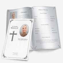
Standard funeral program sizes & folds (what most printers expect)
When printers say “standard,” they usually mean the sizes below (so your file won’t need special handling):
1) Bi-fold (half-letter finished size)
- File/Sheet: US Letter 8.5″ × 11″
- Fold: Once down the middle (landscape), finished 5.5″ × 8.5″
- Use when: You want a classic 4-panel program (cover, inside left/right, back)
- It’s also the most common funeral program format per industry guides.
2) Tri-fold (letter tri-panel)
- File/Sheet: US Letter 8.5″ × 11″
- Fold: Two folds, three panels per side (six total panels)
- Use when: You need organized sections (schedule, lyrics, short bio) in narrow columns.
3) Legal or Tabloid variants (when you need more room)
- Legal tri-fold: 8.5″ × 14″ gives longer panels for lyrics/readings
- Tabloid bi-fold: 11″ × 17″ folded to 8.5″ × 11″ for a booklet feel with more photos/tributes. Template.net
Tip: If your program is photo-heavy or includes long readings, tabloid bi-fold prints look premium but still staple easily.
Paper weights explained (feel matters)
You’ll see “20 lb text,” “80 lb cover,” and “gsm” thrown around. Here’s how to choose:
- 20–24 lb text (75–90 gsm): Standard copy paper. Budget-friendly, but can feel flimsy.
- 28–32 lb text (105–120 gsm): Heavier text stock; great for tri-folds or bi-folds with fewer pages. Feels substantial without being too thick.
- 60–80 lb cover (160–215 gsm): Cardstock. Ideal for single-sheet bi-folds where you want a keepsake feel.
- 100 lb cover (≈270 gsm): Premium cardstock—use for elegant 4-page programs or tabloid bi-fold covers.
House rule: If you’re printing a single bi-fold and want it to feel like a keepsake, choose 80 lb cover. If adding multiple interior pages, use a cardstock cover + 28–32 lb text inside.
DPI & photo resolution (so images don’t print blurry)
For crisp printing:
- Target 300 DPI/PPI at the final print size (not just any 300). That’s the long-standing print standard for brochures/photos.
- Very detailed graphics can benefit from 600 PPI, but file sizes jump; 300 PPI is plenty for most program photos.
Quick check: If a photo will print at 5″ wide, multiply 5 × 300 = 1500 pixels minimum width. If your image is only 900 px wide, reduce its print width to 3″ or pick a higher-resolution file.
Bleed, trim & safe area (and why margins matter)
- Bleed is extra image extending past the final cut so edges print to the very border without white slivers.
- Typical bleed: 0.125″ (3 mm) on all sides for small print pieces.
- Trim is the final cut line.
- Safe area is the margin inside trim where you keep text/logos so they don’t risk being chopped—keep key text ≥ 0.125″ inside trim.
Example: For a finished 5.5″ × 8.5″ bi-fold cover, set your page (or canvas) to 5.75″ × 8.75″ (adds 0.125″ bleed each side) and keep names/dates at least 0.125″ inside the trim.
Exact Microsoft Word settings (booklet + bi-fold done right)
If you’re building in Word, use the built-in booklet tools:
For a multi-page booklet (tabloid folded or letter booklet):
- Layout → Margins → Custom Margins
- In Multiple pages, choose Book fold (Word automatically flips to landscape and paginates correctly).
- Optional: Add a Gutter (extra inner margin) to avoid text creeping into the fold.
For a simple bi-fold on letter paper:
- Keep page size: 8.5″ × 11″, orientation landscape, and design left/right panels.
- If your printer supports borderless: add 0.125″ bleed to the canvas; if it doesn’t, keep backgrounds within safe margins.
Printing two half-pages per sheet (for 5.5″ × 8.5″ finished pages):
- In Word’s Page Setup, you can print 2 pages per sheet to create statement-size halves on letter paper.
Need more step-by-step? See Printing a Program Template and Funeral Program Fonts in Word on our site for screenshots and font pairing tips.
Fold types at a glance (and when to choose each)
- Bi-fold (half-fold): 4 panels. Fastest to design, easy to print anywhere. Most common for services.
- Tri-fold: 6 panels. Great for lots of short sections (order of service, lyrics, directions).
- Graduated (step-tab): Sections are labeled on visible tabs—professional and easy to navigate.
- Booklet (stapled): Multiple sheets nested and saddle-stitched for 8–12–16 pages; ideal for photo-heavy services.
Design help: Browse Funeral Program Examples & Design Ideas to see how different formats handle photos, readings, and acknowledgments.
Creating a Funeral Program That Stands Out
Step 4: Organize the Program Layout
While wording and design matter, the overall layout determines how easy it is for guests to follow along. A well-structured funeral program should have a logical flow from the front cover to the final acknowledgments.
Recommended order:
- Front Cover – Name, photo, birth and death dates, short phrase or scripture.
- Inside Left Page – Order of service or ceremony outline.
- Inside Right Page – Obituary or life story.
- Back Page – Acknowledgments, pallbearers list, final message, and contact info.
💡 For an in-depth breakdown, see our Funeral Order of Service Guide.
Step 5: Choosing Images and Graphics
Images create an emotional connection and help personalize the program.
- Portrait Photo: Clear, high-quality headshot, ideally with a warm smile.
- Lifestyle Photo: A candid image showing the person in a favorite activity.
- Themed Graphics: Flowers, doves, crosses, military insignias, or seasonal elements.
If you are using our templates, you can easily swap images without distorting the design. Avoid overloading the program with too many images — 1–3 meaningful photos usually work best.
Step 6: Selecting Paper and Printing Options
The paper you choose can elevate the presentation of your program.
- Standard Option: 32 lb or 80–100 gsm paper for affordability and ease of printing at home.
- Premium Option: 100–120 lb cardstock for a luxurious feel.
- Finish: Matte for a soft, timeless look, or glossy for vibrant colors and sharp images.
💡 Pro Tip: Always print a single test copy before printing in bulk to ensure colors, margins, and text size are correct.
Step 7: Adding Personal Touches
A funeral program is more than a schedule — it’s a keepsake. Consider adding:
- Favorite Quotes or Scriptures
- Song Lyrics or Poems
- Special Notes from Family Members
- Collage Pages for photos from different life stages
💡 See our Funeral Program Examples & Design Ideas for creative inspiration.
Step 8: Making It Accessible to Guests
Not everyone can attend the service in person. You can share your program digitally by:
- Emailing a PDF to friends and family
- Posting it on a memorial website
- Sharing on private social media groups
💡 Pro Tip: Our templates are easy to export as both printable files and digital PDFs.
Ashley Giddens is the editor at FuneralPamphlets.com and your first point of contact for support. Since 2013, she’s helped families create clear, print-ready memorial programs—editing wording, fixing layouts in Microsoft Word, restoring photos, and customizing templates so they print correctly the first time. Ashley reviews every guide for clarity and printer specs (paper size, margins, image resolution) and updates articles as formats change. Need help? She handles customer service directly and can make quick edits to your file when you’re short on time.