Customization Services
 Photo
Retouching Services
Photo
Retouching Services Live
Support
Live
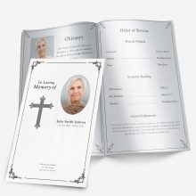
SupportPhotos carry the heart of a memorial program. They welcome guests on the cover, guide them through the service, and become the keepsake families hold onto. Yet most frustrations—blurry prints, muddy colors, cropped heads—come from a few simple issues: resolution, cropping, and color.
Think of resolution like the number of tiles in a mosaic. More tiles, sharper picture. For print, the common target is 300 DPI (dots per inch). In practice, that means:
- A 4″ × 6″ cover photo needs ~1200 × 1800 pixels.
- A quarter-page image (about 3.5″ wide) needs ~1050 pixels across.
- A small thumbnail (2″ wide) should still be ~600 pixels across.
If the only copy available is smaller, it can still look good—if it’s placed smaller on the page. Upsizing too far usually creates softness or jagged edges.
Two quick ways to set yourself up for success:
- Match photo size to the layout. Bifold covers often use a single portrait image. Trifold layouts spread content across narrow panels, so choose images that crop well vertically. Graduated programs reward a mix—one strong portrait up front, smaller supporting images on the tabs inside. For a sense of how different layouts display images, skim these example design ideas.
- Plan for paper and print method. Glossy stocks can boost contrast; matte stocks are gentler and reduce glare. If you’re unsure what weight or finish suits your layout, this sizes & paper guide is a solid reference.
Scanning Old Photos the Right Way
Old prints often hold the best memories but need careful handling to look good in print.
Set the scanner once, print with confidence.
- 300 DPI is fine when the print will be used at the same size it’s scanned.
- 600 DPI gives breathing room to enlarge up to 2× or crop tighter.
- Go to 1200 DPI only for small originals (wallet size) or when you plan a full-page cover.
Prep the photo before the scan.
- Gently remove dust with a microfiber cloth or a blower (no tissues—they shed fibers).
- If the print is under glass, do not use liquids. Photograph it instead (see phone method below) to avoid water marks.
- Align the photo square to the scanner glass to avoid skewed edges.
After the scan: basic fixes go a long way.
- Crop to remove borders and tilt.
- Straighten horizons and backgrounds.
- If the image is faint or yellow, a small nudge of white balance and contrast helps. For heavily faded or cracked photos, consider a pro touch via the in-house photo restoration service.
If you’re building the layout in Word, small edits (crop, straighten) can happen right inside the document. This overview on editing a template shows where to find those tools and how to keep images anchored so they don’t jump when you add text.
Cropping & Resizing Photos Without Losing Quality
Even when photos are scanned correctly, a common mistake is improper cropping or resizing. This usually happens when someone tries to “make it fit” into the funeral program template but accidentally stretches, squishes, or cuts off important details.
Common Cropping Mistakes
- Heads cut off – The top of the person’s head is missing because the image wasn’t centered before cropping.
- Excessive background – Too much empty space pushes the person off to the side and makes the program look unbalanced.
- Over-zooming – Enlarging a small section of a photo makes it blurry or pixelated.
Fixes That Work in Real Life
- Use proportional scaling – Hold Shift (in Word, Publisher, or Canva) while resizing so the photo doesn’t distort.
- Center the subject first – Crop around the person, not the background.
- Add a border or frame – If the image doesn’t perfectly fit the space, insert a white or black border. This avoids awkward stretching.
- Check print preview – Many mistakes look fine on-screen but show up in the print proof. Always preview before printing.
👉 If you’re using one of our funeral program templates, the photo boxes are already proportioned to reduce distortion.
Fixing Color & Brightness Issues in Old Photos
Even with the right DPI and cropping, color problems often make old photos look dull, faded, or yellowed. This is especially true for older film prints that have aged or photos taken in poor lighting.
Common Color & Brightness Problems
- Faded faces — Skin tones look pale or washed out.
- Yellow tint — Old paper and film photos often turn yellow over time.
- Too dark — Shadows make it hard to see the person’s expression.
- Overexposed — Bright areas lose detail, especially in white clothing.
Simple Fixes You Can Do Yourself
- Auto-adjust tools – Most basic editors (even the free Windows Photos app or Mac Preview) have a one-click “auto enhance” that balances brightness and color instantly.
- Adjust contrast, not just brightness – Raising brightness alone makes photos look hazy. Increasing contrast adds depth and restores detail.
- Remove yellow tint – In Word, PowerPoint, or Canva, use the “Color Balance” or “Temperature” slider to cool the image slightly toward blue.
- Convert to black and white – If the colors can’t be saved, black-and-white often looks timeless and more professional.
- Spot-fix shadows – In Canva or Photoshop, the “Shadows” slider helps reveal details without over-lightening the whole picture.
Pro Tip
If you’re not comfortable editing, a quick solution is to use online tools like Fotor or Canva’s built-in adjustments. But for the best results, upload your edited photos directly into our funeral program templates—they’re designed to print true-to-color, so what you see on screen matches what you’ll hold in hand.
Rescuing Damaged or Low-Quality Photos
Sometimes the only photo you have is far from perfect — maybe it’s creased, blurry, or printed so small it looks pixelated when scanned. Don’t worry: there are workarounds that can still give you a respectful, clear image for the program.
1. Fixing Creases, Tears, and Spots
- Basic method: Crop around the damaged area if possible, focusing on the person’s face.
- Editing tools: Free apps like Canva or Pixlr have “heal” or “retouch” tools to remove spots. Photoshop makes this easier with the “Spot Healing Brush.”
- Black-and-white trick: Converting a damaged color photo to grayscale can hide stains or discoloration.
2. Saving Blurry or Small Photos
- Upscale with AI: Free tools like Let’s Enhance, Remini, or Adobe Express can sharpen small or blurry photos using AI.
- Avoid stretching too far: If the source is tiny (like a wallet-size photo), use it in a smaller frame on the program rather than as a full-page background.
3. Working With Old Family Photos
- Scan at high DPI: Even if the photo is small, scanning at 600 DPI gives you more detail to work with.
- Restore before printing: A quick round of contrast and sharpness adjustment can make the difference between a faded face and one that looks vibrant.
Pro Tip
If you can only salvage a low-quality picture, place it alongside a favorite quote or prayer inside one of our editable funeral program templates. This balances the design so the photo doesn’t look stretched or out of place, while still keeping the tribute deeply personal.
Final Checklist: Ensuring Photos Print Beautifully
Before sending your program to print, run through this quick checklist:
- ✅ Scan photos at 300–600 DPI (never just snap a phone pic of the print).
- ✅ Crop and straighten so the person’s face is centered.
- ✅ Balance brightness and contrast to make details clear.
- ✅ Avoid stretching small photos — use them in frames, not backgrounds.
- ✅ Fix spots and creases with free editing tools or by converting to black-and-white.
- ✅ Preview in print size — always zoom out to see what it looks like on paper.
Even one or two improvements from this list can completely transform how a photo looks in your finished program. Families often notice these small touches most — a face that’s clearer, a smile that’s more visible, or colors that feel more alive.
Conclusion
High-quality photos are the heart of a memorable funeral program. Taking a few extra minutes to scan properly, crop carefully, and adjust colors can make the difference between a faded image and one that honors your loved one in the best light possible.
If you’re ready to put these tips into action, explore our full collection of funeral program templates where you can insert your photos seamlessly into professional, print-ready designs.
FAQ
What DPI should I scan old photos at for a funeral program?
For clear, print-ready results, scan at 300–600 DPI. Anything lower can look blurry once printed.
Can I use phone photos instead of scanning prints?
Yes, but only if taken in bright, even lighting without shadows or glare. Scanning is always better for detail.
How do I fix faded or damaged old photos?
You can use free tools like Fotor, Canva, or GIMP to adjust brightness/contrast and repair minor blemishes. Converting to black-and-white can also disguise damage.
What’s the best way to crop funeral program photos?
Always crop so the face is centered and fills the frame. Avoid zooming in too far — it can cause pixelation.
Should photos be in color or black and white?
Both work. Use color for a vibrant, modern look or black and white for a classic, timeless feel — especially if the original print is damaged.
Ashley Giddens is the editor at FuneralPamphlets.com and your first point of contact for support. Since 2013, she’s helped families create clear, print-ready memorial programs—editing wording, fixing layouts in Microsoft Word, restoring photos, and customizing templates so they print correctly the first time. Ashley reviews every guide for clarity and printer specs (paper size, margins, image resolution) and updates articles as formats change. Need help? She handles customer service directly and can make quick edits to your file when you’re short on time.